Bar Chart: Compare Categories at a Glance
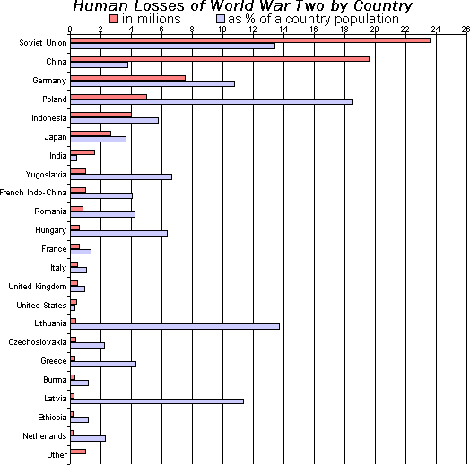
A bar chart is a lineup of rulers for different categories, making it easy to compare values. It's perfect for showing "how much" for discrete items, like monthly sales or user counts by country. The footgun: don't use it for continuous data—use a line chart.
WHY IT EXISTS Our brains struggle to quickly compare raw numbers in a table. We need a visual way to see relationships between quantities for different categories. The bar chart was created to solve this by translating numerical values into simple, proportional lengths that we can compare instantly.
THE MENTAL MODEL Think of a bar chart as a physical lineup. Each bar is a separate category (a person, a product, a country), and its height or length is its "score" (sales, population, votes). You can immediately see the winner, the loser, and the gaps between them without reading a single number.
HOW IT WORKS A bar chart has two axes. One axis presents the discrete categories you are comparing (e.g., "Product A," "Product B"). The other axis represents a numerical scale. For each category, a rectangular bar is drawn. The length or height of this bar is proportional to that category's value. Bars can be oriented vertically (a column chart) or horizontally, which is often better when category labels are long.
WHEN TO USE IT Use a bar chart when you need to compare values across a handful of distinct categories. It excels at showing rankings and comparisons. Examples include: comparing the number of users from different countries, showing revenue per quarter, or displaying the results of a survey with multiple-choice answers.
WHEN NOT TO USE IT Avoid bar charts for showing trends over time with many data points (e.g., daily website traffic for a year); a line chart is far better for revealing the shape and continuity of the data. Also, if you have too many categories (more than 10-12), the chart becomes cluttered and hard to read. Finally, don't use it to show the parts of a whole; that's a job for a pie chart or a stacked bar chart.
ONE CANONICAL EXAMPLE Imagine a poll asking people their favorite pet. The categories are "Dog," "Cat," and "Fish." The results are 50 votes for Dog, 35 for Cat, and 10 for Fish. A bar chart would have three bars. The "Dog" bar would be the longest (proportional to 50), the "Cat" bar would be shorter (proportional to 35), and the "Fish" bar would be the shortest (proportional to 10), making the ranking immediately obvious.
Read the original → en.wikipedia.org
Get five bites like this every day.
Tezvyn delivers a daily feed of 60-second tech bites with quizzes to lock in what you learn.