Color Theory: Harmony, Contrast, and Meaning in UI
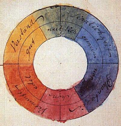
Color theory is a system for using contrast, harmony, and symbolism to guide user experience. It's applied in UI to create visual hierarchy, evoke brand emotions, and ensure readability.
WHY IT EXISTS Color theory was developed to provide a systematic way to understand and predict how colors behave and are perceived. Instead of choosing colors randomly, it offers a shared body of knowledge for making intentional, effective decisions in art and design.
THE MENTAL MODEL Think of color theory as the grammar of color. Just as grammar provides rules for constructing meaningful sentences, color theory provides principles for combining colors to create clear, effective, and emotionally resonant user interfaces. It bridges the subjective feeling of a color with its objective function in a design.
HOW IT WORKS Color theory operates on several core principles. Color Harmony describes which combinations are pleasing to the eye, based on their relationships. Color Contrast is about making elements distinct from each other, which is critical for readability and creating visual hierarchy. Color Symbolism refers to the cultural and psychological associations of colors, like using green for success or red for danger. Color Schemes are the practical application of these principles, creating a palette that works together to serve a design's goals.
WHEN TO USE IT Use color theory any time you are designing a user interface. It is fundamental for choosing a brand's primary, secondary, and accent colors. It's essential for designing states, like for buttons (default, hover, disabled), and for ensuring that text is legible against its background. It also guides the use of color to draw attention to key actions or information.
WHEN NOT TO USE IT Avoid relying solely on traditional, subjective color theory when objective precision is required. For example, in color reproduction for printing or manufacturing, the more rigorous, measurement-based rules of color science are necessary to ensure consistency. Color theory guides aesthetic and psychological choices, while color science governs physical accuracy.
ONE CANONICAL EXAMPLE Consider a 'Sign Up' button. Its color is chosen based on a color scheme that aligns with the brand's identity (harmony). It's made to stand out from the background using high contrast, drawing the user's eye. The color itself might be a vibrant, positive one like green or blue, leveraging color symbolism to encourage action. The text on the button, often white or black, is also chosen for maximum contrast and readability, ensuring the interface is accessible.
Read the original → en.wikipedia.org
Get five bites like this every day.
Tezvyn delivers a daily feed of 60-second tech bites with quizzes to lock in what you learn.