CSS Box Model: Every Element is a Box
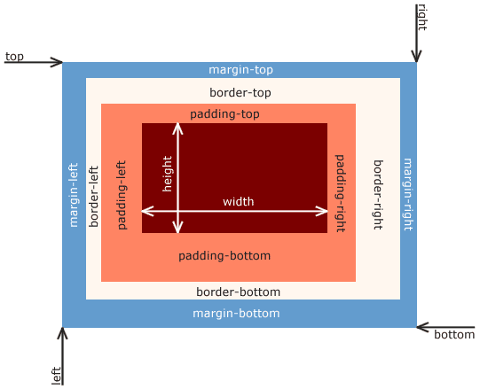
Every HTML element is a box with layers: content, padding, border, and margin. This model dictates how elements take up space and align, forming the basis of all CSS layout. The footgun is the default sizing, which adds padding *outside* the set width.
WHY IT EXISTS: Web browsers need a consistent set of rules to determine how much space an element occupies on a page. Without a standard model, the same CSS could produce wildly different layouts in different browsers. The CSS box model provides this shared, predictable rulebook for calculating an element's dimensions and position.
THE MENTAL MODEL: Imagine every HTML element as a picture in a frame hanging on a wall. The picture itself is the CONTENT area. The matting between the picture and the frame is the PADDING. The frame is the BORDER. The empty space between this picture and any other pictures on the wall is the MARGIN. All web layout is just the art of arranging these boxes.
HOW IT WORKS: The browser calculates an element's final size by summing its four parts: content, padding, border, and margin. The key property controlling this calculation is box-sizing. There are two main modes. First, content-box (the default), where the width and height properties apply only to the content area. Any padding or border you add increases the element's total size. Second, border-box, where width and height define the total size of the element up to and including the border. Padding and border are then placed inside this dimension, shrinking the content area to fit.
WHEN TO USE IT: You don't choose whether to use the box model; every element on a webpage is subject to it. You use it constantly when you define an element's width, add padding for internal spacing, create a border, or use margin to push other elements away. It is the foundation of all CSS layout.
WHEN NOT TO USE IT: You cannot avoid the box model itself. The only choice is which sizing mode to use. For modern web development, there are very few reasons to use the default content-box mode. Most developers apply box-sizing: border-box to all elements as a reset, because it makes layout math far more intuitive and predictable, especially in responsive designs.
ONE CANONICAL EXAMPLE: Consider a button with width: 200px, padding: 20px, and border: 5px. With the default box-sizing: content-box, its final rendered width is 200px (content) + 40px (left/right padding) + 10px (left/right border) = 250px. This unexpected growth breaks layouts. If you set box-sizing: border-box, the button's final width is exactly 200px, as specified. The browser automatically calculates the inner content area to be 150px to make room for the padding and border.
Read the original → en.wikipedia.org
Get five bites like this every day.
Tezvyn delivers a daily feed of 60-second tech bites with quizzes to lock in what you learn.