First Click Testing: Predicting Task Success with One Click
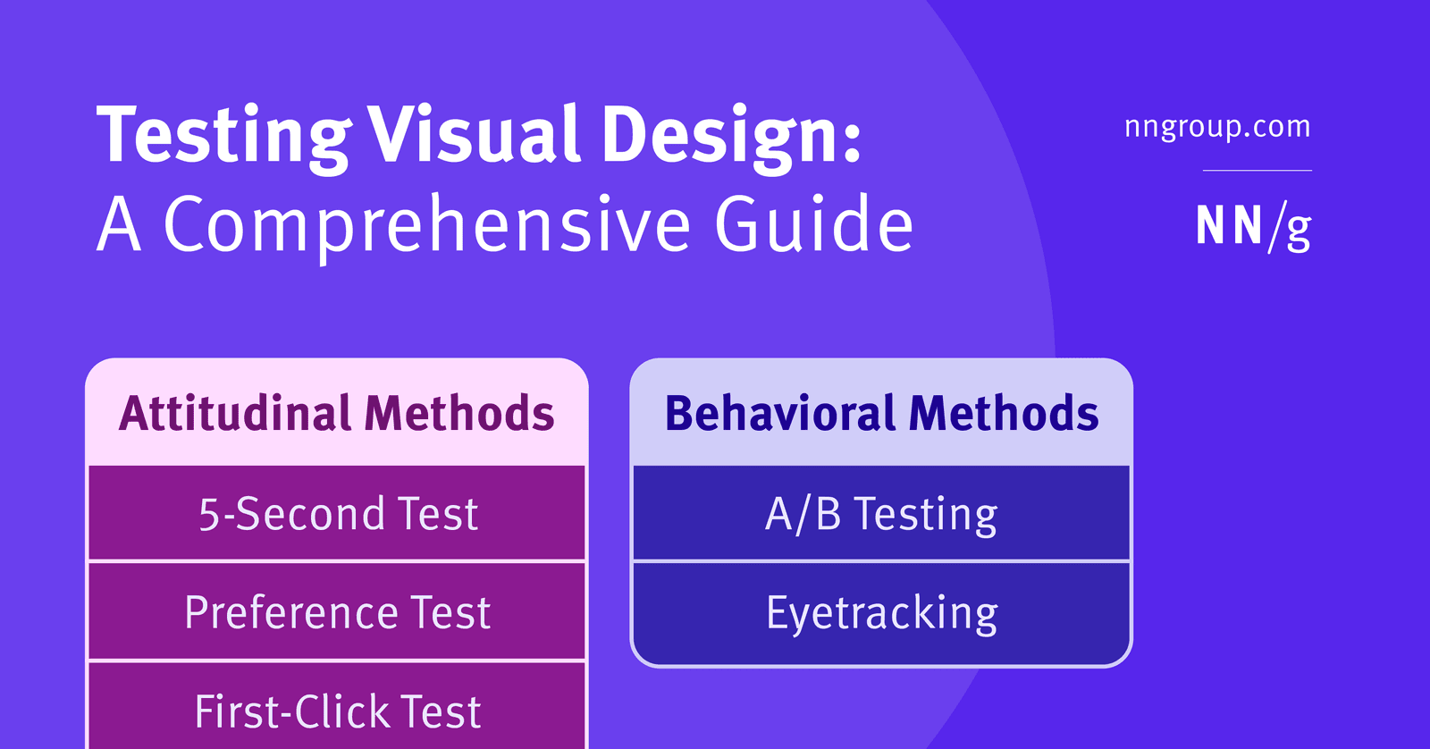
First Click Testing predicts if users can complete a task by tracking where they'd click first on an interface. If the first click is right, success is far more likely. It's used to validate navigation and UI clarity. The footgun is a poorly phrased task.
WHY IT EXISTS: Designing interfaces means making assumptions about how users will navigate. It's expensive to build a full user flow only to discover the initial path is confusing. We need a fast, cheap way to validate our core assumptions about user navigation before committing to a full build.
THE MENTAL MODEL: Think of it like a "choose your own adventure" book. The first choice a reader makes dramatically impacts their path. First Click Testing measures that very first choice. If a user clicks the right link on a homepage, they have a much higher chance of successfully completing their entire task. A wrong first click often leads to frustration and abandonment.
HOW IT WORKS: The process is straightforward. First, you define a clear task, like "Find out the return policy." Second, you present the user with a static image of the interface—a wireframe or mockup. Third, you ask them to click where they would go first to complete that task. Software records the click location and time. By running this with multiple users, you get a heatmap of clicks, showing where people expected to go.
WHEN TO USE IT: Use it early and often in the design process to test wireframes and mockups before coding begins. It's excellent for evaluating homepage design, testing navigation labels, validating information architecture, and checking the clarity of calls-to-action. It provides high-value feedback with low effort.
WHEN NOT TO USE IT: Don't use it to test multi-step, complex flows. It only validates the very first step of a journey and cannot tell you what happens after. Also, avoid using it if your task requires information that isn't present on the screen shown; the test is about finding information, not recalling it.
ONE CANONICAL EXAMPLE: You're redesigning an e-commerce site's navigation. You have two proposed designs. The task is "You want to find a gift for your father. Where would you click?" You show each design to 50 users. Design A gets 80% correct first clicks on the "Gifts" category, while Design B gets only 45%, with many users mistakenly clicking "Men's Apparel". The data strongly suggests Design A's navigation is clearer for this task.
Read the original → nngroup.com
Get five bites like this every day.
Tezvyn delivers a daily feed of 60-second tech bites with quizzes to lock in what you learn.