Heatmap: Visualizing Magnitude with Color
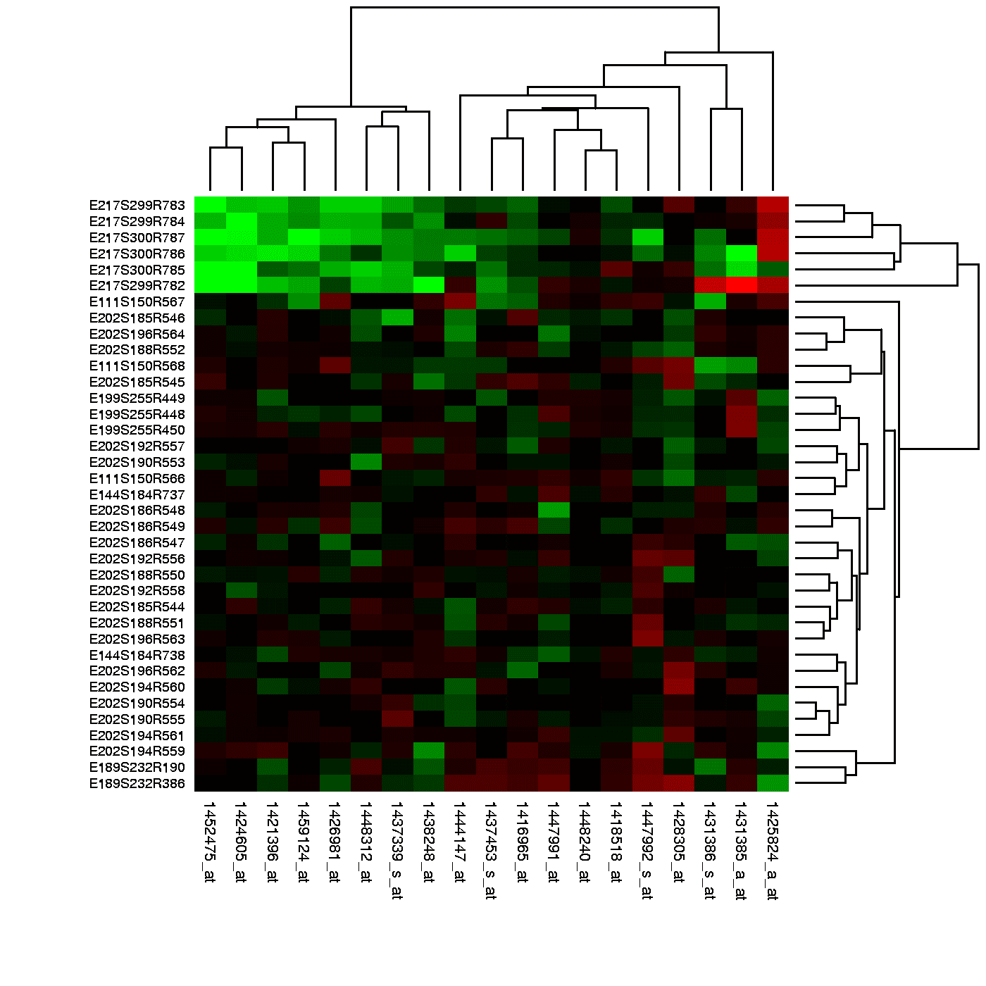
A heatmap is like coloring in a spreadsheet, using color to show the magnitude of values in a 2D grid. It's used to spot user engagement hotspots on a webpage, analyze financial data, or visualize gene expression.
WHY IT EXISTS: Raw tables of numbers are hard to interpret. The human eye struggles to scan a grid of figures and quickly identify high values, low values, clusters, or patterns. Heatmaps solve this by translating numerical magnitude into color, a visual cue we process almost instantly.
THE MENTAL MODEL: Think of a heatmap as coloring in a spreadsheet. Instead of reading each cell's number, you just look at its color. Hot colors (like red or yellow) might represent high values, and cool colors (like blue or green) low values. This instantly reveals the 'shape' of the data, showing hotspots, coldspots, and gradients at a glance.
HOW IT WORKS: A heatmap takes a two-dimensional matrix of data. It maps the range of values in that matrix (from minimum to maximum) to a predefined color gradient. Each cell in the grid is then colored according to its value's position within that range. The result is a mosaic where color directly corresponds to magnitude.
WHEN TO USE IT: Use heatmaps to visualize any 2D matrix where you need to spot patterns quickly. This is ideal for showing user interaction on a webpage (click maps), displaying correlation matrices in statistics, visualizing financial market performance across sectors, or showing gene expression data in bioinformatics.
WHEN NOT TO USE IT: Avoid heatmaps for data that isn't inherently 2D or grid-like, as forcing it into a matrix can be misleading. They are also poor for showing precise numerical values, as the eye is better at comparing color intensity than decoding it back to an exact number. If precision is key, a table is better.
ONE CANONICAL EXAMPLE: A website click map is a classic heatmap. The webpage layout forms the 2D grid. The number of clicks in each area is the value. The heatmap then colors the page to show where users click most (hotspots in red) and least (coldspots in blue), giving designers immediate feedback on user engagement and UI effectiveness.
Read the original → en.wikipedia.org
Get five bites like this every day.
Tezvyn delivers a daily feed of 60-second tech bites with quizzes to lock in what you learn.