Use Fitts's Law to size and place primary vs secondary mobile actions
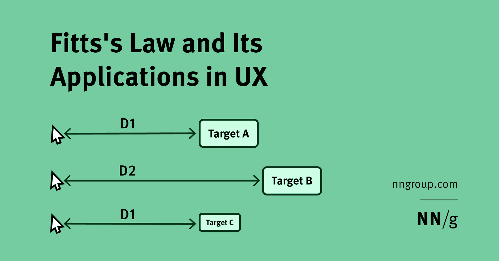
Fitts's size-distance tradeoff applied to mobile thumb zones.
Large primary actions in easy thumb zones; secondary actions farther but keep minimum targets.
Bigger buttons alone, ignoring distance or finger precision.
What's really being asked
This question evaluates whether you can move beyond memorizing Fitts's formula and instead use it as a design heuristic for constrained mobile environments. The interviewer wants to see that you understand movement time is a function of both target size and distance, that the relationship is logarithmic rather than linear, and that fingers are far less precise than mouse cursors. They are also checking if you can hierarchize actions, giving primary buttons preferential spatial treatment over secondary ones.
A GOOD ANSWER COVERS four things in order. First, state Fitts's Law concisely: the time to acquire a target increases with distance and decreases with target width, and because the equation is logarithmic, doubling the distance does not double the time. Second, apply this to mobile touch by noting that fingers require larger targets than cursors, so primary actions should be sized generously, typically 48 density-independent pixels or more, and placed within the natural thumb zone, usually the bottom third of the screen. Third, explain how secondary actions are treated differently: they can be smaller or positioned farther from the thumb's resting position, but they must still respect minimum touch targets to avoid errors. Fourth, mention that screen edges and corners are special cases because they provide infinite effective width in one dimension, making them fast to reach even if they are distant, which is why destructive or frequent actions are often anchored there.
COMMON WRONG ANSWERS include treating the size-distance relationship as linear, suggesting that simply making every button huge is sufficient without considering placement, or applying desktop mouse logic directly to touch. Another red flag is ignoring the two-component model of movement, where an initial fast coarse motion is followed by a slower precise adjustment; this explains why very small targets disproportionately slow users down.
LIKELY FOLLOW-UPS include asking how you would adapt these principles for left-handed users or one-handed versus two-handed holds, how accessibility settings like dynamic type change target sizing, or how you would justify a small secondary target to a product manager who wants every button equally prominent.
A concrete example
In a checkout flow, the primary Pay Now button should sit at the bottom center of the screen at 48dp height and full width, placing it inside the thumb zone and maximizing width. A secondary Change Payment Method link can sit above it at 44dp, farther from the thumb's resting position but still tappable. If a Cancel action is needed, it can be anchored to the top-left screen edge, leveraging the edge's infinite width for fast acquisition without risking accidental taps near the primary action.
Interview question
In a mobile checkout flow, why might a designer place a destructive Cancel button at the top-left screen edge rather than near the primary Pay Now button at the bottom center?
- a.Because edge placement provides infinite effective width in one dimension, enabling fast acquisition while separating it from the primary action to prevent accidental taps.Correct
- b.Because Fitts's Law states that movement time increases linearly with distance, so distant buttons are always slower regardless of their position.
- c.Because secondary actions must always be placed outside the thumb zone and sized below minimum touch targets to reduce visual prominence.
- d.Because fingers are more precise than cursors, allowing smaller targets at screen edges without increasing error rates.
Why? this is the answer
Screen edges provide infinite effective width in one dimension, making them fast to reach despite distance, and anchoring destructive actions there avoids accidental taps near primary buttons. Distractor A misrepresents Fitts's logarithmic relationship as linear, which is a common misconception.
Just read this? Test yourself on what you have been reading.
Read the original → nngroup.com
- #fitts-law
- #mobile-ux
- #interaction-design
- #thumb-zone
- #ui-hierarchy
You just looked this up. Could you explain it out loud?
That is the part interviews actually test. Tezvyn takes questions like this one and gives you what the interviewer is really checking, the answer that lands, and the mistake that ends the conversation, in the four minutes before your next meeting.
The iPhone app is on the way
We are building it. Until it lands, nothing here is held back from you: every interview card, your saved cards, streaks and the job board all work in Safari, plus hundreds of free practice quizzes of thirty questions each. Sign in and it all carries over to the app the day it arrives.
Want it as an icon? Tap Share at the bottom of Safari, then Add to Home Screen. It opens full screen and the cards you have read stay available offline.
We are hiring for this. Every open role lists the topics its interview covers, so you can prepare for the real thing rather than guessing.
See open roles