Wireframing: The Blueprint for Your UI
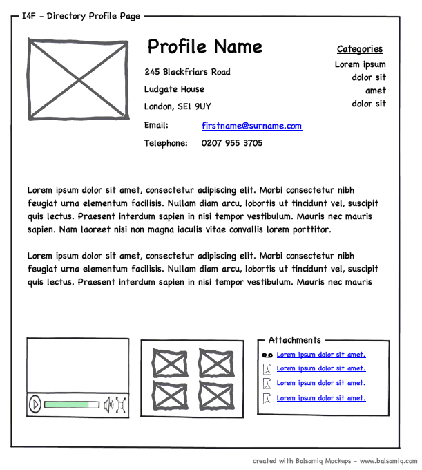
A wireframe is a UI blueprint that shows a screen's structure, not its visual design. Use it early to agree on layout and function before getting lost in colors and fonts. The footgun is adding too much detail, which distracts from its core purpose.
WHY IT EXISTS: Building a user interface involves solving two distinct problems: structure (what elements are on the page and how they relate) and visuals (colors, fonts, and branding). Wireframing exists to solve the structural problem first. It allows teams to agree on layout and functionality quickly and cheaply, before investing expensive time in visual design.
THE MENTAL MODEL: A wireframe is a blueprint for a digital screen. Just as an architect uses a blueprint to show where walls, doors, and windows go before deciding on paint colors, a designer uses a wireframe to map out the layout, content areas, and interactive elements of a UI. It's about the bones of the page, not the skin.
HOW IT WORKS: Wireframes are intentionally simple, using basic shapes to represent UI elements. A box with an 'X' through it stands for an image. Rectangles represent buttons. Lines of text might be shown as placeholder "lorem ipsum" or simple squiggles. The goal is to communicate the page's hierarchy and functionality without the distraction of visual design. This low-fidelity approach makes them fast to create and easy to change.
WHEN TO USE IT: Use wireframes in the earliest stages of the design process, right after initial ideation. They are perfect for internal reviews with product managers and engineers to align on functionality and for early user testing to validate core navigation and layout concepts. Their low cost allows for rapid iteration.
WHEN NOT TO USE IT: Do not use wireframes for final design presentations to stakeholders who might misinterpret the lack of polish as the final product. They are also the wrong tool for testing brand resonance or emotional impact, as they intentionally lack the visual elements that create aesthetic appeal. Once you need to discuss color, typography, or branding, you should move on to higher-fidelity mockups.
ONE CANONICAL EXAMPLE: For a new e-commerce product page, a wireframe would show a large box at the top left for the product image, a column to its right with placeholders for the product title, price, and an "Add to Cart" button. Below this, there would be sections marked out for "Product Description," "Customer Reviews," and "Related Items." It's all structure; no actual images, brand fonts, or colors are used.
Read the original → en.wikipedia.org
Get five bites like this every day.
Tezvyn delivers a daily feed of 60-second tech bites with quizzes to lock in what you learn.