
Design a type-safe polymorphic component that renders as different HTML elements
Tests TypeScript generics and prop forwarding in design systems. Answer: generic as constrained to keyof JSX.IntrinsicElements, merged with ComponentPropsWithoutRef<C>, omit clashes, forward ref with ElementRef.

What WAI-ARIA attributes and keyboard interactions make Tabs accessible?
This tests mastery of the W3C Tabs pattern. A strong answer covers role tablist tab tabpanel, aria-selected, aria-controls, and arrow-key roving focus with optional auto-activation. A red flag is treating tabs as buttons and relying only on the Tab key.

Two strategies to prevent style leakage in reusable components and their trade-offs
This tests style encapsulation in design systems. A strong answer contrasts Shadow DOM, which fully isolates CSS via a shadow root, with scoped naming like BEM or CSS Modules. Red flag: proposing global resets or !important as a solution.

When should data in a reusable component be a prop or state?
This tests controlled versus uncontrolled patterns. Great answers ask who owns the data: props when parent must drive or observe it, state only for private details.
How do you handle a one-off token exception for a campaign?
Tests balancing speed and systemic consistency. Strong answers outline a governance fast-track with sunset clauses, document the exception, and isolate it via campaign overrides instead of mutating core tokens. Red flag: permanently hardcoding the one-off.
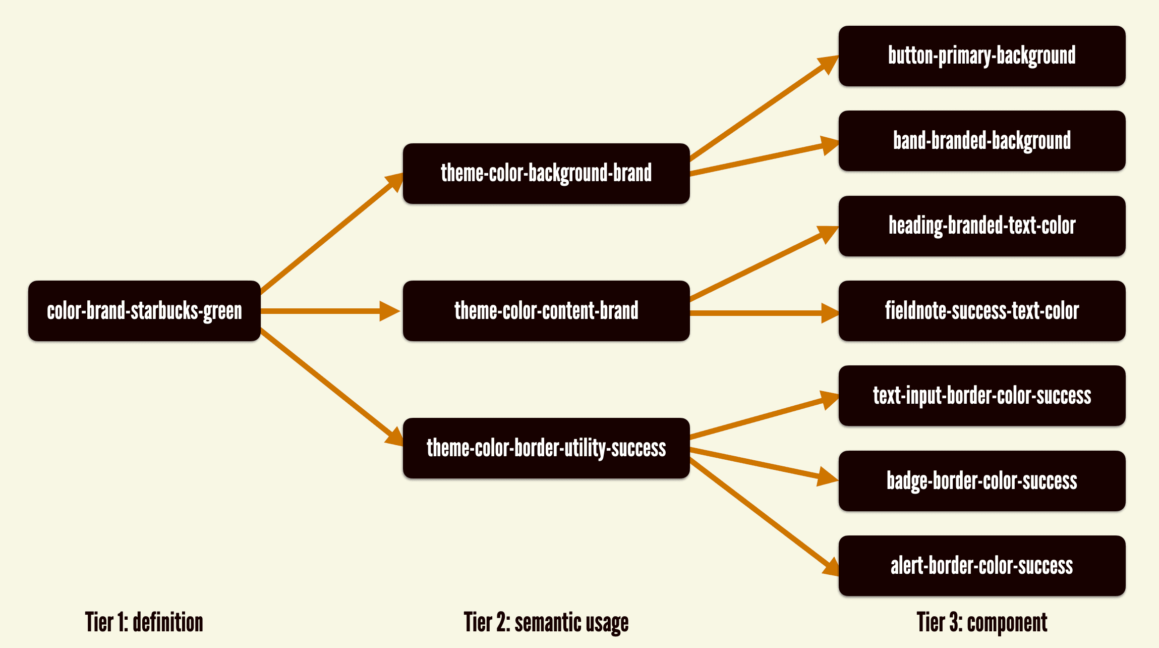
Describe a robust architecture for implementing theming using design tokens
WHAT IT TESTS: Tiered token separation and runtime strategy for multi-theme systems. ANSWER OUTLINE: Three tiers, CSS custom properties for live switching, and layered overrides. RED FLAG: Hardcoded colors in components or CSS rebuilds on theme change.
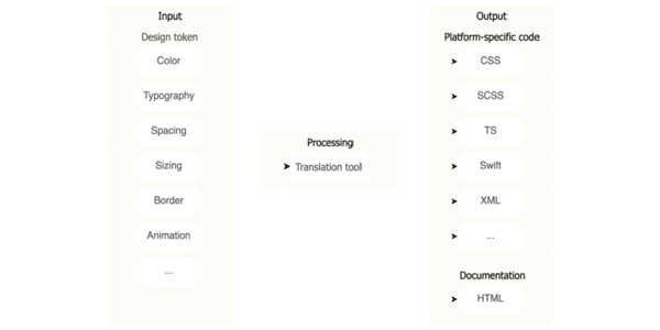
Design token pipeline serving Web, iOS, and Android
This tests cross-platform design system architecture and governance. A strong answer uses W3C JSON tokens in option, decision, component layers, with Style Dictionary generating Web, iOS, and Android outputs. Red flag: using Figma or CSS as source of truth.
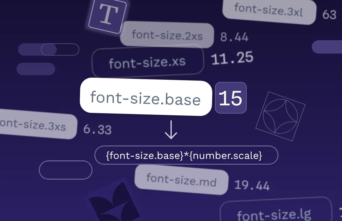
Implement a typographic scale using design tokens and accessible properties
Token-driven typography and accessibility. Start with base size (14-16px) and ratio token, compute sizes, then bundle font-size with line-height, letter-spacing, weight, and family in composite tokens. Red flag: ignoring line-height, spacing, or composites.
.avif&w=3840&q=75)
How does a mature design system change cross-functional collaboration?
Tests whether you view maturity as a collaborative operating framework, not just components. Strong answers hit shared definitions of done, living documentation, code/design parity, and trust-based adoption. Red flag: calling it a docs or enforcement problem.
How do you handle a product team requesting a custom Button?
This tests governance discipline. A strong answer asks context questions to separate misuse from a real gap, uses a decision tree for actions and CTAs, and extends the system with a documented variant. A red flag is instantly greenlighting a custom fork.
What metrics measure design system success and adoption?
Tests if you connect design system health to delivery speed and consistency. Strong answers hit adoption rate, component usage, design-to-code parity, and accessibility compliance tied to team behavior.
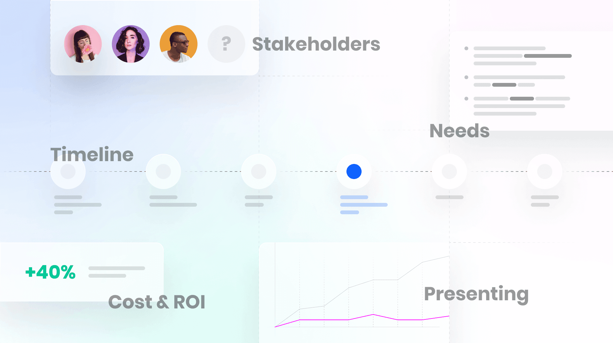
How would you build a design system business case for leadership?
WHAT IT TESTS: Reframing UI inconsistency as a business cost. ANSWER OUTLINE: Audit inefficiencies with metrics, map the pitch to stakeholder priorities like ROI and velocity, and contrast build cost with projected savings.

What are the main benefits of consuming a design system?
WHAT IT TESTS: whether you see a design system as more than a UI kit and tie tokens to velocity. ANSWER OUTLINE: cite tokens for theming, isolated components, live docs, and designer collaboration. RED FLAG: calling it just a CSS framework and ignoring tokens.
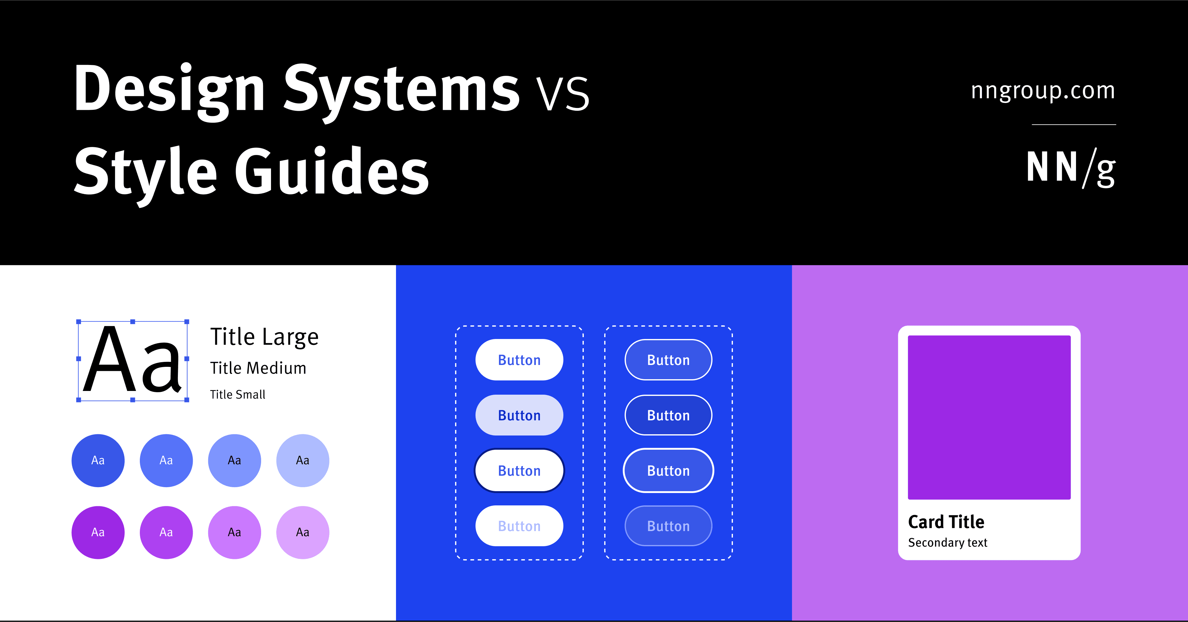
Component library vs style guide vs design system
WHAT IT TESTS: Knowledge of hierarchy in design artifacts. ANSWER: A design system is holistic parent for scale; a style guide is a narrow visual/content child; a component library is a coded child of reusable UI elements. RED FLAG: Do not conflate them.

Pitching Design Systems with Business Value
Design systems fail without people, not tools. Pitch them by asking stakeholders if they like saving time and money, then frame consistency, speed, and shared vocabulary as business value instead of design ideology.

Storybook: Design System Documentation
Storybook is a workshop for building UI components in isolation, then auto-publishing docs from those living examples. Teams use it to catalog design systems without maintaining a separate documentation site.

Design Token Transformation: One Source for All Platforms
A design token standard is a universal adapter for your style. It defines properties like color in a standard JSON format, which tools then transform into platform-specific code for iOS, Android, and web. The footgun is building bespoke transformation logic.

Reduce Time-to-Market with a Design System
A design system is a shared toolkit of pre-built UI components, not just a style guide. It lets teams build interfaces from a library of pre-coded parts, drastically cutting repetitive work. The footgun is treating it as a static document, not a living system.

A Design System Newsletter: Make Invisible Work Visible
A design system newsletter makes your team's invisible infrastructure work visible. Use it to announce component updates and share challenges, keeping stakeholders engaged.

Form Layout Best Practices
Guide users with a clear visual path, not a maze. A single-column layout with consistent spacing creates a streamlined data entry experience. Use it for everything from contact forms to complex UIs.