
Lead Time for Changes: From Commit to Production
Lead Time for Changes measures the time from a developer's commit to that code running in production. It's a core DORA metric for assessing DevOps velocity. The key footgun is confusing it with 'Lead Time,' which tracks from idea to delivery.

How Design Systems Lower Your UI Bug Rate
A design system is a factory for pre-tested UI parts. By using standardized components instead of hand-crafting them each time, you reduce one-off bugs. This is a key metric for proving a design system's ROI, but teams often fail to track it.

Component Coverage: The 80/20 Rule for Design Systems
Component coverage applies the 80/20 rule to your UI, measuring what's built from a design system versus custom code. It helps track adoption and justify freeing up dev time for unique features.

Design System Triage: Treating Your DS Like a Product
Treat your design system like a product, not a static library. It requires a triage process to handle bugs and feature requests from its users—your designers and developers. This applies when a component breaks or needs a new feature.

Who Can Change the Button? Design System Contribution Models
A contribution model defines who can change the design system, balancing consistency with evolution. It dictates whether you can fix a typo or must lobby for a new component.
Design System Intake Process: The Gatekeeper for Quality
A design system intake process is the formal "front door" for new components, defining how they get proposed, built, and approved. It's crucial for coordinating contributions across teams.
The Design System PM: Treating Internal Tools as Products
A Design System Product Manager treats the system as a product, not a project. They define the roadmap and prioritize components for their internal engineering and design "customers."

Accessibility Linters: Automate Compliance in Your Design System
An accessibility linter is like a spellchecker for WCAG compliance, automatically flagging component errors like bad contrast or missing labels. It runs in CI/CD to catch bugs early, preventing them from propagating. The footgun: it can't catch everything.

Image Alt Text: What Screen Readers Say About Pictures
Alt text tells screen readers what to say when an image can't be seen. For a photo, describe the scene. For a button, describe its action ("Submit form"). For pure decoration, use an empty alt="" to tell screen readers to skip it.
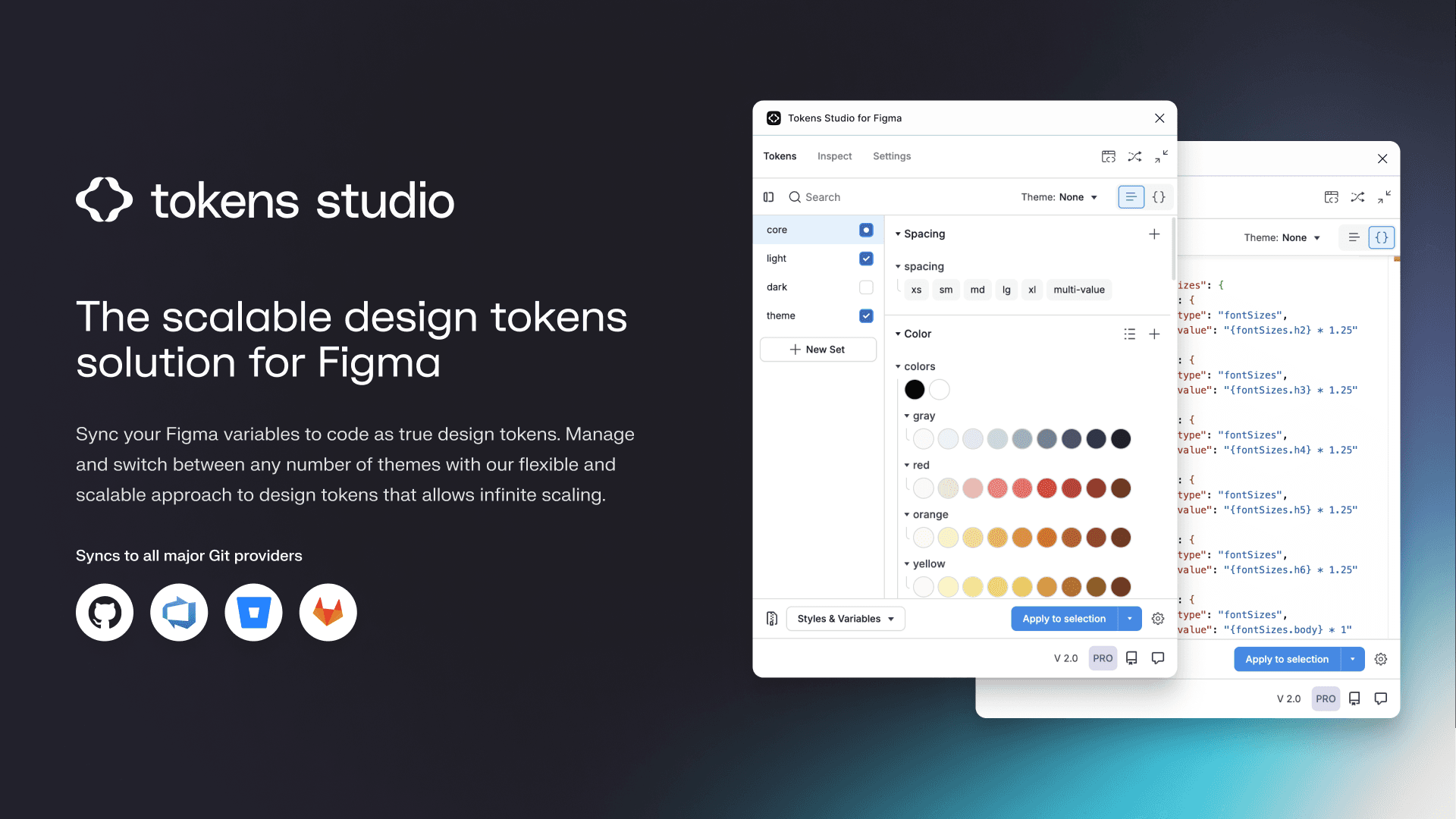
Token Studio: Bridge Figma Designs to Production Code
Token Studio is a control panel for your design system's raw values, bridging Figma with production code. Use it to manage themes and sync design decisions to a developer-accessible Git repo. The main footgun is using it only locally for Figma styles.

Chromatic: Visual Regression Testing for Components
Chromatic is a smoke detector for your UI's appearance, taking snapshots of every component on every commit to catch unintended visual changes. It's used in CI/CD to prevent visual regressions when refactoring. The footgun is relying on it for business logic.

Unit Testing UI Components: Beyond the DOM Mock
Unit tests for UI components verify individual pieces in a mocked browser environment (jsdom). This is standard for checking component logic with Jest or Vitest, but it can't test visual rendering, element sizes, or layout, creating critical blind spots.

Monorepos: A Design System's Single Source of Truth
A monorepo places your design system and its consuming apps in one repo. This enables atomic changes: update a component and all its consumers in a single commit. It's ideal for keeping UI consistent, but requires strict tooling to avoid becoming a monolith.

Storybook: A Workshop for Isolated UI Components
Storybook is a workshop for building UI components in isolation, separate from your app's business logic. It's ideal for developing edge cases and documenting a design system.
Automated Prop Docs with Storybook Autodocs
Treat your component stories as the single source of truth for documentation. Storybook's `autodocs` reads your code to generate interactive docs automatically. It's used in design systems to prevent stale docs. The footgun: sparse types yield sparse docs.

Writing Accessibility Docs for Your Components
Accessibility docs are the user manual for your component's a11y features. They guide consumers on correct usage, like required ARIA attributes or keyboard behavior.

Design System Changelogs: For Humans, Not Machines
A design system changelog translates code changes into human-readable impact. It's a curated notice for consumers—not a raw git log. It's essential for communicating new components, token updates, and breaking changes so teams can adopt updates safely.
Design System Onboarding: The Welcome Mat
Design system onboarding is a welcome mat, not a full manual. It orients new users by explaining the system's purpose and scope, then routes designers to interactive guides and engineers to implementation docs. The footgun is information overload.
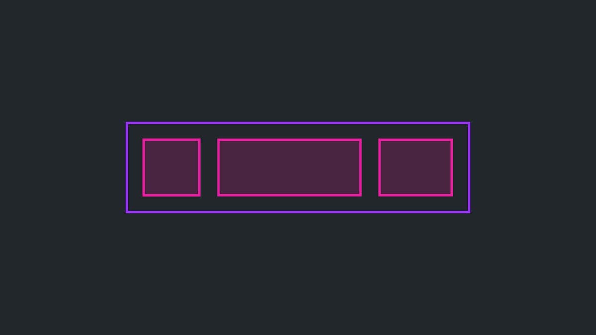
The Slot Pattern: Making UI Components Composable
The Slot Pattern makes components flexible by defining areas for custom content, like a picture frame for your UI. It's used in Cards or Modals to allow varied content in a consistent frame. The footgun is that too much flexibility can break consistency.

Wizard/Stepper Pattern: Guide Users Through Complex Tasks
A wizard or stepper pattern is like a recipe for a complex task, breaking a long process into numbered, manageable steps. It's ideal for multi-stage forms like onboarding or checkout flows.