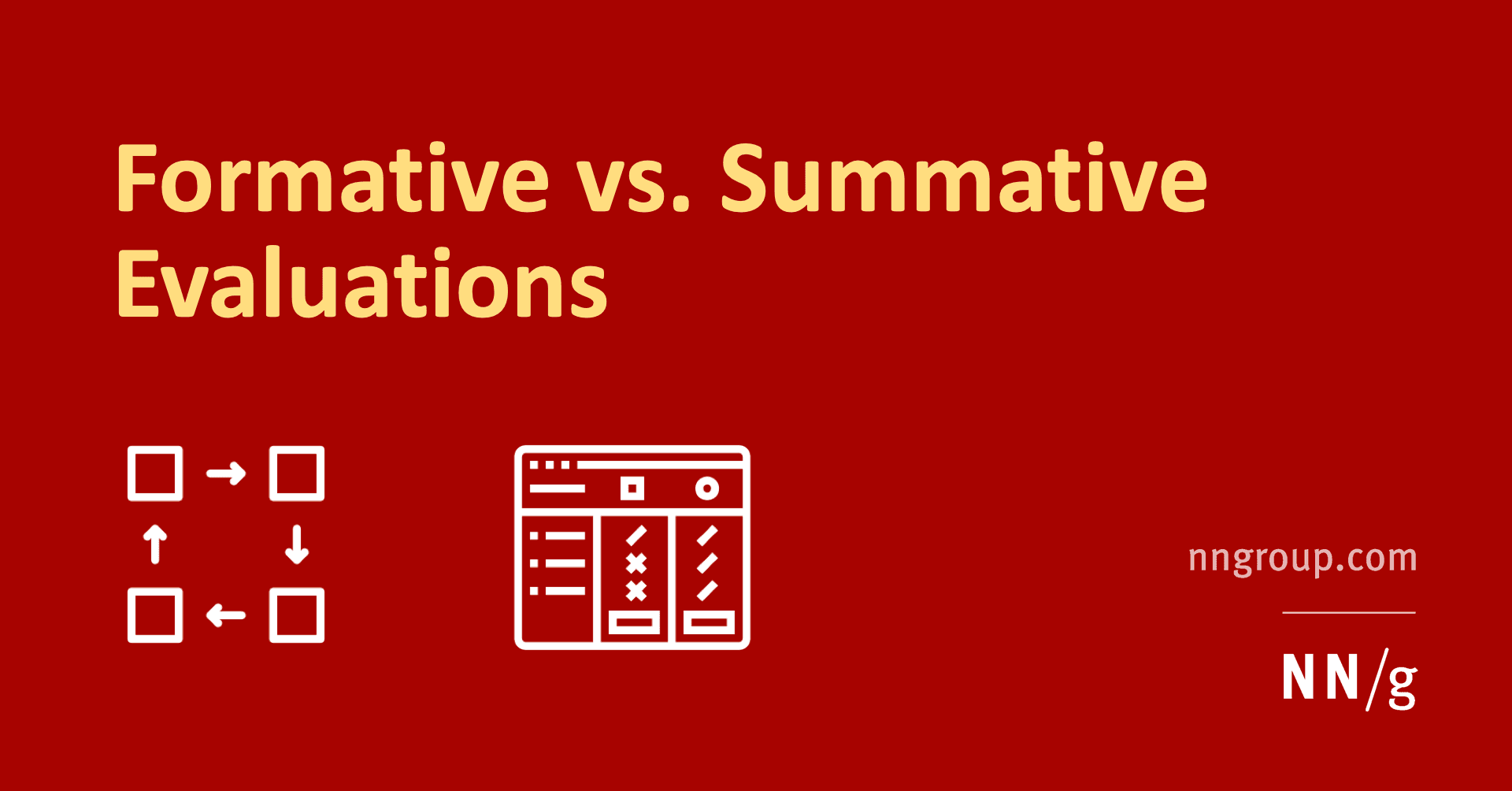
Formative vs. Summative Evaluation: Improve vs. Judge
Formative evaluation improves a design in progress; summative evaluation judges a finished one. Use formative tests to find and fix flaws iteratively. Use summative tests to measure a shipped product against a benchmark, like a prior version or a competitor.

Jobs to Be Done: Sell the Hole, Not the Drill
The Jobs to Be Done framework says customers 'hire' products to get a job done. Instead of selling a drill, sell the quarter-inch hole. This reframes innovation around stable customer needs, not temporary product features.
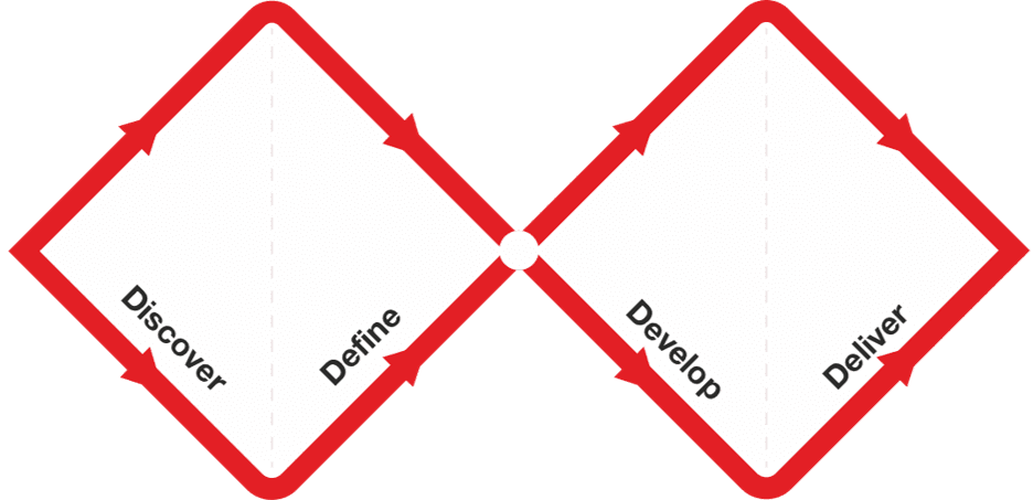
Double Diamond: Explore, Then Focus, Twice
The Double Diamond model prevents building the wrong thing by forcing two cycles of 'go wide, then narrow down.' First, explore the problem space, then define a specific problem. Second, explore solutions, then deliver a tested one.

User Flow Diagrams: Mapping the Path to 'Done'
A user flow diagram maps the exact steps a user takes in your app to complete one task. It aligns teams on product goals and gives developers a visual guide, preventing confusion and rework. The footgun: it's not a customer journey, which is far broader.

Real-time Collaboration: Figma's 'Multiplayer' Model
Real-time collaboration uses a central server as the single source of truth for a file. Instead of passing copies, users connect to the same live document, enabling simultaneous editing in tools like Figma.

Figma Comments: Annotate Designs for Better Handoff
Figma comments are the inline documentation for your designs, bridging the gap between a static screen and its intended behavior. Use them to clarify interactions and edge cases directly on the canvas. The footgun is assuming the design speaks for itself.
Design System Docs: The Product, Not the Afterthought
Treat your design system documentation as a product, not a cleanup task. It's the instruction manual that prevents your component library from being misused. It's essential for scaling a design system to ensure consistency and speed up onboarding.

Drive Design System Adoption, Don't Just Build It
Treat your design system like an internal product, not a one-off project. To drive adoption, show quick, measurable wins and offer tiered onboarding for different roles.
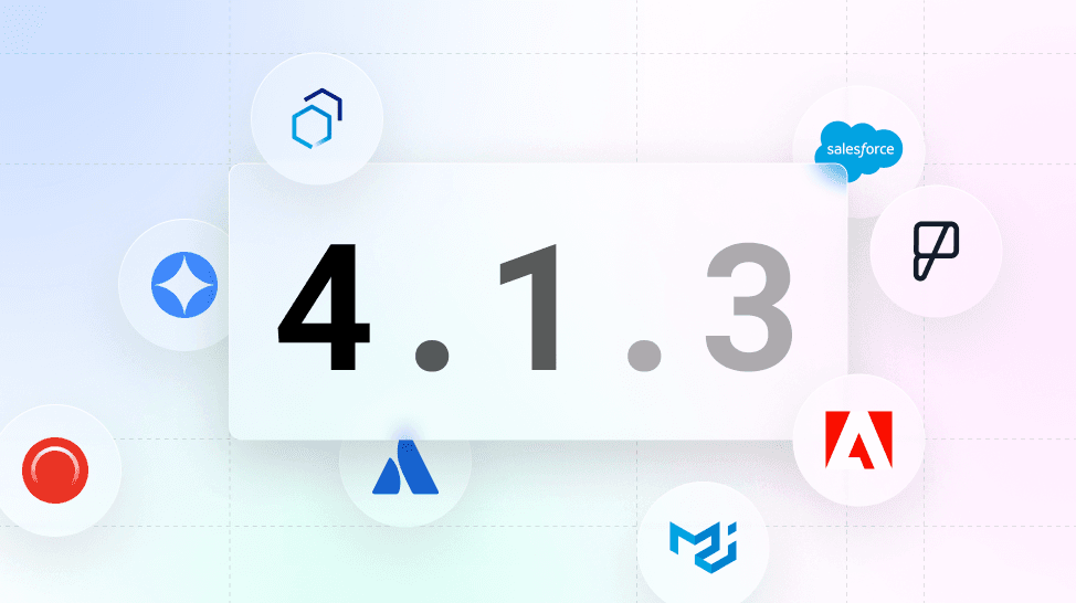
Versioning a Design System with Semantic Versioning
Use Semantic Versioning (MAJOR.MINOR.PATCH) to signal the impact of design system changes. This tells teams if an update is a breaking change (MAJOR), a new feature (MINOR), or a bug fix (PATCH).

Design System Governance: Preventing UI Drift
Design system governance is the constitution for your UI, defining how components evolve, not just what they are. It prevents the slow drift where production code diverges from the Figma library as teams make local exceptions.
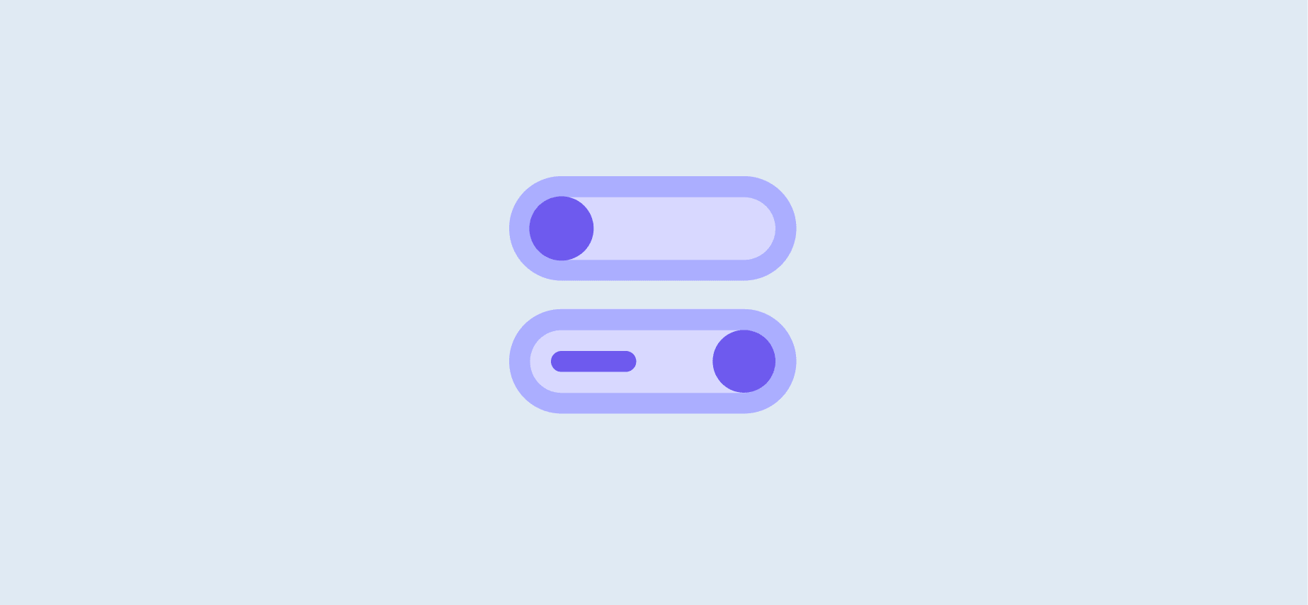
Base Component Pattern: Your Design System's Template
Think of a base component as a master template for UI elements. Changes to the master instantly update every copy, ensuring consistency. Use it for repeated elements like buttons or icons that need slight variations.

The 8-Point Grid: A Shared Language for UI Spacing
The 8-point grid system stops spacing debates by making every dimension and gap a multiple of 8px. It's used in design systems like Google's to create consistent layouts that render cleanly across devices. The biggest mistake is breaking the rule for "feel."

Mental Models: Design for What Users Believe
A mental model is the user's internal story of how your UI works, based on past experiences, not your design spec. This is why users expect your site to work like others they've used. The footgun is assuming users share your expert model; they don't.

The Design Critique: Improving Work with Focused Feedback
A design critique is a structured conversation to measure a design against its goals, not a session for subjective opinions. It helps get early feedback on feasibility or catch inconsistencies.

Usability Testing: Watch Real Users, Not Just Experts
Usability testing evaluates a product by observing real, first-time users interact with it, revealing flaws that designers often miss. It's used to validate design intuitiveness before launch.
Automated Design Linting: Your Design System's Spellchecker
Design linting is like a spellchecker for your UI, automatically flagging inconsistencies against your design system. It catches missing styles or wrong colors before handoff, ensuring consistency. The footgun: a 'clean' file isn't necessarily a good design.

Designing for Reduced Motion
Treat UI animations as an enhancement some users must disable for comfort. The `prefers-reduced-motion` media query lets you respect system-level accessibility settings, preventing vestibular triggers.

Screen Readers: Designing for a Non-Visual UI
A screen reader navigates your UI's invisible DOM structure, not its visual layout. Think of it as a text adventure where headings are rooms and links are doors. This is essential for all web UIs, checked via alt text and keyboard focus.

Accessible Form Design: A Conversation, Not an Interrogation
Think of a form not as a data bucket, but a structured conversation. Every field is a question needing a clear prompt. This is vital for logins and checkouts, especially for users with screen readers. The footgun: using placeholder text as a label.
Semantic HTML: Use the Right Element for the Job
Think of HTML tags as pre-built components, not just style containers. Using `<button>` instead of a styled `<div>` gives you keyboard navigation and screen reader support for free. The biggest mistake is using generic `<div>`s for interactive elements.