
The Narrative Arc for Data Storytelling
A narrative arc gives data a story by building tension toward a key insight. It guides stakeholders from a problem (plot) to a turning point (climax) and a resolution. The footgun is oversimplifying; compelling stories have multiple smaller tension peaks.

Anscombe's Quartet: When Numbers Lie
Anscombe's Quartet shows how four datasets can share identical summary stats (mean, variance) but look completely different when plotted. It's a classic reminder to always visualize your data before trusting numerical summaries.

Ad Hoc Reporting: Answering One-Off Business Questions
Ad hoc reporting is your data "quick dive" for one-off questions, unlike static dashboards. A sales team might use it to see how a holiday affected regional sales.
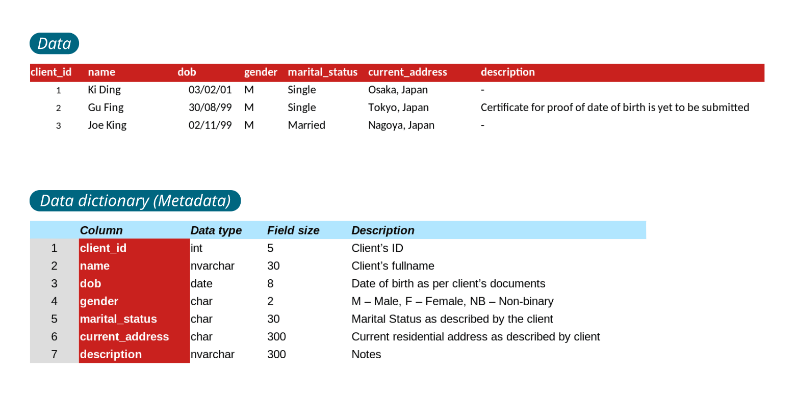
Data Dictionary: The 'About' Page for Your Data
A data dictionary is the instruction manual for your database, defining what each piece of data means and how it's formatted. It's used by engineers to understand a schema or by analytics tools to interpret columns. The biggest footgun is letting it go stale.
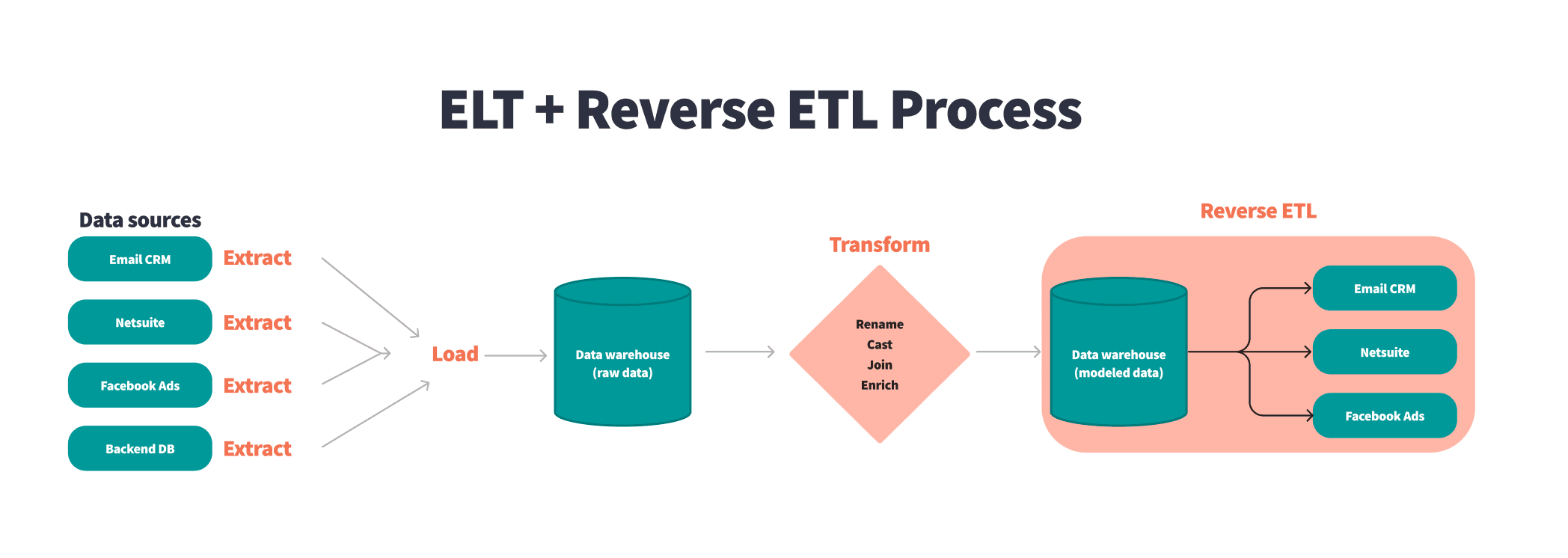
Reverse ETL: From Warehouse Insights to Operational Action
Reverse ETL pushes clean data from your central warehouse back into the operational tools business teams use daily. This powers sales with customer scores in their CRM or marketing with personalized segments, all from a single source of truth.
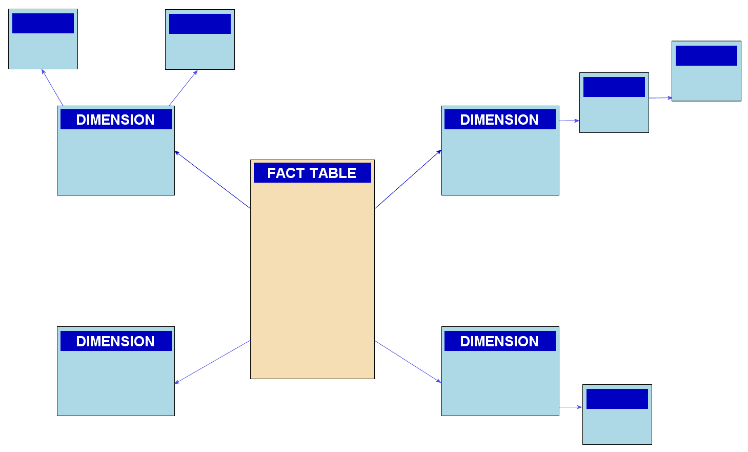
Snowflake Schema: Trading Query Speed for Storage
A snowflake schema saves storage by normalizing a star schema's dimensions into smaller, related tables. It's used in data warehouses to reduce redundancy, but the extra joins required can slow down queries, making it a trade-off against a simpler star schema.
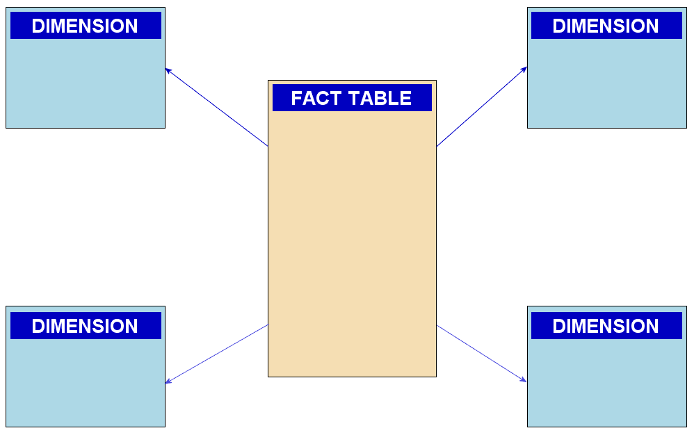
Star Schema: The Blueprint for Analytics Data
A star schema organizes analytics data with a central fact table (e.g., sales) surrounded by dimension tables (e.g., customers). It's built for fast queries in data warehouses. The footgun is normalizing dimensions, which negates its speed advantage.

Data Marts: Your Department's Slice of the Data Warehouse
Think of a data mart as a department's personal slice of the main data warehouse, containing only relevant data. This allows teams like Sales or Marketing to run faster, focused queries. The footgun is letting each team define shared terms differently.
Data Warehouse: The Single Source of Truth for Analytics
A data warehouse is a central database optimized for analytics, not transactions. It integrates historical data from disparate sources like sales and marketing to create a single source of truth for business intelligence.
Customer Data Platform (CDP): Your Customer's Single Source of Truth
A Customer Data Platform (CDP) creates a single, persistent profile for each customer by unifying data from siloed sources. It's used for real-time personalization and AI-driven marketing. The footgun is confusing it with a CRM, which manages relationships.

Client-Side vs. Server-Side Tracking
The difference is who sends your data: the user's browser (client-side) or your server (server-side). Client-side is simple but fragile against ad blockers. Server-side offers more control but adds cost. The footgun is thinking server-side is a magic fix.

User ID: The Key to Cross-Device Analytics
A User ID stitches together a person's journey across devices and sessions, moving beyond anonymous tracking. It's key for apps with logins to see the full customer lifecycle. The footgun: never use the User ID for a custom dimension; it will break reporting.

The Data Layer: Your Web Page's Central Message Bus
The data layer is a central message bus for your website, decoupling your app from analytics tags. It passes dynamic data like purchase totals or button clicks to tools like Google Tag Manager, which listens for these events to fire tags.
Event Tracking: Measuring What Users Do
Event tracking turns user actions like clicks and purchases into analyzable data. Analytics platforms use this data to report on engagement and conversions. The biggest footgun is inconsistent naming, which pollutes your data and breaks reports.
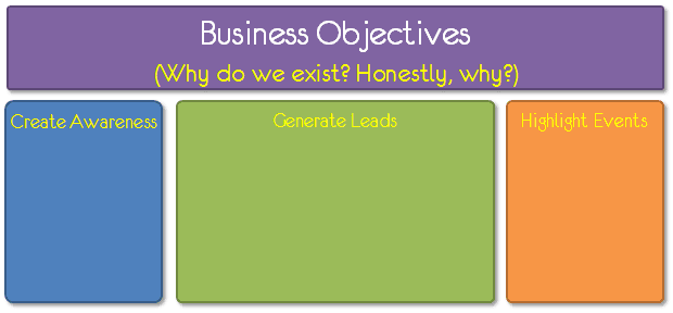
Analytics Measurement Plan: From Why to What
An analytics measurement plan forces you to define success before you look at data. It connects high-level business objectives to specific user actions and sets clear targets.
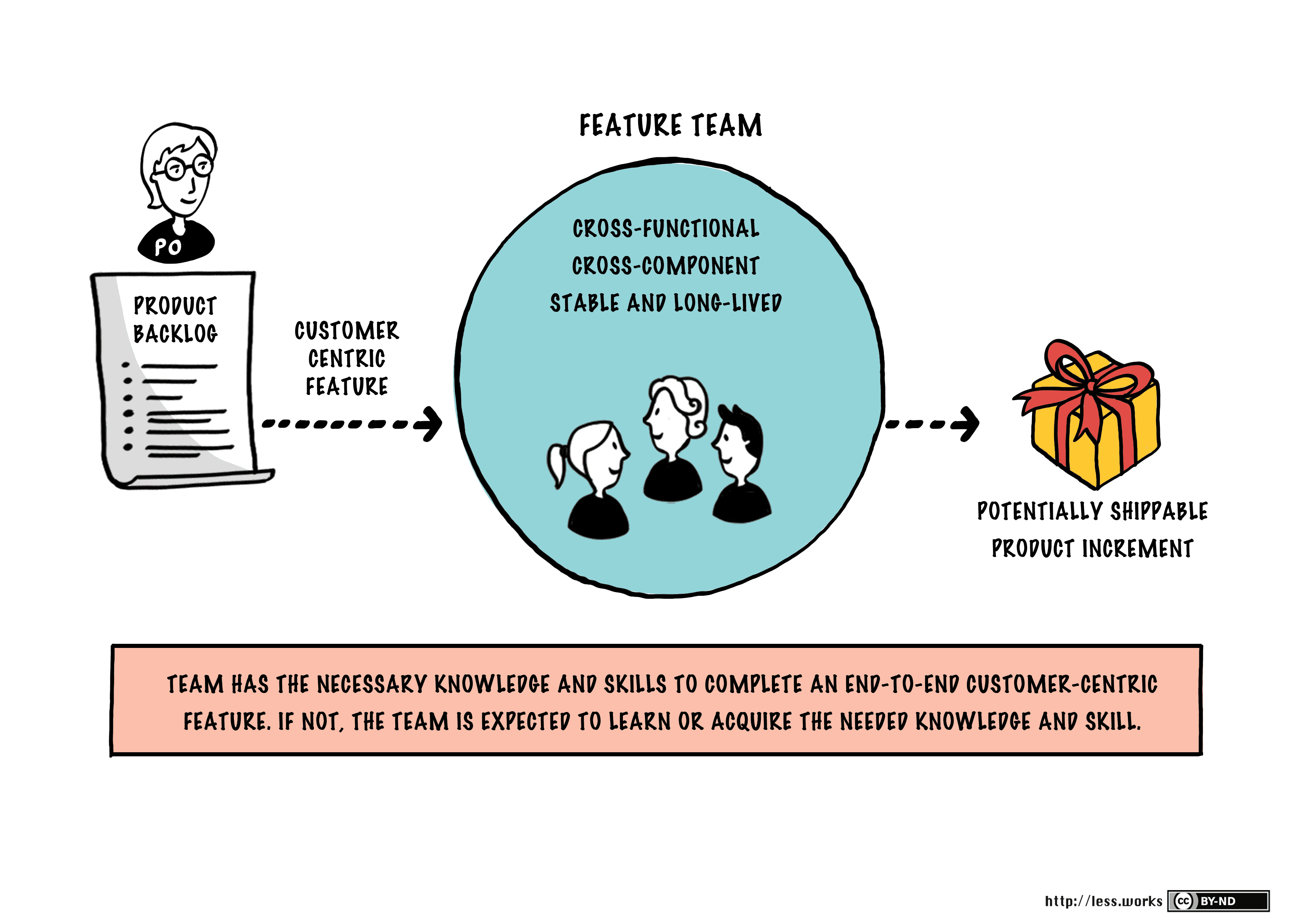
Feature Teams: Ship Value, Not Layers
A feature team owns a customer-facing feature from start to finish, unlike component teams that own a single tech layer. This reduces handoffs and speeds up delivery.

Work Item Age: Don't Let Your Tasks Spoil
Think of work item age as the time elapsed since a task started, like food in a fridge with an expiration date. Kanban teams use it to spot delays and bottlenecks. The biggest mistake is tracking age without acting on aging items to unblock them.
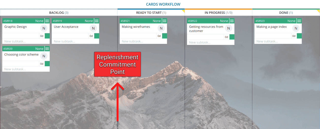
Kanban Replenishment: Pulling Work, Not Pushing It
Instead of a manager pushing tasks, a replenishment meeting is where the team pulls work into their active backlog. This cadence refills the 'Ready to Start' column, ensuring a steady flow of well-understood tasks.

Kaizen: The Art of Continuous Improvement
Kaizen means "continuous improvement," making small, frequent changes instead of big, risky ones. In Scrum, this is the heart of the Sprint Retrospective, where teams inspect their process and define concrete actions for the next sprint.
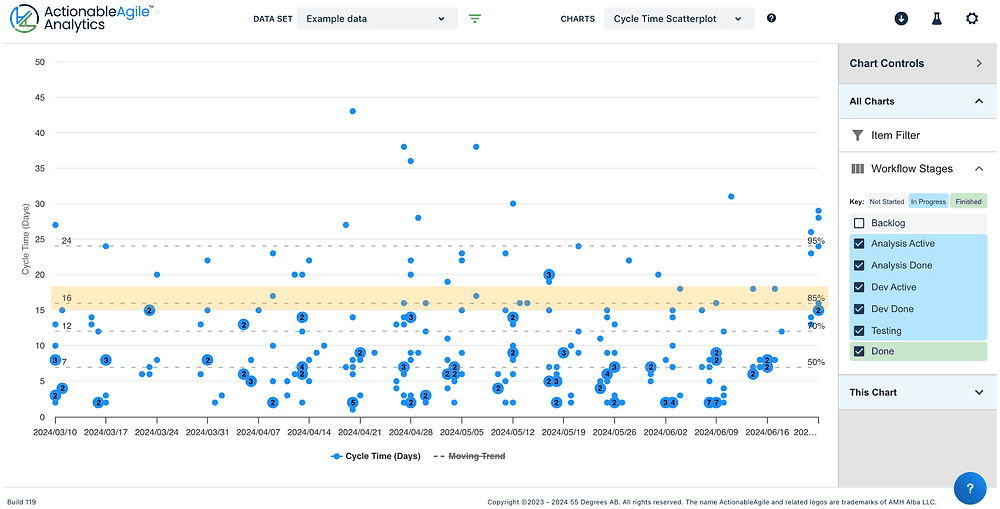
Cycle Time Scatterplot: Visualize Your Team's Predictability
A Cycle Time Scatterplot visualizes delivery speed by plotting how long each task took against its completion date. Agile teams use it to spot predictability trends and set realistic delivery forecasts.