Affinity Diagramming: Finding Structure in Chaos
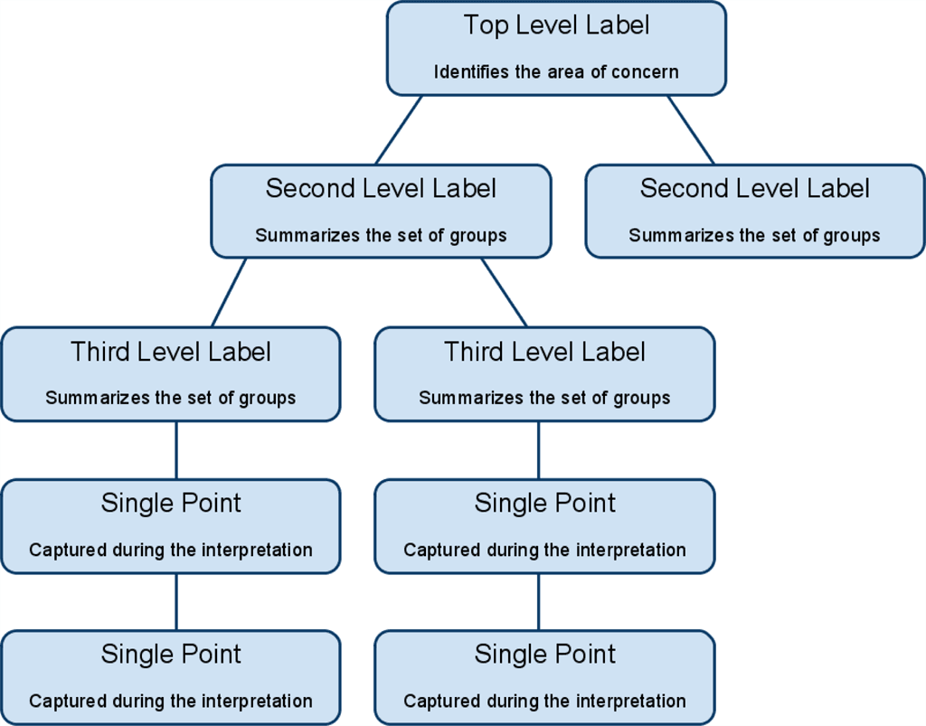
Affinity diagramming turns a pile of raw ideas into organized themes by grouping them based on natural relationships. Use it after brainstorming to find patterns. The biggest mistake is debating ideas instead of focusing on the connections between them.
WHY IT EXISTS: To make sense of a large volume of unstructured, qualitative information. When you have dozens or hundreds of ideas from a brainstorm or user interviews, it's impossible to see the big picture. This method provides a structured way to find the signal in the noise by grouping data based on natural relationships.
THE MENTAL MODEL: Think of it as creating a "bottom-up" table of contents for your team's thoughts. Instead of starting with predefined chapters (categories), you write down all the individual sentences (ideas) on separate notes, then group similar sentences together to form paragraphs (clusters), and finally give each paragraph a title (the theme). The structure emerges from the content itself.
HOW IT WORKS: The process, devised by Jiro Kawakita and called the KJ Method, involves a few key steps. First, every idea or data point is written on a separate card. Second, the team silently begins to group related notes together on a large wall. The silence is key; it prevents debates and encourages focus on the "natural relationships" between ideas. Third, once clusters form, the team discusses them. Finally, the team creates a summary card for each group that captures its essential theme.
WHEN TO USE IT: Use this tool after any activity that generates a large number of unorganized ideas. It's perfect for synthesizing notes from user research, debriefing after a brainstorming session, or analyzing open-ended survey responses. It helps a group build a shared understanding of what the raw data actually means.
WHEN NOT TO USE IT: Affinity diagramming is not the right tool for quantitative data analysis or for problems with a clear, pre-existing structure. If you're trying to decide between a few well-defined options or already know the categories you need to sort information into, this bottom-up approach is unnecessary overhead.
ONE CANONICAL EXAMPLE: A team brainstorms ways to improve an app. They generate 50 ideas on sticky notes, like "faster login," "add Face ID," "better search," and "filter search results." During silent grouping, "faster login" and "add Face ID" are placed together. "Better search" and "filter search results" form another group. The team then names these clusters "Login & Authentication" and "Search & Discovery." They've turned 50 chaotic ideas into a few actionable themes.
Read the original → en.wikipedia.org
Get five bites like this every day.
Tezvyn delivers a daily feed of 60-second tech bites with quizzes to lock in what you learn.