Eye Tracking: See What Your Users Actually See
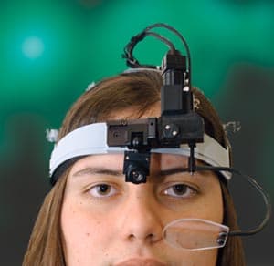
Eye tracking reveals what users actually look at, not just what they say they do. It's used in UX to generate heatmaps showing which UI elements draw the eye. The footgun: a long gaze can mean interest, but it can also mean confusion.
WHY IT EXISTS: Traditional usability testing relies on users telling you what they did. But memory is fallible and people rationalize their actions. Eye tracking was adopted by UX to get objective, quantitative data on visual behavior, closing the gap between what users say they do and what they actually do.
THE MENTAL MODEL: Think of eye tracking not as a mind-reader, but as a spotlight-tracker. It shows you where the user chose to shine the 'spotlight' of their visual attention, second by second. You get a map of their visual journey, but you still have to infer the 'why' behind their path.
HOW IT WORKS: A device, typically a camera, uses video to measure eye positions and movement. It tracks the pupil and corneal reflection to calculate the precise point of gaze on a screen. This data is recorded as a series of coordinates over time, which software then visualizes. While other methods exist, this video-based approach is most common in product design.
WHEN TO USE IT: Use eye tracking to validate visual hierarchy, test the noticeability of critical UI elements like warnings or buttons, and compare different layouts for scanning efficiency. It is most powerful when combined with qualitative methods to understand the reason behind the gaze patterns.
WHEN NOT TO USE IT: Don't use it as your only research method; it tells you what users see, not why they see it or what they think. The setup and analysis can be complex, making it overkill for early-stage design exploration where cheaper methods are more effective. It's a tool for optimization, not initial discovery.
ONE CANONICAL EXAMPLE: An e-commerce team wants to test a new product page. An eye-tracking study generates a heatmap that shows almost no visual attention on the 'add to cart' button. The design has a poor visual hierarchy, and users are not seeing the primary call to action. The team now has definitive evidence to justify a redesign.
Read the original → en.wikipedia.org
Get five bites like this every day.
Tezvyn delivers a daily feed of 60-second tech bites with quizzes to lock in what you learn.