Sankey Diagram: Visualizing Proportional Flow
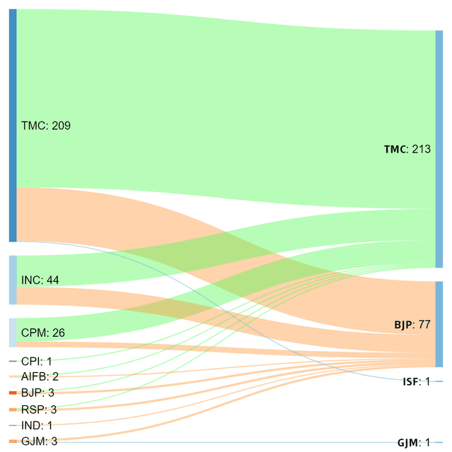
A Sankey diagram visualizes flow, where the width of each path is proportional to the quantity moving through it. Use it to trace user journeys or track budget allocation.
THE MENTAL MODEL: A Sankey diagram is a flow diagram where the width of the paths is directly proportional to the quantity of flow. It's like a river system for data, showing not just that water flows from a source to a delta, but exactly how much water is in each tributary along the way. It visualizes the magnitude of movement between states.
HOW IT WORKS: The diagram consists of nodes (representing states or categories) and links (representing the flow between them). The defining feature is that the width of each link is scaled to a specific numeric value. For example, if twice as many users flow from the homepage to the pricing page as to the contact page, the link to the pricing page will be twice as wide. This makes it easy to spot the most significant pathways and drop-offs in a complex system.
WHEN TO USE IT: Sankey diagrams are ideal for visualizing the distribution and flow of any conserved resource. Three common use cases are: first, analyzing user journeys on a website to see where they drop off; second, tracking budget allocations from revenue sources to department expenses; and third, showing energy transfers from primary sources through conversion processes to final consumption, highlighting losses at each stage.
WHEN NOT TO USE IT: Avoid Sankeys when you have too many nodes or criss-crossing flows, as the chart becomes an unreadable 'hairball'. They are also poor for showing precise numerical values; a table is better for that. If the relationships between nodes do not represent a flow of a conserved quantity, a standard network graph is a more appropriate choice.
ONE CANONICAL EXAMPLE: The most famous precursor is Charles Minard's 1869 map of Napoleon's Russian campaign. It uses a thick band to represent the size of the French army, and this band dramatically thins as the army marches toward Moscow and retreats. The visual impact of the shrinking band powerfully communicates the devastating human cost of the campaign, a story that raw numbers alone would fail to convey with such immediacy.
Read the original → en.wikipedia.org
Get five bites like this every day.
Tezvyn delivers a daily feed of 60-second tech bites with quizzes to lock in what you learn.