Mean vs. Median for API Response Times?
Tests if you know latency data has outliers. A good answer chooses median because it's robust to extremes. Explain that mean gets skewed by a few slow requests (e.g., GC pauses), hiding the typical user experience.

How would you architect a fast, multi-dimensional analytics dashboard?
This tests your grasp of analytics architectures and trade-offs between pre-computation and real-time querying. A great answer clarifies needs, then proposes a hybrid model using an OLAP cube for core metrics and a columnar store for ad-hoc queries.

Generate a monthly cohort retention table from user events
This tests your ability to translate a business metric into a multi-step SQL query. A great answer defines cohorts by first activity, maps subsequent activity to period indices, counts distinct users, and pivots the result.

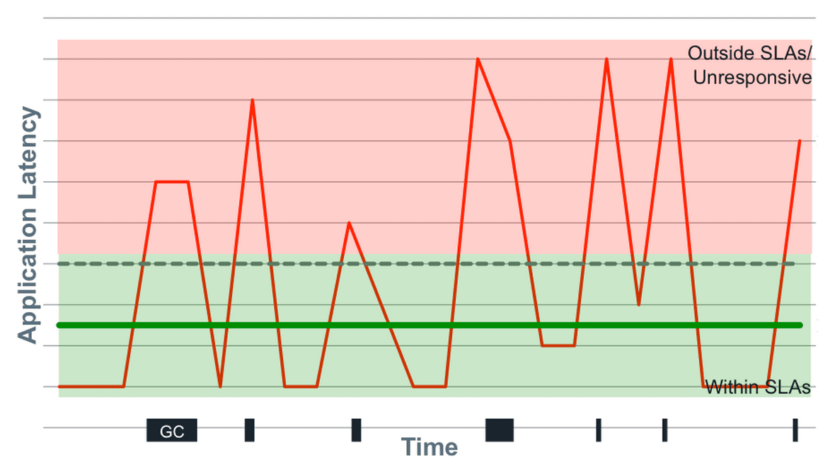
Average latency is up, but p99 is flat. Why?
This tests your grasp of latency distributions. Hypothesize that a large group of typical requests slowed, pulling up the average but not crossing the p99 threshold. Segment by endpoint or customer to find the cohort.
DAU dropped 10%. What user segments do you investigate first?
Tests your systematic problem-solving. First, clarify the metric and timeline. Then, segment by platform, geography, and user tenure (new vs. returning). A red flag is jumping to external causes before ruling out internal issues like a bad deployment.
How do you visually represent statistical uncertainty in a chart?
This tests your ability to communicate statistical nuance beyond simple averages. A great answer discusses error bars (specifying CI vs. SD), then moves to richer visualizations like graded error bars or violin plots.

How would you design a product management dashboard?
Tests your ability to structure data into a decision-making narrative. A good answer moves from a high-level summary (DAU) to trends (retention) and then actionable details (feature adoption). A red flag is simply listing charts without a narrative connection.

When is a pie chart an appropriate choice for visualization?
Tests data viz principles for part-to-whole data. A good answer defines this use case, gives a clear example (market share), and lists pitfalls like too many slices or similar values. A red flag is defending them for complex data or time-series analysis.

How do you manage an event schema change?
This tests your understanding of data contracts and backward compatibility. A great answer details a phased, backward-compatible rollout (add nullable field), starting with consumers (warehouse) then producers, and mentions using a schema registry for…
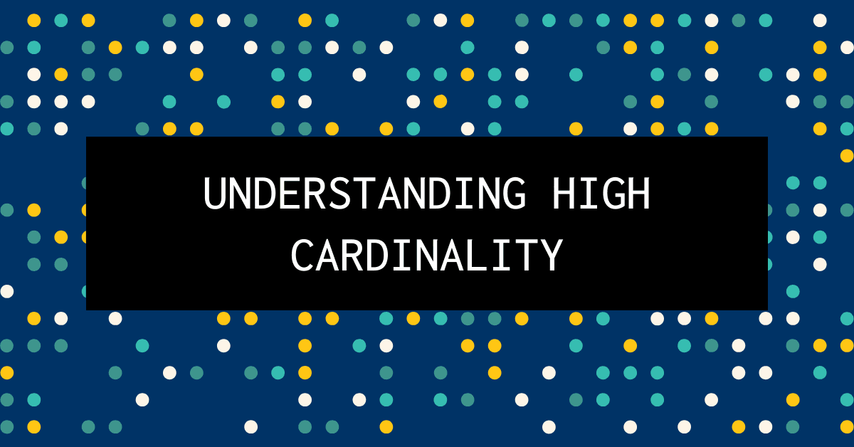
Challenges of Grouping by a High-Cardinality Dimension
This tests your grasp of how data shape impacts system resources. A great answer explains that high cardinality explodes memory usage for aggregation state, increases CPU load, and hurts storage compression.
Trade-offs: Pre-aggregation vs. querying raw event data
This tests your grasp of data engineering trade-offs for analytics dashboards. A great answer contrasts pre-aggregation (fast, cheap, stale) with on-the-fly queries (slow, costly, fresh) and mentions hybrid solutions.

How do you ensure accurate counts with duplicate analytics events?
Tests your grasp of data integrity under at-least-once delivery. Explain why COUNT(*) is inflated, then propose deduplication using a unique event ID. Mention trade-offs of stateful processing. A red flag is ignoring the cost or the need for a unique ID.
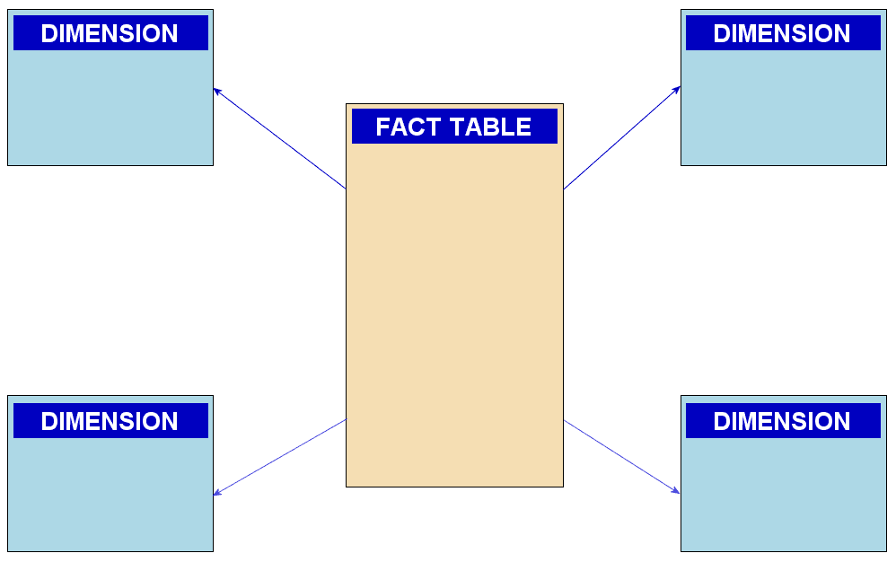
Explain a star schema and its advantages for analytics
Tests your grasp of data modeling trade-offs for OLAP vs. OLTP. A good answer defines fact/dimension tables, then explains how denormalization and fewer joins improve query speed for analytics. A red flag is confusing it with a snowflake schema.
Why use p50/p95 over mean for API response times?
Tests your grasp of statistical distributions for UX metrics. A good answer explains how outliers skew the mean, while percentiles (p50, p95) better represent typical and worst-case user experiences.
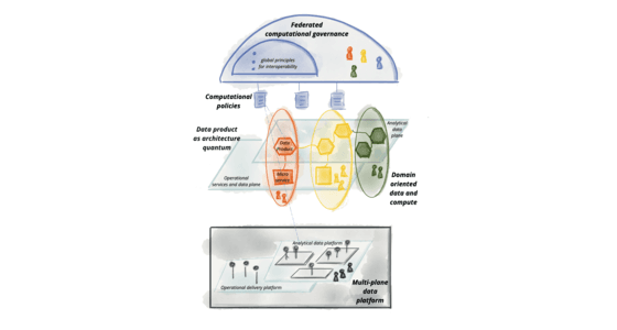
Design a Scalable Data Governance Framework
This tests your grasp of decentralized data governance (Data Mesh). A great answer outlines four principles: domain ownership, data as a product, a self-serve platform, and federated computational governance.

What is a data schema and why enforce it on ingestion?
This tests your grasp of data governance. Define a schema as a data blueprint. Explain that enforcement on ingestion prevents "garbage in, garbage out" by validating types and formats, ensuring data is usable for analytics.

Design a data quality framework for a modern data platform.
Tests your ability to design a systematic data quality strategy. A great answer outlines a framework starting with governance (roles), then profiling/assessment, defining standards, and finally implementing pipeline controls.
What is data partitioning in a cloud data warehouse?
Tests your grasp of performance and cost trade-offs in data systems. A good answer defines partitioning, explains partition pruning for performance, and links it directly to reduced data scan costs.
Describe star and snowflake schemas and their trade-offs.
Tests your grasp of data warehouse design trade-offs. Define star (denormalized dimensions) and snowflake (normalized dimensions) schemas. Contrast them: star is faster for queries but uses more space; snowflake is space-efficient but requires more joins.
What is a data warehouse vs. a transactional database?
Tests your grasp of read-optimized (OLAP) vs. write-optimized (OLTP) systems. A great answer defines warehouses for analysis, contrasts them with transactional DBs for operations, and explains the resulting differences in workload, schema, and data structure.