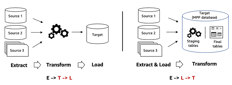
ETL vs. ELT: Key differences and when to use each?
This tests your understanding of modern data architecture trade-offs. A good answer explains the T vs. L order, then links ETL to structured, legacy systems and ELT to flexible, cloud-native data lakes/warehouses.
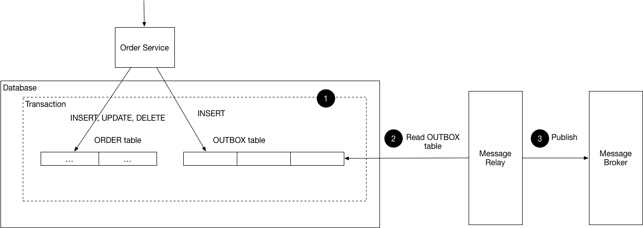
Guarantee at-least-once delivery for a critical event?
This tests your grasp of atomicity without 2PC. A great answer outlines the Transactional Outbox pattern: write the event to a DB table in the same transaction as the business logic, then use a relay process. A red flag is relying on simple try/catch blocks.

Design a client-side event batching system for a high-traffic app
This tests your grasp of frontend performance and data reliability. Outline a batching strategy (timer/size), then explain using `visibilitychange` with `navigator.sendBeacon()` to prevent data loss on unload. A red flag is suggesting synchronous XHR.

Build vs. Buy: Third-Party vs. In-House Analytics
Tests your grasp of the time-vs-control trade-off. A great answer weighs speed vs. customization and total cost of ownership. Advocating for 'build' without considering the massive, ongoing maintenance cost is a major red flag.
How would you debug a sudden drop in a key metric?
Tests your systematic debugging of complex data systems. First, validate the drop against a source of truth and segment the data. Then, hypothesize causes like misattribution or data loss.
How do you track page views in a Single Page Application?
This tests your grasp of SPA routing mechanics. A great answer covers both programmatic navigation (using router hooks) and browser history events (`popstate`), explaining why both are necessary.

Explain the North Star Metric and propose one for a product
Tests your ability to link product strategy to a single metric reflecting customer value and business growth. Define the NSM, propose one for a product like Spotify, and justify it. A red flag is picking a vanity metric like DAU or a pure business metric.

How would you diagnose a flat feature adoption KPI?
This tests your ability to create a diagnostic plan from a single lagging metric. A great answer outlines a funnel (Awareness > Activation > Usage), segments users, and combines quantitative data with qualitative feedback.

Translate 'increase engagement' into a technical measurement plan
This tests your ability to translate vague business goals into concrete metrics. First, clarify the goal with the PM. Then, propose specific, measurable proxy metrics (e.g., DAU/MAU, session length). Finally, outline the instrumentation plan.

ETL: The Assembly Line for Your Data
ETL (Extract, Transform, Load) is an assembly line for data, moving it from various sources into a single destination for analysis. It's used to populate data warehouses by combining data from databases, logs, and APIs into a unified view.

Color Theory: Guiding the Eye in Data Visualization
Color in a chart is a cognitive shortcut, telling the viewer's brain what to notice and how to feel. Use it to highlight trends (green for growth) or group categories. The footgun is using too many colors, which creates noise and obscures insights.

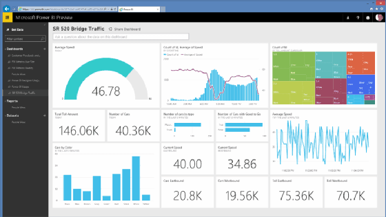
Data Dashboards: The Single-Page Business Story
A data dashboard is the executive summary for your metrics, telling a story on a single page with key visualizations. It consolidates data from multiple reports, providing a high-level view to monitor business performance.

Analytics CoE: Centralizing Your Data Strategy
An Analytics Center of Excellence (CoE) is an internal data consulting group, centralizing experts to set standards and drive strategy. It helps large organizations standardize data quality and tooling. The footgun: becoming a bottleneck that slows teams down.
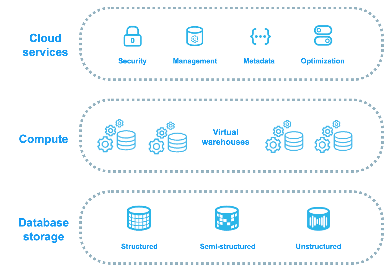
Snowflake: Decoupled Storage and Compute
Snowflake decouples storage from compute, acting like a shared-disk system for data management but a shared-nothing system for query performance. This lets you scale compute and storage independently, ideal for variable analytic workloads.

Multivariate Testing: Finding the Best Combination
Multivariate testing (MVT) finds the best *combination* of changes, not just the best single change. It tests multiple elements at once, like three headlines and two button colors, to see how they interact.

Period-over-Period Analysis: Measuring Change Over Time
Period-over-Period analysis answers 'Are we getting better?' by comparing metrics from consecutive time blocks, like this month's sales vs. last month's. The footgun is ignoring seasonality, which can create false signals of growth or decline.

The HEART Framework: Measuring User-Centric Success
The HEART framework measures user-centric success, not just clicks. It provides five categories (Happiness, Engagement, Adoption, Retention, Task Success) to track product health.

Vanity vs. Actionable Metrics: Measure What Matters
Actionable metrics are levers that change business outcomes; vanity metrics are scoreboard numbers that feel good but don't inform decisions. Use this distinction when setting KPIs to avoid the footgun of celebrating 'total downloads' over actual retained…
Self-Service Analytics: Let Teams Answer Their Own Data Questions
Self-service analytics gives business teams tools like Power BI to explore data and build reports without waiting for an analyst. This speeds up decision-making by giving teams direct data access.

Data Democratization: Self-Service Analytics for Everyone
Data democratization means non-technical staff can access and use data without waiting for IT. It empowers sales to analyze their pipeline or marketing to track campaign ROI directly.