
HiPPO: Highest Paid Person's Opinion
HiPPO stands for "Highest Paid Person's Opinion," where a senior leader's gut feeling overrules data. This occurs when deciding on features without A/B tests. The footgun: a HiPPO's intuition can kill great ideas or greenlight costly failures.

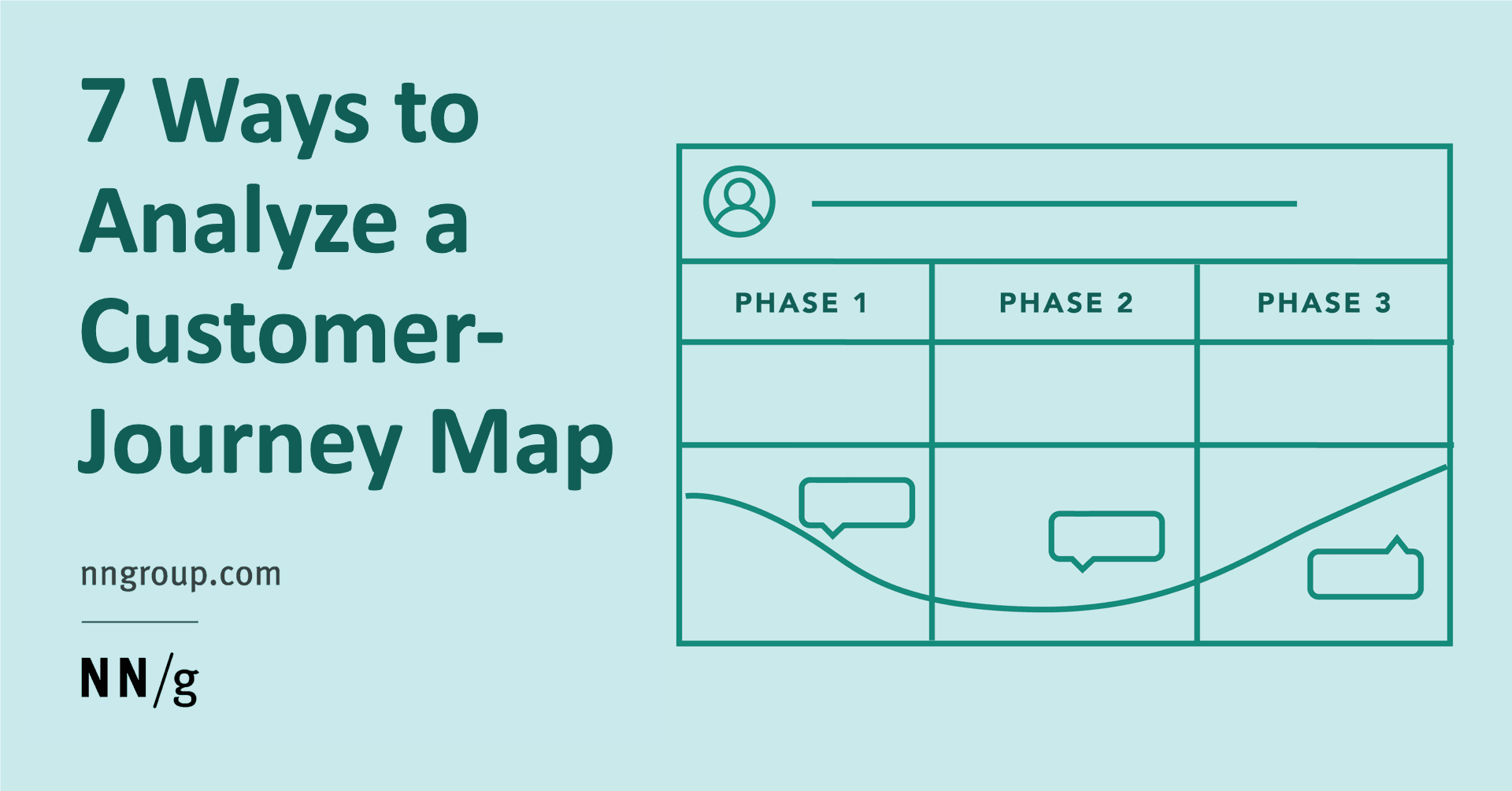
User Journey Orchestration: From Map to Reality
User Journey Orchestration is the conductor for your customer's experience, ensuring every team and channel plays in harmony. It translates a static journey map into a live, consistent experience by coordinating actions across touchpoints.
Training vs. Test Sets: Judging a Forecast's True Accuracy
Don't judge a forecast by how well it fits the data it was trained on. To measure true accuracy, split your data into a training set for model fitting and a test set for evaluation, using data the model has never seen before.

The Power User Curve: Go Beyond DAU/MAU
The Power User Curve is a histogram showing user activity distribution, revealing what single metrics like DAU/MAU hide. It shows if you have a core of daily "power users" (a "smile" curve) or just casual visitors, guiding your product and monetization…
User Engagement Score: A Health Check for Your Product
A User Engagement Score distills complex user behavior into a single number, showing if users find value or are at risk of churning. Product teams use it to gauge feature adoption, while success teams identify at-risk accounts.
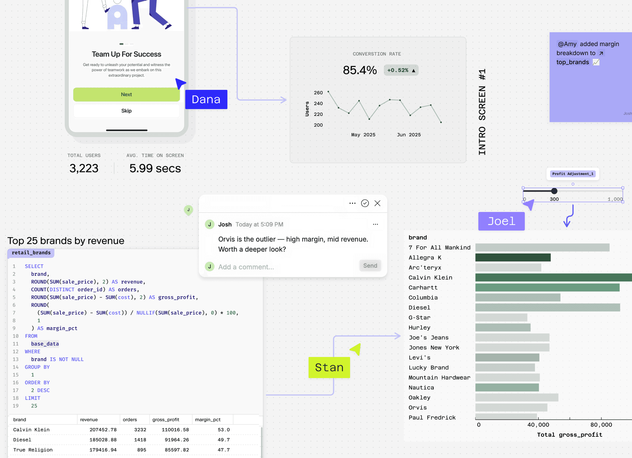
User Journey Analysis: Finding Friction and Opportunity
User journey analysis is like watching a film of your customer's experience to find plot holes. It helps spot where a product fails to meet expectations or has redundant steps. The biggest footgun is analyzing without a clear persona in mind.
Feature Adoption Rate: Measuring if New Features Deliver Value
Feature adoption rate measures if users actually use specific features, not just log in. It's vital for SaaS products to prove ongoing value for renewals. The footgun: a low rate means customers pay for unused bloat, which actively hurts perceived value and…

Activation Rate: Measuring the 'Aha!' Moment
Activation rate measures the percentage of users who experience your product's core value, not just sign up. It's a key metric for diagnosing onboarding effectiveness. The common mistake is tracking 'completed onboarding' instead of the 'aha!'

Granger Causality: Forecasting, Not Causing
Granger Causality tests if one time series can forecast another, not if it causes it. It's used in econometrics to see if money supply changes predict inflation. The footgun is the name itself: it only shows predictive power, not true cause-and-effect.

Prophet: Automated Time Series Forecasting
Prophet treats forecasting like decomposing a signal, breaking a time series into trend, seasonality, and holiday effects. It excels at predicting business metrics with strong seasonal patterns, like web traffic.
Time Series Cross-Validation
Unlike standard cross-validation that shuffles data, time series cross-validation respects the arrow of time. It evaluates a forecasting model by training only on past data to predict a future point, then rolling forward. The footgun is using random k-folds.
Exponential Smoothing: Weighting Recent Data More Heavily
Exponential smoothing creates forecasts from a weighted average of past data, where weights decay exponentially for older points. It's used for quick, reliable predictions like inventory demand. The footgun: simple versions ignore trends and seasonality.

The Novelty Effect: When New Isn't Always Better
The Novelty Effect is a temporary metric spike from a feature's newness, not its inherent value. It often appears in A/B tests for high-frequency products, inflating short-term metrics. The footgun is mistaking this initial excitement for a long-term win.

The Multiple Comparisons Problem
Running many statistical tests on one dataset is like buying many lottery tickets; your chance of a "winning" false positive increases with each test. This happens in A/B tests with many metrics.

Probability Distribution: Mapping What's Possible
A probability distribution maps every possible outcome of a random event to its likelihood. It's used in A/B testing to model conversions or in monitoring to predict server load. The footgun is assuming every distribution is a bell curve; many are not.
Time Series Decomposition: Separating Signal from Noise
Time series decomposition breaks a metric into its core parts: long-term trend, repeating seasonal patterns, and random noise. This helps you understand *why* a metric changed—was it a real shift or just the usual holiday rush?

Confidence Interval: Quantifying Uncertainty in Your Estimates
A confidence interval puts error bars around a measurement, showing the plausible range for a true value. It's used in A/B tests to report not just a winner, but the range of its likely impact.
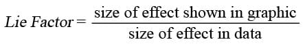
Lie Factor: Quantifying Visual Distortion in Graphs
The Lie Factor measures how much a graph's visuals distort the data's story. It's used to critique charts that exaggerate changes, like with a truncated y-axis.

The Narrative Arc for Data Storytelling
A narrative arc gives data a story by building tension toward a key insight. It guides stakeholders from a problem (plot) to a turning point (climax) and a resolution. The footgun is oversimplifying; compelling stories have multiple smaller tension peaks.

Anscombe's Quartet: When Numbers Lie
Anscombe's Quartet shows how four datasets can share identical summary stats (mean, variance) but look completely different when plotted. It's a classic reminder to always visualize your data before trusting numerical summaries.