
What's the functional difference between wireframes, mockups, and prototypes? Describe a scenario.
This tests whether you distinguish structure, visuals, and interactivity. A strong answer defines each by fidelity and function, then names a lifecycle stage like using wireframes in discovery to align scope before visual design.

How would you automatically audit WCAG AA contrast in Figma?
This tests Figma plugin vs REST API color extraction limits. Good answers contrast live traversal with export-based analysis, cite WCAG AA ratios of 4.5:1 and 3:1, and note opacity. A red flag is assuming the REST API can sample pixels without image export.
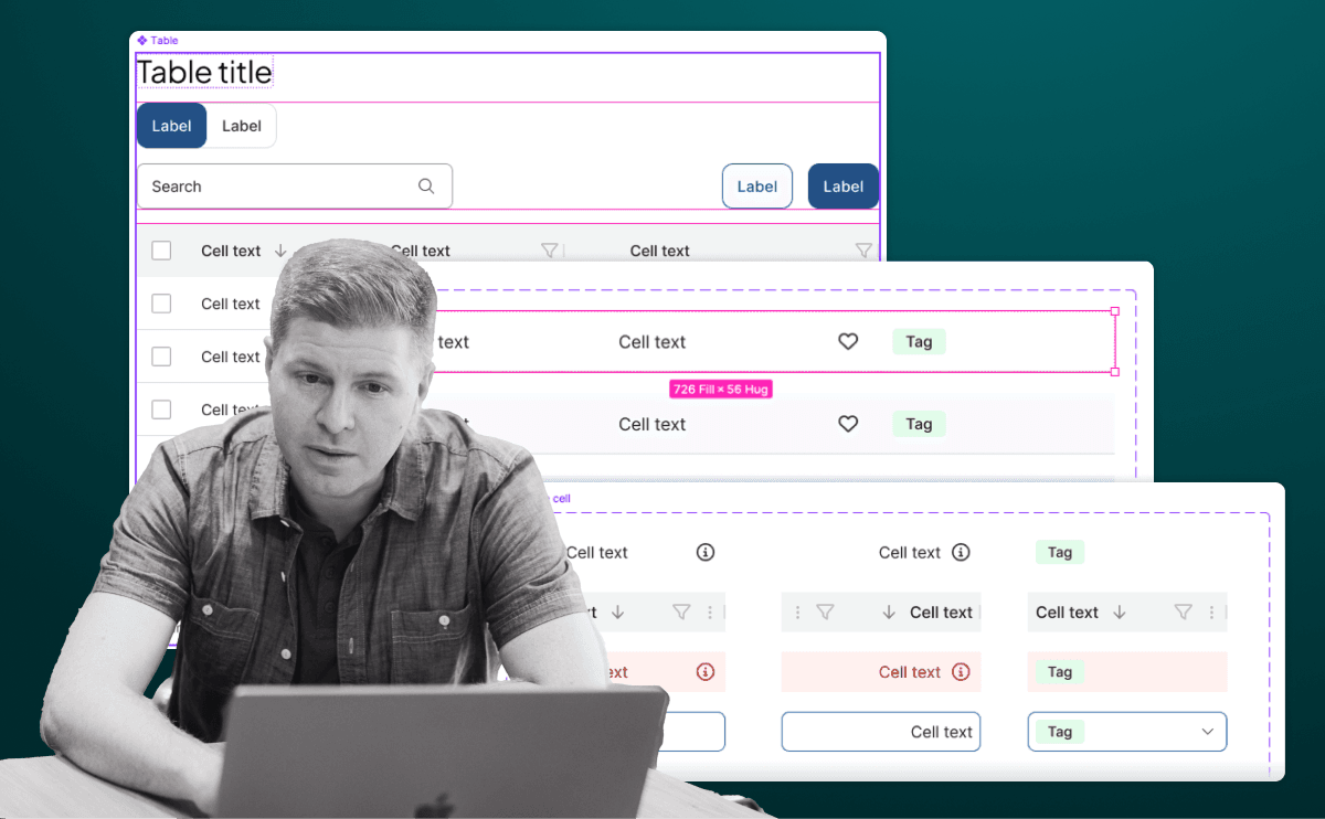
Design a flexible Table component in Figma with slots
Tests Figma Slots to avoid variant bloat. Answer: Cell variants; Row as a horizontal Slot with zero padding for dividers/hover; Table as a vertical Slot for rows plus a header Slot; componentize the configured row for bulk edits.

Describe a workflow to sync Figma tokens to front-end code
Tests if you see tokens as version-controlled code. Strong answer: Tokens Studio pushes W3C DTCG JSON to Git; CI runs Style Dictionary to emit CSS or JS. Red flag: saying the artifact is a Figma file or manual spec sheet.
Translate Figma Auto Layout padding, direction, and spacing to Flexbox
Tests your ability to bridge design tools and CSS layout mechanics. Match direction to flex-direction, padding to gap or container padding, space-between to justify-content, and hug/fill to flex-grow or flex-shrink.

How do you indicate sort state accessibly in a data table?
WHAT IT TESTS: Communicating sort state without relying on color alone. ANSWER OUTLINE: Use shape-differentiated icons, annotate aria-sort on the active header, and maximize the button click target.
Design the keyboard interaction flow for a modal dialog
Your grasp of accessible focus management per WAI-ARIA dialog patterns. Cover initial focus rules, Tab trapping inside the modal, Escape to close, and restoring focus to the trigger on exit.

How do you migrate a breaking change in a mature design system?
This tests organizational change management at scale, not just code changes. A strong answer covers SemVer major versioning, beta testing with key consumers, phased deprecation timelines, and automated file audits.

How do you handle versioning and breaking changes in a shared library?
This tests bridging design and engineering workflows. A strong answer covers semantic versioning, a protected main file with branching, a visible changelog, and release alignment with code.
Super button versus composition: discuss trade-offs and scalability
Tests combinatorial explosion and API trade-offs in design systems. Contrast the super button's exponential growth with composition's explicit APIs and linear scalability, noting governance needs. Red flag: absolutism or ignoring type safety and tree-shaking.

How do you apply systematic rules to asymmetrical layouts predictably?
WHAT IT TESTS: Boxing visual tension with rigid rules. ANSWER OUTLINE: Grid and spacing tokens as guardrails; deliberate ratios create asymmetry, not random offsets; engineers get rules, not pixels.

How would you structure a multi-theme color system in Figma and CSS?
WHAT IT TESTS: Token architecture bridging Figma modes to code. ANSWER OUTLINE: Primitives and Semantic collections with theme modes; pipeline to CSS variables; components use semantic tokens only.
How would you optimize and implement a full-bleed responsive hero image?
WHAT IT TESTS: responsive image delivery and performance budgeting across breakpoints. ANSWER OUTLINE: use srcset with AVIF/WebP, CSS object-fit cover, and width/height to prevent CLS. RED FLAG: serving one 4K JPEG as a background image with no size hints.
How would you establish a modular typographic scale for a design system?
This tests systems thinking and contextual ratio choice. A strong answer picks a ratio by contrast—high for marketing, low for dashboards—rounds values, adds sizes for dense UIs, adjusts base size across breakpoints.

Line-height vs letter-spacing: impact on readability and values for body vs headings
This tests whether you distinguish vertical rhythm from horizontal glyph spacing. A strong answer sets body line-height to at least 1.5x per WCAG with minimal tracking, while headings use tighter line-height and tighter tracking. Red flag: identical values.
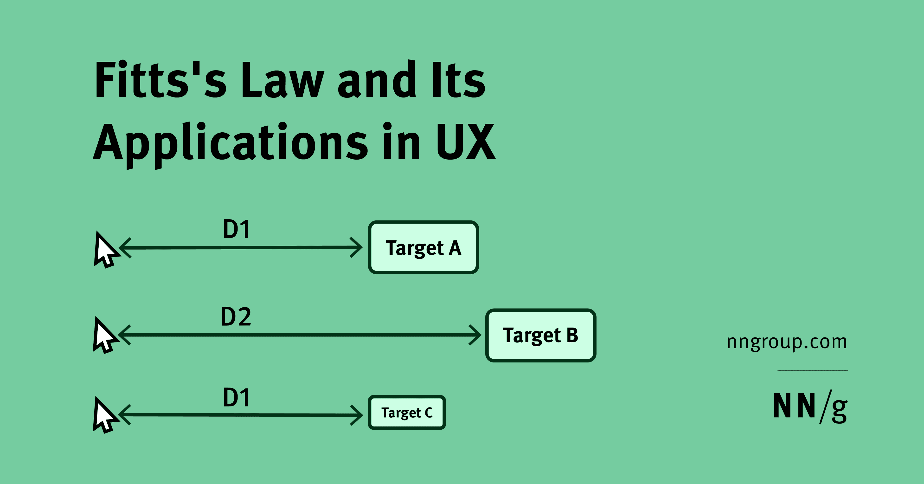
Use Fitts's Law to size and place primary vs secondary mobile actions
WHAT IT TESTS: Fitts's size-distance tradeoff applied to mobile thumb zones. OUTLINE: Large primary actions in easy thumb zones; secondary actions farther but keep minimum targets. RED FLAG: Bigger buttons alone, ignoring distance or finger precision.

How do you model and articulate long-term design debt cost to stakeholders?
WHAT IT TESTS: Quantifying UX debt as compound interest on rework and churn. ANSWER: Estimate refactor hours and support tickets; show fixes cost 3-5x more later; map inconsistency to trust erosion. RED FLAG: Treating it as taste not system tax.
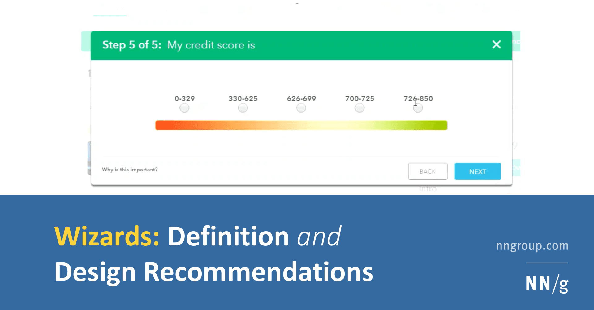
How do you design a low-cognitive-load wizard and implement it technically?
WHAT IT TESTS: pairing progressive disclosure with solid architecture. A strong answer hits step validation, URL-synced navigation, and isolated step components. RED FLAG: one monolithic form using only local useState without validation boundaries.
How does affordance guide choosing a native button over a styled div?
This tests if you see affordance as built-in behavior, not only looks. A strong answer picks the native button for free keyboard, focus, and reader support, noting a div needs tabindex, role, and keydown logic. A red flag is treating it as purely visual.

How do you apply progressive disclosure and hierarchy in complex data tables?
This tests layered UI decomposition. Strong answer: default to essential columns with horizontal dividers; disclose sort and filter on interaction; paginate at 48-56px row height; apply contrast and color cues sparingly.