ROC Curve and AUC: Measuring Classifier Performance
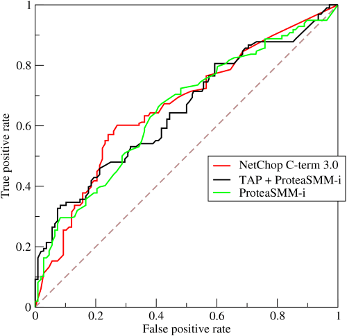
An ROC curve visualizes a classifier's trade-off between catching true positives and flagging false ones across all thresholds. It's used to evaluate models like medical diagnostics or spam filters.
WHY IT EXISTS: Simple accuracy (correct predictions / total) is a misleading metric for classifiers, especially with imbalanced data. A model that always predicts 'no disease' for a rare illness might be 99.9% accurate but is completely useless. We need a metric that measures a model's ability to distinguish between classes, independent of the final decision threshold.
THE MENTAL MODEL: An ROC curve is like seeing the performance of an airport security scanner at every possible sensitivity setting. Set it too low, and you miss threats (low True Positive Rate, low False Positive Rate). Set it too high, and you flag every belt buckle (high True Positive Rate, high False Positive Rate). The ROC curve plots this entire trade-off, letting you see the full capability of your classifier, not just its performance at one arbitrary setting.
HOW IT WORKS: The curve plots two metrics. The Y-axis is the True Positive Rate (TPR), or 'Sensitivity', which is the fraction of actual positives you correctly identified. The X-axis is the False Positive Rate (FPR), the fraction of actual negatives you incorrectly flagged as positive. Each point on the curve represents the TPR/FPR pair for a specific decision threshold. A diagonal line from (0,0) to (1,1) represents a random-guess classifier. A perfect model would go from (0,0) straight up to (0,1) and then across to (1,1). The Area Under the Curve (AUC) summarizes this plot into a single number from 0 to 1. An AUC of 1.0 is a perfect classifier, while 0.5 is no better than random chance.
WHEN TO USE IT: Use ROC curves and AUC to compare the overall discriminative power of different binary classification models. It's the standard for assessing diagnostic tests in medicine and is useful in any domain where you want to understand a model's performance across all possible trade-offs between sensitivity and specificity.
WHEN NOT TO USE IT: Be cautious with ROC/AUC on highly imbalanced datasets. If positive cases are very rare, a model can generate many false positives without significantly increasing the False Positive Rate, making the AUC seem deceptively high. In such cases, a Precision-Recall (PR) curve is often more informative.
ONE CANONICAL EXAMPLE: A credit card fraud detection model outputs a risk score from 0 to 1. An ROC curve shows its performance at every threshold. A low threshold (e.g., score > 0.1) catches most fraud (high TPR) but also flags many legitimate transactions (high FPR). A high threshold (e.g., score > 0.9) has few false alarms (low FPR) but misses more subtle fraud (low TPR). The AUC score tells us how well the model, in general, gives higher scores to fraudulent transactions than to legitimate ones.
Read the original → en.wikipedia.org
Get five bites like this every day.
Tezvyn delivers a daily feed of 60-second tech bites with quizzes to lock in what you learn.