Network Visualization: Making Sense of Connections
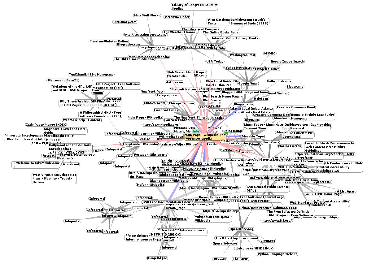
Network visualization turns abstract relationships into a 2D map. It's used to see structure in social networks or biological pathways. The footgun is that layout choices can create misleading patterns; a pretty graph isn't always a true one.
WHY IT EXISTS Raw data about connections—like a list of who follows whom on a social network—is just a table of numbers. It's difficult for humans to grasp the overall structure, find influential points, or identify communities from text alone. Network visualization was developed to translate this abstract data into a visual format that our brains can process intuitively.
THE MENTAL MODEL Think of graph drawing as cartography for data. You have a set of locations (nodes) and the roads between them (edges). Your job isn't just to place them on a page, but to choose a projection (a layout algorithm) that makes the landscape understandable. A good map reveals continents (clusters), major highways (central connections), and hidden valleys (isolated groups).
HOW IT WORKS Graph drawing uses algorithms that combine principles from geometric graph theory and information visualization. These algorithms take a graph's structure as input and calculate a 2D position for each node. The goal is to create a depiction that is both aesthetically pleasing and analytically useful, often by optimizing for properties like minimizing edge crossings, keeping connected nodes close together, and distributing nodes evenly.
WHEN TO USE IT Use network visualization when you need to explore the qualitative structure of a system of relationships. It excels at answering questions like "What are the distinct communities in this network?", "Which nodes are the most central or influential?", and "Are there any unexpected bridges between groups?". The source mentions its use in social network analysis, cartography, linguistics, and bioinformatics.
WHEN NOT TO USE IT Avoid visualization as the primary tool for extremely large or dense graphs, which often result in an unreadable "hairball" where no structure is visible. It's also less useful when your primary goal is precise quantitative measurement rather than qualitative exploration; a statistical summary or a simple chart might be more effective.
ONE CANONICAL EXAMPLE A classic example is visualizing a social network. Nodes represent users and edges represent connections like friendships or follows. Running a force-directed layout algorithm will pull connected users together and push unconnected ones apart. The resulting image can immediately reveal dense communities of friends, as well as individual users who act as bridges between different social circles.
Read the original → en.wikipedia.org
Get five bites like this every day.
Tezvyn delivers a daily feed of 60-second tech bites with quizzes to lock in what you learn.