Violin Plots: Box Plots with a Sense of Shape
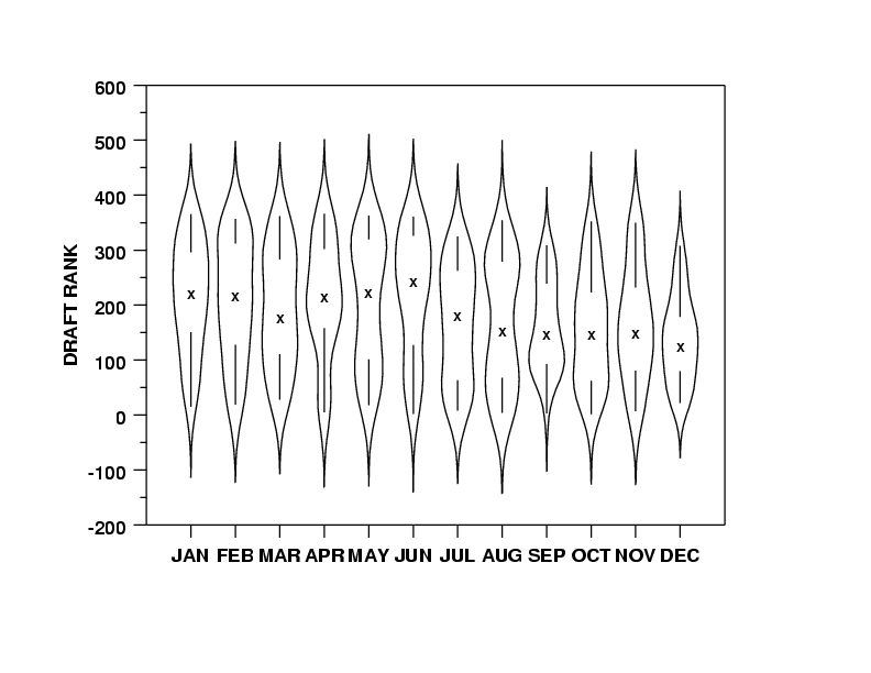
A violin plot is a box plot that also shows the data's shape. It reveals multi-modal distributions or skews that a simple box plot would hide. Use it to compare distributions across categories, like server response times.
Why it exists
Standard box plots are great for summarizing data with medians and quartiles, but they hide the shape of the distribution. You can't tell if your data has one peak (unimodal), two peaks (bimodal), or is uniformly distributed. Violin plots were invented to show the summary and the full distribution in one graphic.
The mental model
Think of a violin plot as a box plot wearing its distribution as a coat. The box plot provides the statistical summary (median, interquartile range), while the 'violin' shape around it is a density plot. This shape shows you exactly where your data points are clustered, giving a much richer view than a simple box.
How it works
A violin plot combines two plots into one. First, a kernel density estimate (KDE) is generated from the data. A KDE is like a smoothed-out histogram that shows the probability density of the data at different values. This density curve is then plotted vertically. To create the 'violin' shape, this same curve is mirrored on the other side of a central axis. Often, a traditional box plot is overlaid in the middle of this shape to provide explicit quartile and median markers.
When to use it
Use violin plots when you need to compare the distribution of a continuous variable across multiple groups or categories. They are especially powerful when you suspect the distributions might be complex, such as bimodal or heavily skewed. For example, comparing latency distributions for different microservices could reveal that one service has two distinct performance modes.
When not to use it
Violin plots can be misleading for small datasets, as the kernel density estimation might create a smooth shape that doesn't accurately represent the few data points available. For small N, a strip plot or a simple box plot is often more honest. They can also become visually cluttered if you try to compare too many categories at once.
One canonical example
A data scientist wants to compare customer satisfaction scores (from 1-100) across three different product versions: A, B, and C. A box plot might show they all have a median score of 85. However, a violin plot could reveal that Version A has a tight distribution around 85, Version B has a bimodal distribution with peaks at 70 and 95 (a love-it-or-hate-it product), and Version C has a long tail of low scores, indicating a significant group of unhappy users.
Interview question
What is the primary reason to choose a violin plot over a standard box plot?
- a.To more accurately identify and highlight individual outliers in the data.
- b.To primarily display the mean and standard deviation, rather than the median and quartiles.
- c.To visualize the full distribution shape, including modality and skew, across groups.Correct
- d.To provide a simpler, less cluttered summary of central tendency for numerous categories.
Why? this is the answer
Violin plots are chosen because they combine the summary statistics of a box plot with a kernel density estimate, revealing the underlying shape, modality, and skew of the data distribution. Option A is incorrect because while box plots are good for outliers, violin plots' density estimation can sometimes smooth over individual extreme points, and they are not primarily designed to improve outlier identification over box plots.
Just read this? Test yourself on what you have been reading.
Read the original → en.wikipedia.org
Put your scrolling time to good use
Learn one idea, try a quiz and save useful cards for revision. Tezvyn makes it easy to learn and stay current in your tech field, a few minutes at a time.
The iPhone app is on the way
We are building it. Until it lands, nothing here is held back from you: every interview card, your saved cards, streaks and the job board all work in Safari, plus hundreds of free practice quizzes of thirty questions each. Sign in and it all carries over to the app the day it arrives.
Want it as an icon? Tap Share at the bottom of Safari, then Add to Home Screen. It opens full screen and the cards you have read stay available offline.
We are hiring for this. Open roles that interview on data visualization — each one lists the topics its interview covers.
See open roles