Pair Plot: See All Your Data's Relationships at Once
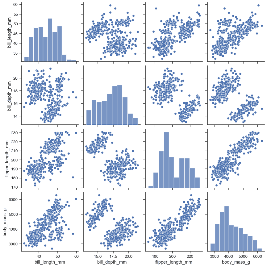
A pair plot is a matrix of charts showing every pairwise relationship in a dataset. Use it in exploratory data analysis to spot correlations and distributions at a glance. The footgun: it becomes unreadably large and slow with more than ~10 variables.
Why it exists
When you first get a dataset, you need to understand how its variables relate to each other. Plotting every pair of variables one by one is tedious and makes it hard to see the big picture. A pair plot automates this, giving you a comprehensive first look in a single command.
The mental model
Think of a pair plot as a "data dashboard" in a grid. The grid's diagonal axis (from top-left to bottom-right) shows you the distribution of each individual variable, typically as a histogram. Every other cell is a scatter plot showing the relationship between the variable for its row and the variable for its column.
How it works
A pair plot function, like seaborn.pairplot in Python, takes a data frame as input. It identifies the numeric columns and creates an N-by-N grid of subplots, where N is the number of variables. For the plot at grid position (row i, column j), it plots variable i on the y-axis against variable j on the x-axis. On the diagonal, where i equals j, it plots a univariate distribution of that single variable to show its shape and spread.
When to use it
Use it early in exploratory data analysis (EDA) on datasets with a manageable number of features (e.g., fewer than 15). It's excellent for quickly identifying which variable pairs are correlated, which might have non-linear relationships, and whether distinct clusters exist. Using a hue parameter to color points by a category is a powerful way to see how groups behave differently.
When not to use it
Avoid pair plots for high-dimensional data. The number of plots grows quadratically (N-squared) with the number of variables, making the output computationally expensive, slow to render, and visually overwhelming. It is an exploration tool, not a final presentation graphic; for reports, select only the most insightful individual plots you discovered.
One canonical example
In Python's Seaborn library, you can load the 'iris' dataset, which has four numeric features and a 'species' category. Running seaborn.pairplot(iris_df, hue='species') generates a 4x4 grid. The diagonal shows histograms for sepal length, sepal width, petal length, and petal width. The off-diagonal scatter plots show, for instance, that petal length and petal width are highly correlated. The hue coloring reveals that the different species form clear, distinct clusters in the data.
Interview question
Why is a pair plot generally not recommended for datasets with a large number of features (e.g., 50)?
- a.Its computational demands make it impractical to generate for many variables.
- b.The resulting grid of plots becomes too dense and visually overwhelming to draw insights.Correct
- c.It cannot effectively highlight correlations in high-dimensional data.
- d.It is primarily designed for presenting final results, not initial data exploration.
Why? this is the answer
The card states that for high-dimensional data, the output becomes "visually overwhelming" and "unreadable large," making it difficult to interpret. While computational inefficiency (option A) is also a factor, the primary limitation from an analytical perspective is the inability to gain insights from the cluttered visualization.
Just read this? Test yourself on what you have been reading.
Read the original → seaborn.pydata.org
You just looked this up. Could you explain it out loud?
That is the part interviews actually test. Tezvyn takes questions like this one and gives you what the interviewer is really checking, the answer that lands, and the mistake that ends the conversation, in the four minutes before your next meeting.
The iPhone app is on the way
We are building it. Until it lands, nothing here is held back from you: every interview card, your saved cards, streaks and the job board all work in Safari, plus hundreds of free practice quizzes of thirty questions each. Sign in and it all carries over to the app the day it arrives.
Want it as an icon? Tap Share at the bottom of Safari, then Add to Home Screen. It opens full screen and the cards you have read stay available offline.
We are hiring for this. Open roles that interview on data science — each one lists the topics its interview covers.
See open roles