All bites
The whole library, newest first. Filter by what you are here for, or pick a topic if you already know.
4247 bites
Page 30
Figma Shape Tools: Your Design Building Blocks
Figma's shape tools are the building blocks for any design. Use them to create everything from buttons and icons to dividers. The footgun: forgetting to hold Shift for perfect squares/circles or Option/Alt to resize from the center, slowing you down.
Figma Color Profiles: sRGB vs. Display P3
Figma's color profiles ensure consistent color across screens. Use sRGB for web standard compatibility or Display P3 for more vibrant colors on modern displays.
Figma REST API: Access Design Files as Structured Data
The Figma REST API treats your design files as structured JSON data, not just images. Use it to automate workflows like exporting assets, syncing design tokens, or posting comments. The main footgun is using the wrong base URL for Government vs.
Auto Layout's `border-box`: strokesIncludedInLayout
Figma's strokesIncludedInLayout is the equivalent of CSS box-sizing: border-box. It makes an Auto Layout frame's total dimensions include its stroke, preventing size changes.
Figma Components: Main vs. Instance
Think of a main component as a cookie cutter and instances as the cookies. The main component defines the master design (e.g., a button's shape). Instances are linked copies you use everywhere.
Nesting Components: Building Systems, Not Just Screens
Nesting components is like building with Lego: you combine small, reusable pieces (icons, buttons) into larger structures (cards). This is key for scalable design systems, where a card might contain nested icon and button instances.
Figma Text Properties: Beyond Font and Size
Text properties are your toolkit for precise typographic control, managing readability and hierarchy beyond just font and size. Use them to adjust line height for paragraphs, letter spacing for headings, and alignment for layout consistency.
Instance Swap Properties: Control Nested Components
An instance swap property is like a designated parking spot for a nested component. It tells designers 'you can swap this part out' and provides recommended replacements, like swapping an icon in a button.
Figma Libraries: Your Team's Single Source of Truth
A Figma library is your team's shared toolbox, ensuring everyone uses the same approved components. Use it to distribute your design system across files. The footgun is forgetting to publish updates, leaving teammates with outdated, inconsistent designs.
Breaking the Link: Detaching Figma Instances
Detaching an instance in Figma permanently breaks its link to the main component, converting it into a standard frame. Use this to make changes overrides can't handle or to create a new component variation.
Figma's Slot Pattern: Flexible Components Without Detaching
Think of a slot as a 'bring your own content' area within a Figma component. It lets you customize instances with unique layouts, like in a card or modal, without detaching them from the main component and breaking your design system.
Figma Prototype Scrolling: Simulating Overflow
Think of a frame as a window onto your content. To make it scroll, the content must be larger than the window. Use this for long pages, image carousels, or to fix navbars. The biggest footgun: if content doesn't extend beyond the frame, there's nothing.
Figma Interactive Components: Prototype Smarter
Interactive Components build prototype logic directly into your component variants. Instead of wiring up hundreds of frames for a form, you define interactions like 'On Click' or 'Hover' once, and every instance inherits them.
Preserve Scroll Position: Seamless Figma Prototypes
Preserve scroll position makes Figma prototypes feel real by remembering where a user scrolled, even after navigating away. It's essential for long lists or maps. The footgun: if scrollable layers aren't identically named and structured, the position resets.
Figma Expressions: Dynamic Prototypes with Logic and Math
Figma expressions are like mini-formulas in your prototype, letting you manipulate variables with math and logic. Use them to build shopping carts that calculate totals or progress bars that fill up.
Figma Video: It's a Fill, Not a Layer
Treat video in Figma as just another fill, not a special layer. Apply it to any shape to prototype video players or motion backgrounds. The footgun is forgetting it requires a paid plan to upload and won't play in the Figma mobile app.
Figma: Stacking Multiple Interactions on One Object
Stack multiple interactions on a single Figma object by treating each as a separate event listener, like onClick and onHover. This is essential for components with hover states that also need to navigate.
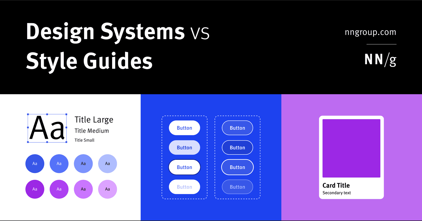
Design System vs. Style Guide: The Parent and the Child
A Design System is the parent; a Style Guide is just one child. The system is a complete toolkit for building products, containing reusable components and code, used by large teams to maintain consistency.
Measuring Design System ROI: From Cost to Investment
Frame a design system not as a cost but as a force multiplier for your team's time. Calculate its ROI to show management how much money reusable components and clear standards will save.
POUR: The Four Pillars of Web Accessibility
POUR is a mental model for web accessibility. It asks: can users Perceive content, Operate the interface, Understand the information, and use it with Robust tools? It applies to all UI design.