Create a responsive card grid without media queries
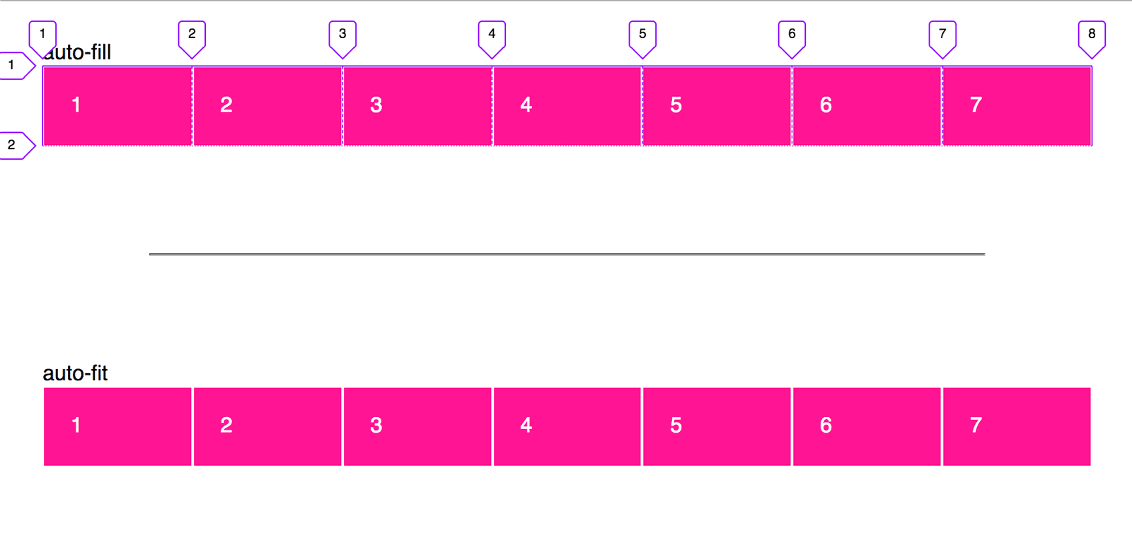
This tests CSS Grid intrinsic sizing. Answer: grid-template-columns with repeat(auto-fit, minmax(min, 1fr)), leveraging repeat, minmax, and auto-fit for fluid wrapping. Red flag: defaulting to Flexbox or media queries instead of intrinsic grid behavior.
What's really being asked
Whether you understand CSS Grid's intrinsic sizing and auto-placement keywords well enough to build a responsive layout without imperative breakpoints. The interviewer wants to see that you know how to delegate responsiveness to the browser's layout engine rather than manually managing viewport ranges.
The full answer
First, the declaration display: grid on the container. Second, grid-template-columns set to repeat(auto-fit, minmax(minimum, 1fr)) where minimum is a length like 250px or 20rem and 1fr is the maximum. Third, the role of the repeat function in generating tracks, minmax in setting a floor and ceiling, and auto-fit in fitting only non-empty columns into the available space. Fourth, the difference between auto-fit and auto-fill, specifically that auto-fill keeps empty tracks in the flow while auto-fit collapses them so extra space is redistributed to existing items. Fifth, the fact that no media queries are required because the browser wraps items to new rows automatically once the minimum width can no longer be satisfied.
The mistakes people make
Reaching for Flexbox with flex-wrap and flex-basis instead of using Grid's track sizing. Suggesting media queries with breakpoint-based column changes like grid-template-columns: 1fr for mobile and repeat(3, 1fr) for desktop. Using repeat(auto-fit, minmax(250px, 1fr)) without explaining why auto-fit is chosen over auto-fill or what minmax actually does. Proposing JavaScript to measure container width and inject classes. Forgetting to mention that 1fr only absorbs free space after the minimum is satisfied.
What usually comes next
When would you choose auto-fill over auto-fit? The answer is when you want to preserve explicit empty tracks for future content or to maintain a rigid column structure. How does this behave inside a container that is not the full viewport width? It works in any container because the grid responds to its own track container, not just the viewport. What happens if you use a fixed maximum like 300px instead of 1fr? The columns will not grow to fill leftover space, causing ragged edges. Can you combine this with dense packing? Yes, by adding grid-auto-flow: dense, though that changes visual ordering.
A concrete example
A photo gallery container with grid-template-columns: repeat(auto-fit, minmax(280px, 1fr)) and gap: 1.5rem. On a 1440px monitor this yields five equal columns. On a tablet it drops to three. On a phone it becomes a single column. The same CSS handles all three states without a single media query because auto-fit collapses unused tracks and minmax enforces the 280px minimum before wrapping.
Interview question
In a grid declared with repeat(auto-fit, minmax(250px, 1fr)), what happens to leftover space in a row after all items are placed?
- a.Existing columns grow to fill the space because auto-fit collapses unused tracksCorrect
- b.Items wrap to the next row so that no column exceeds the 250px minimum
- c.Empty tracks remain in the flow, preventing existing columns from expanding to fill the row
- d.Columns stay fixed at 250px and leftover space is ignored, creating ragged edges
Why? this is the answer
auto-fit collapses empty tracks so extra space is redistributed to existing columns via 1fr, whereas auto-fill preserves empty tracks that compete for space. Wrapping only occurs when the container cannot satisfy the minimum track size, not after items are placed.
Just read this? Test yourself on what you have been reading.
Read the original → css-tricks.com
You just looked this up. Could you explain it out loud?
That is the part interviews actually test. Tezvyn takes questions like this one and gives you what the interviewer is really checking, the answer that lands, and the mistake that ends the conversation, in the four minutes before your next meeting.
The iPhone app is on the way
We are building it. Until it lands, nothing here is held back from you: every interview card, your saved cards, streaks and the job board all work in Safari, plus hundreds of free practice quizzes of thirty questions each. Sign in and it all carries over to the app the day it arrives.
Want it as an icon? Tap Share at the bottom of Safari, then Add to Home Screen. It opens full screen and the cards you have read stay available offline.
We are hiring for this. Every open role lists the topics its interview covers, so you can prepare for the real thing rather than guessing.
See open roles