CSS Anchor Positioning: Beyond the Containing Block
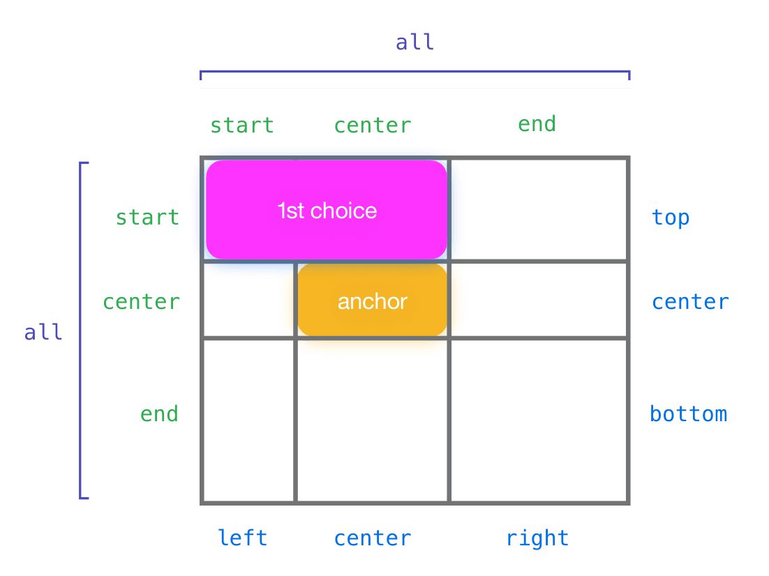
CSS Anchor Positioning lets you tether an element to any other element, not just its parent. Use it for popovers or tooltips that automatically reposition to stay in view. The footgun is forgetting to explicitly name your anchor with anchor-name.
Why it exists
For years, positioning a non-child element (like a tooltip) next to a trigger element (like a button) required complex JavaScript to calculate coordinates and handle viewport edges. The position: absolute property is limited to a containing block, which is often not the element you want to be relative to. Anchor Positioning provides a declarative, CSS-only solution to this common UI problem.
The mental model
Imagine giving one element a GPS tracker and having another element follow it. You designate an element as an "anchor" by giving it a name. Then, you tell a separate, absolutely positioned element to use that anchor's coordinates as its reference point. The positioned element can place itself relative to the anchor's edges, corners, or center, and even use the anchor's dimensions for its own sizing.
How it works
The process has two core parts. First, you designate an anchor element using the anchor-name property, for example: anchor-name: --my-anchor;. Second, you tell the element you want to position (e.g., a popover) to use that anchor. You do this by applying position: absolute and using the anchor() function in its inset properties, like top: anchor(--my-anchor bottom);. This line of CSS tells the popover to align its top edge with the bottom edge of the --my-anchor element. The system becomes truly powerful when you add fallback positions with the @position-try at-rule, letting the browser automatically find the best position to avoid clipping.
When to use it
Use Anchor Positioning for any component that needs to be positioned relative to another element but sits elsewhere in the DOM. It is the perfect tool for building robust tooltips, custom select menus, popovers, and context menus that intelligently avoid overflowing the viewport without any JavaScript.
When not to use it
Do not use Anchor Positioning for general page layout. It is not a replacement for CSS Grid or Flexbox, which are designed for the primary structure of a document. Anchor Positioning is a specialized tool for elements that pop out of the normal document flow and are tethered to another element. Using it for static layout is overly complex and semantically incorrect.
One canonical example
A tooltip for a button. The button element receives anchor-name: --btn;. The tooltip element gets position: absolute; and its position is set with top: anchor(--btn bottom); left: anchor(--btn center);. This places the tooltip just below the button and horizontally centered on it. By defining a fallback with @position-try, the browser can automatically move the tooltip above the button if it would otherwise render off-screen.
Interview question
What key problem does CSS Anchor Positioning solve that traditional position: absolute often required JavaScript for?
- a.Positioning an element relative to any arbitrary element in the DOM and intelligently preventing it from overflowing the viewport.Correct
- b.Managing the stacking order (z-index) of pop-up elements to ensure they always appear above other content.
- c.Automatically resizing a positioned element to match the dimensions of its anchor element.
- d.Structuring complex page layouts with multiple independent sections that respond to content changes.
Why? this is the answer
The card states that Anchor Positioning addresses the need to position "a non-child element (like a tooltip) next to a trigger element" which previously "required complex JavaScript to calculate coordinates and handle viewport edges." Option A directly reflects this, providing a CSS-only solution for arbitrary relative positioning and intelligent viewport collision avoidance. Option D is incorrect as the card explicitly mentions Anchor Positioning is "not a replacement for CSS Grid or Flexbox" and "not for general page layout."
Just read this? Test yourself on what you have been reading.
Read the original → w3.org
- #css
- #layout
- #positioning
- #design systems
You just looked this up. Could you explain it out loud?
That is the part interviews actually test. Tezvyn takes questions like this one and gives you what the interviewer is really checking, the answer that lands, and the mistake that ends the conversation, in the four minutes before your next meeting.
The iPhone app is on the way
We are building it. Until it lands, nothing here is held back from you: every interview card, your saved cards, streaks and the job board all work in Safari, plus hundreds of free practice quizzes of thirty questions each. Sign in and it all carries over to the app the day it arrives.
Want it as an icon? Tap Share at the bottom of Safari, then Add to Home Screen. It opens full screen and the cards you have read stay available offline.
We are hiring for this. Open roles that interview on css — each one lists the topics its interview covers.
See open roles