Dashboard Design: Guide, Don't Overwhelm
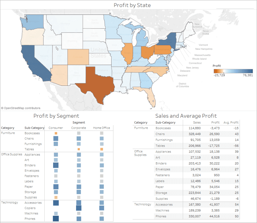
A good dashboard guides users to an insight, not just displays charts. Place your key takeaway in the top-left and limit views to 2-3 to maintain focus. The biggest mistake is including too many views, which clutters the message and slows down the dashboard.
Why it exists
Dashboards exist to solve the problem of data overload. Raw data or scattered charts don't lead to quick decisions. A well-designed dashboard synthesizes information to align teams, uncover insights, and speed up decision-making by presenting a clear, focused story.
The mental model
Think of a dashboard like the front page of a newspaper. The most important headline and story (the key insight) are placed "above the fold" in the top-left, where the eye naturally goes first. Supporting charts are like related articles, providing context without cluttering the main message. The goal is to inform at a glance, not to be an exhaustive archive.
How it works
Effective design follows a few core principles. First, define your purpose and audience: what single question must this dashboard answer? Second, establish a visual hierarchy. Place the most critical view in the top-left spot, as users scan screens in that pattern. Third, limit the total number of views to two or three to maintain clarity and prevent information overload. If you need more, create a second dashboard. Fourth, design for the final display size to avoid scrunched visuals or unexpected scrollbars. Finally, add interactivity like filters and highlighting to let users explore details without cluttering the initial view.
When to use it
Apply these principles when building any dashboard intended for communication and decision-making. They are crucial when presenting a specific conclusion, monitoring key performance indicators (KPIs), or providing an overview for an executive audience. The goal is always to provide clarity and a quick path to understanding.
When not to use it
These principles are less critical for personal, exploratory data analysis workbooks. In that context, it's acceptable to have many worksheets and unfiltered views as you dig through the data. The "don't overwhelm" rule is for the final, published product, not the messy workbench where discoveries are made.
One canonical example
A sales manager's dashboard. The top-left view is a large KPI showing "Quarterly Sales vs. Target." Below it, a map highlights sales performance by region. To the right, a bar chart shows sales by product category. The user immediately sees the most important number, then scans for context. Filters allow them to drill down into a specific region or salesperson's performance without leaving the main view.
Interview question
To prevent information overload and effectively guide users to insights, which dashboard design principle is most critical?
- a.Designing for the final display size to avoid unexpected scrollbars
- b.Placing the most critical view in the top-left position
- c.Limiting the total number of distinct views to two or threeCorrect
- d.Incorporating interactive filters and highlighting for exploration
Why? this is the answer
The card explicitly states that limiting the total number of views to two or three is crucial 'to maintain clarity and prevent information overload.' While placing the most critical view top-left guides attention, it doesn't prevent overload if there are still too many overall views.
Just read this? Test yourself on what you have been reading.
Read the original → help.tableau.com
- #dashboard
- #data visualization
- #analytics
- #ui/ux
You just looked this up. Could you explain it out loud?
That is the part interviews actually test. Tezvyn takes questions like this one and gives you what the interviewer is really checking, the answer that lands, and the mistake that ends the conversation, in the four minutes before your next meeting.
The iPhone app is on the way
We are building it. Until it lands, nothing here is held back from you: every interview card, your saved cards, streaks and the job board all work in Safari, plus hundreds of free practice quizzes of thirty questions each. Sign in and it all carries over to the app the day it arrives.
Want it as an icon? Tap Share at the bottom of Safari, then Add to Home Screen. It opens full screen and the cards you have read stay available offline.
We are hiring for this. Every open role lists the topics its interview covers, so you can prepare for the real thing rather than guessing.
See open roles