Designing Helpful UX Error Messages
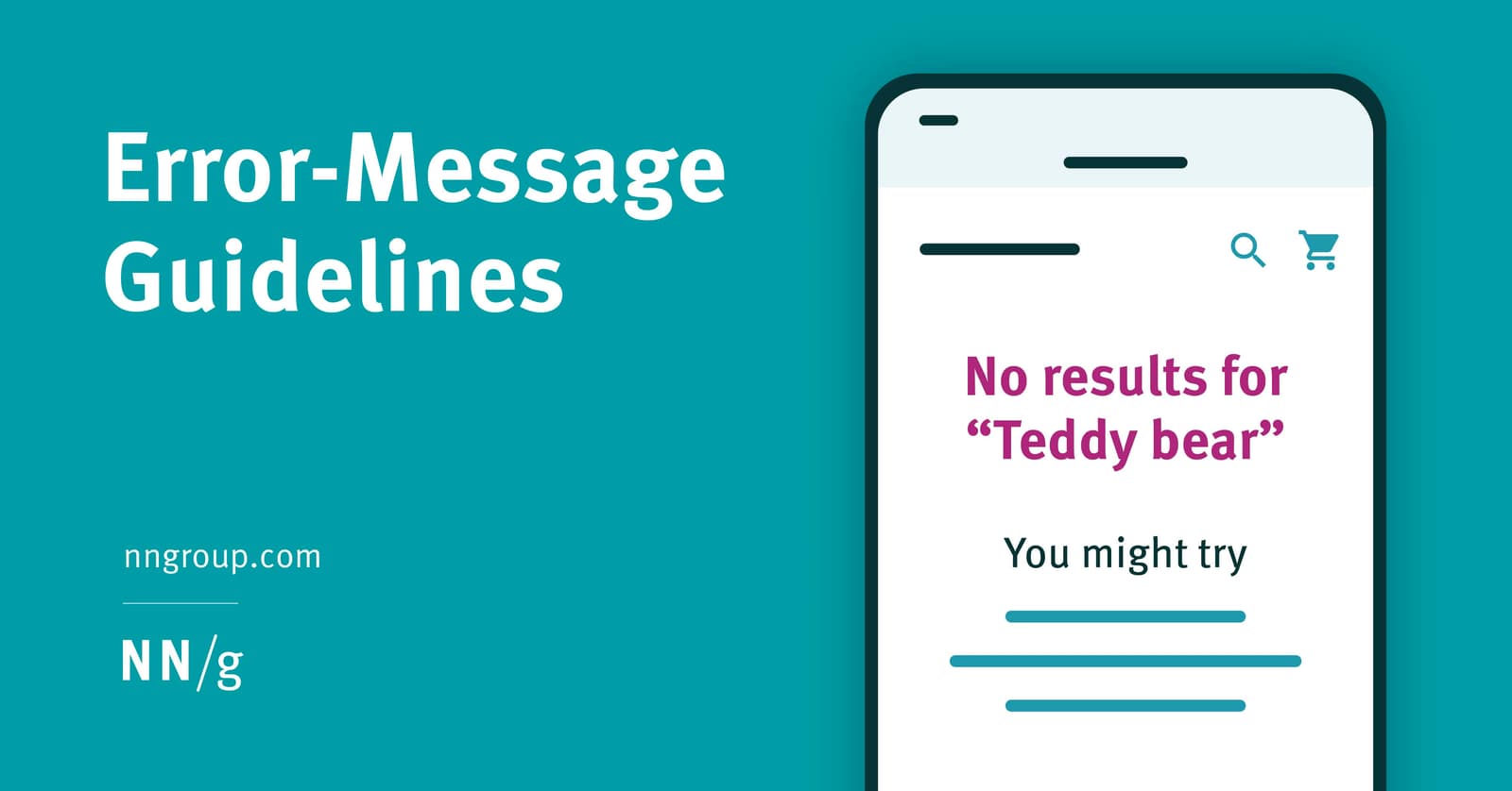
An error message is a guide, not a dead end. Design them to be visible and constructive by placing them near the error's source with clear, high-contrast styling. The footgun is showing errors prematurely, which feels hostile and punishes exploration.
Why it exists
Product teams often focus on the ideal "happy path," but users inevitably make mistakes or encounter system limits. Good error handling is one of the five core components of a usable experience, turning a moment of frustration into a chance for successful recovery.
The mental model
An error message is not a system failure notice; it's a constructive conversation with the user. It should help them recognize what went wrong, diagnose the problem, and recover from it. Think of it as a helpful guide, not a dead end or an accusation.
How it works
Effective error messages are highly visible, provide clear communication, and respect user effort. For visibility, place the message physically close to the source of the error to minimize cognitive load. Use noticeable, redundant, and accessible indicators like bold text, icons, and highlighted borders. Never use color as the only way to signal an error, as this fails for users with color vision deficiencies. The message's design should also match its severity. A minor warning can be a simple toast notification, while a critical, blocking error might require a modal dialog that demands the user's attention. Finally, timing is crucial. Don't show errors prematurely; this is a hostile pattern that punishes users for exploring.
When to use it
Apply these principles anytime a user's workflow is interrupted by an incomplete, incompatible, or undesirable situation. This applies to everything from invalid form inputs and failed API calls to warning users about potentially irreversible actions.
When not to use it
Avoid displaying error states for normal, exploratory user behavior. A user tabbing through a form to see the fields should not be greeted with a screen full of red error messages for empty inputs. This creates unnecessary anxiety and discourages interaction.
One canonical example
A bad error message appears far from the input field it relates to, using only a subtle red text color. A good error message appears directly adjacent to the field, using an icon, a highlighted red border, and clear, bold text to explain the problem, like "Password must contain at least one number." For complex fields like password creation, providing this feedback in real-time as the user types is even better.
Interview question
Which practice is identified as a "hostile pattern" to avoid when designing UX error messages?
- a.Displaying error messages for empty fields as a user explores a form.Correct
- b.Requiring a modal dialog for all types of errors, regardless of severity.
- c.Using only color to indicate an error's presence.
- d.Placing error messages far from the input field they relate to.
Why? this is the answer
The card explicitly states, "Don't show errors prematurely; this is a hostile pattern that punishes users for exploring." Displaying errors for empty fields during exploration falls under this. While using only color (option C) is a bad practice for accessibility, it is not specifically labeled a "hostile pattern" in the text.
Just read this? Test yourself on what you have been reading.
Read the original → nngroup.com
- #ux
- #ui design
- #error handling
- #copywriting
You just looked this up. Could you explain it out loud?
That is the part interviews actually test. Tezvyn takes questions like this one and gives you what the interviewer is really checking, the answer that lands, and the mistake that ends the conversation, in the four minutes before your next meeting.
The iPhone app is on the way
We are building it. Until it lands, nothing here is held back from you: every interview card, your saved cards, streaks and the job board all work in Safari, plus hundreds of free practice quizzes of thirty questions each. Sign in and it all carries over to the app the day it arrives.
Want it as an icon? Tap Share at the bottom of Safari, then Add to Home Screen. It opens full screen and the cards you have read stay available offline.
We are hiring for this. Open roles that interview on ux — each one lists the topics its interview covers.
See open roles