Heatmap Analysis: Seeing Where Your Users Look
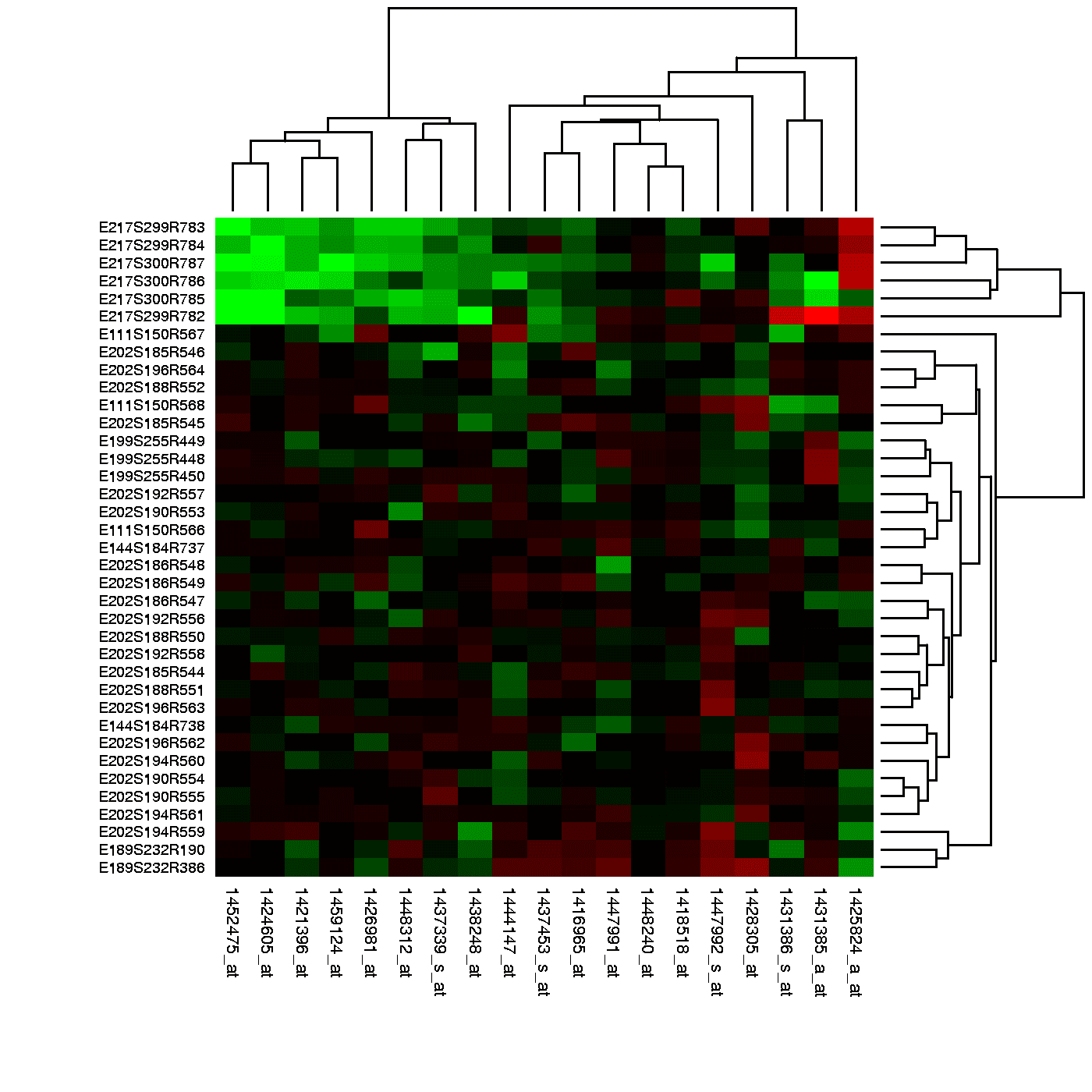
A heatmap is a weather map for your webpage, showing 'hot' spots of high engagement and 'cold' spots users ignore. Use it to see which headlines get clicks or how far down a sales page users scroll.
WHY IT EXISTS Raw analytics data, like a table of X/Y click coordinates or scroll depth percentages, is precise but not intuitive. It's hard to look at a spreadsheet and understand user behavior. Heatmaps were created to translate this raw data into an immediate, visual format that can be understood in seconds.
THE MENTAL MODEL Think of a heatmap like an infrared camera pointed at your website or app. Instead of showing thermal energy, it shows user attention. Bright red areas are 'hot' spots where many users clicked, moved their mouse, or lingered. Blue and green areas are 'colder,' indicating less interaction. It lets you see your interface through your users' collective eyes.
HOW IT WORKS A tracking script on your page records user interactions—clicks, mouse movements, and scroll positions. This data is aggregated, and a semi-transparent color overlay is generated and placed on top of a screenshot of the page. The color at any given point corresponds to the density of interactions there. Red means high density, yellow medium, and blue low. The result is a two-dimensional picture of value magnitude, just as the definition states.
WHEN TO USE IT Use heatmaps to validate design changes, analyze landing page performance, or understand A/B test results. Click maps show what users are trying to interact with, including non-clickable elements (revealing user confusion). Scroll maps show how far users get down a page, telling you where your content stops being engaging. Move maps show where users' cursors hover, which often correlates with where their eyes are looking.
WHEN NOT TO USE IT Heatmaps show the 'what,' not the 'why.' They can't tell you if a user was happy or frustrated. They are also unreliable for pages with dynamic, personalized, or frequently changing content, as the underlying screenshot won't match what every user saw. Finally, they require significant traffic to be statistically meaningful; a heatmap from 20 users is just noise.
ONE CANONICAL EXAMPLE A content team notices a blog post has a high bounce rate. A scroll map reveals 80% of users leave before scrolling past the first 25% of the page. The team sees a large, uninteresting stock photo right below the headline. They replace it with a compelling summary graphic and re-run the analysis. The new scroll map shows 60% of users now reach the end of the article. The heatmap didn't solve the problem, but it correctly identified where the problem was.
Read the original → en.wikipedia.org
Get five bites like this every day.
Tezvyn delivers a daily feed of 60-second tech bites with quizzes to lock in what you learn.