How would you apply progressive disclosure to UI copy and tooltips?
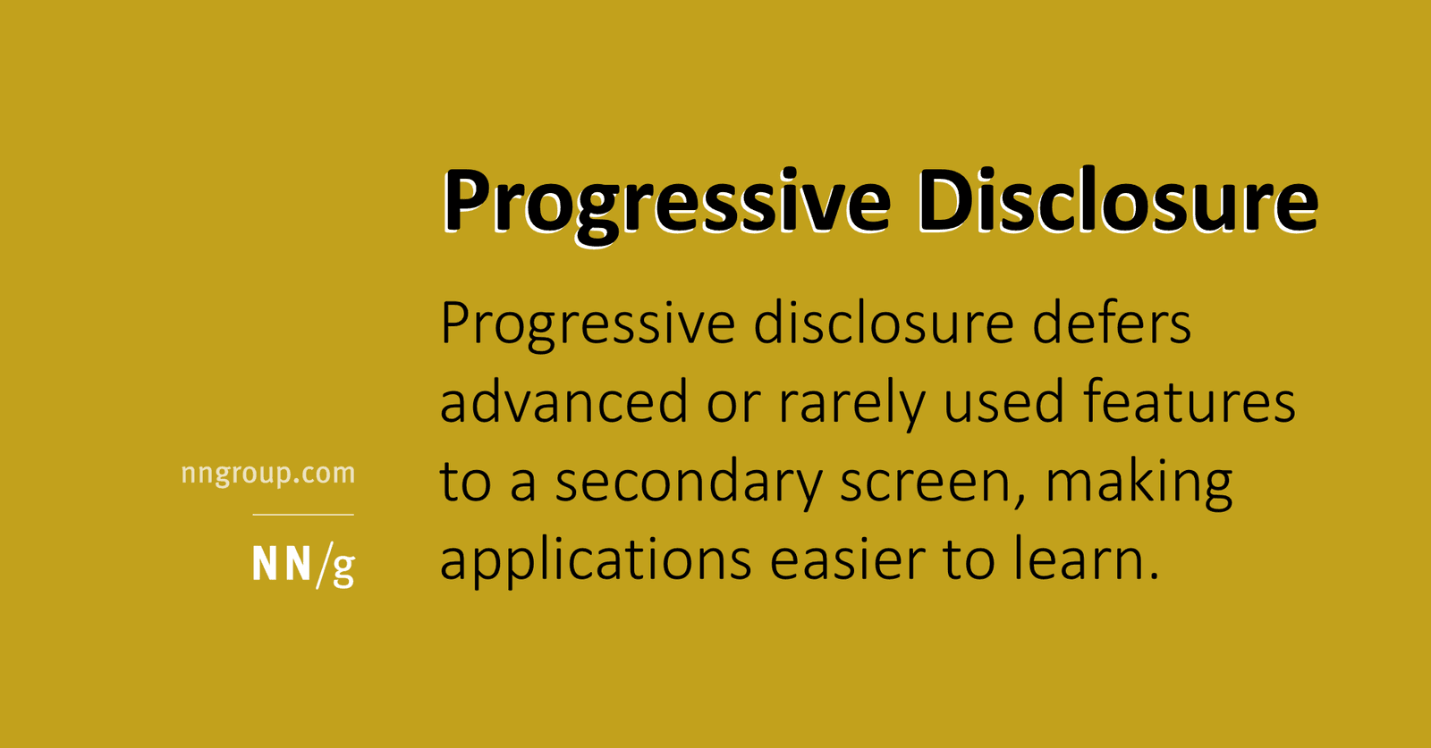
Tests tiering copy by expertise. Good answers: show plain labels and short tooltips for common tasks; hide advanced settings, risks, and edge-case definitions behind expanders or secondary sheets. Red flag: dumping all help text inline to eliminate clicks.
What's really being asked
Whether you treat copy as an information architecture problem, not just a wording problem. Interviewers want to see that you know how to reduce cognitive load by splitting primary from secondary information, and that you understand the trade-off between discoverability and simplicity. The question specifically checks if you can apply the principle to microcopy like labels, tooltips, and help text rather than only to navigation or layout.
The full answer
Four things in order. First, the primary layer should show only the most important option names and one-line plain language descriptions so users know what a setting does without wading through edge cases. Second, concise tooltips should cover the eighty percent use case, answering the most likely question in one sentence. Third, advanced or rarely needed details such as permission requirements, downstream consequences, or niche configuration options should be deferred to an expandable Learn more section, a secondary sheet, or a progressive tooltip. Fourth, the candidate should explicitly connect this tiering to cognitive load by citing that visible items signal importance, that novices avoid mistakes when they are not forced to scan irrelevant details, and that experts save time because they do not have to read past explanations they already know.
The mistakes people make
Three red flags stand out. One, suggesting that all help text should be visible inline to minimize clicks, which ignores the NN/G finding that hiding advanced features helps novices prioritize and reduces error rates. Two, describing progressive disclosure only as a visual design or navigation pattern without mentioning how the copy itself must be rewritten for each tier. Three, failing to explain how the split reduces cognitive load, usually by giving a vague answer like it makes the UI cleaner instead of referencing learnability, efficiency, or error rate.
What usually comes next
The interviewer may ask how you decide what belongs in the primary versus secondary layer, so be ready to say you use frequency of use and risk of harm as your split criteria. They may also ask how you handle discoverability for the hidden content, which is a good moment to mention clear link labels like Advanced print settings rather than vague terms like More. A third follow-up could be how you measure whether your disclosure split is working, where you should mention task success rates for novices and time-on-task for experts.
A concrete example
Imagine a cloud storage settings page with a sync frequency toggle. The primary layer shows the label Sync files and a short tooltip Files update automatically every hour. A secondary expandable link labeled When real-time sync is available and what it costs reveals that continuous sync drains battery and requires a Business plan. This keeps the default view scannable, signals that hourly sync is the standard path, and protects novices from accidentally enabling a battery-intensive option while still making the power user feature discoverable.
Interview question
Which approach best demonstrates progressive disclosure applied specifically to UI copy and tooltips?
- a.Reserve progressive disclosure for navigation menus while keeping all setting descriptions equally detailed
- b.Display all help text inline to minimize clicks and maximize discoverability
- c.Replace tooltips with a single help link to reduce on-screen text
- d.Use short tooltips for common cases and hide advanced details behind clearly labeled expanders or secondary sheetsCorrect
Why? this is the answer
Option D correctly applies progressive disclosure by splitting primary tooltips from secondary details, which reduces cognitive load and error rates for novices while keeping experts efficient. Option B is tempting but wrong because dumping all help text inline eliminates clicks at the cost of overwhelming novices with irrelevant details.
Just read this? Test yourself on what you have been reading.
Read the original → nngroup.com
- #progressive disclosure
- #ux writing
- #cognitive load
- #information architecture
- #content design
You just looked this up. Could you explain it out loud?
That is the part interviews actually test. Tezvyn takes questions like this one and gives you what the interviewer is really checking, the answer that lands, and the mistake that ends the conversation, in the four minutes before your next meeting.
The iPhone app is on the way
We are building it. Until it lands, nothing here is held back from you: every interview card, your saved cards, streaks and the job board all work in Safari, plus hundreds of free practice quizzes of thirty questions each. Sign in and it all carries over to the app the day it arrives.
Want it as an icon? Tap Share at the bottom of Safari, then Add to Home Screen. It opens full screen and the cards you have read stay available offline.
We are hiring for this. Every open role lists the topics its interview covers, so you can prepare for the real thing rather than guessing.
See open roles