Skip to content
tezvyn:

Modular Grid: Organizing UI with Cells, Not Just Columns
Source: uxpin.comMediumHow cards are made

Modular Grid: Organizing UI with Cells, Not Just Columns

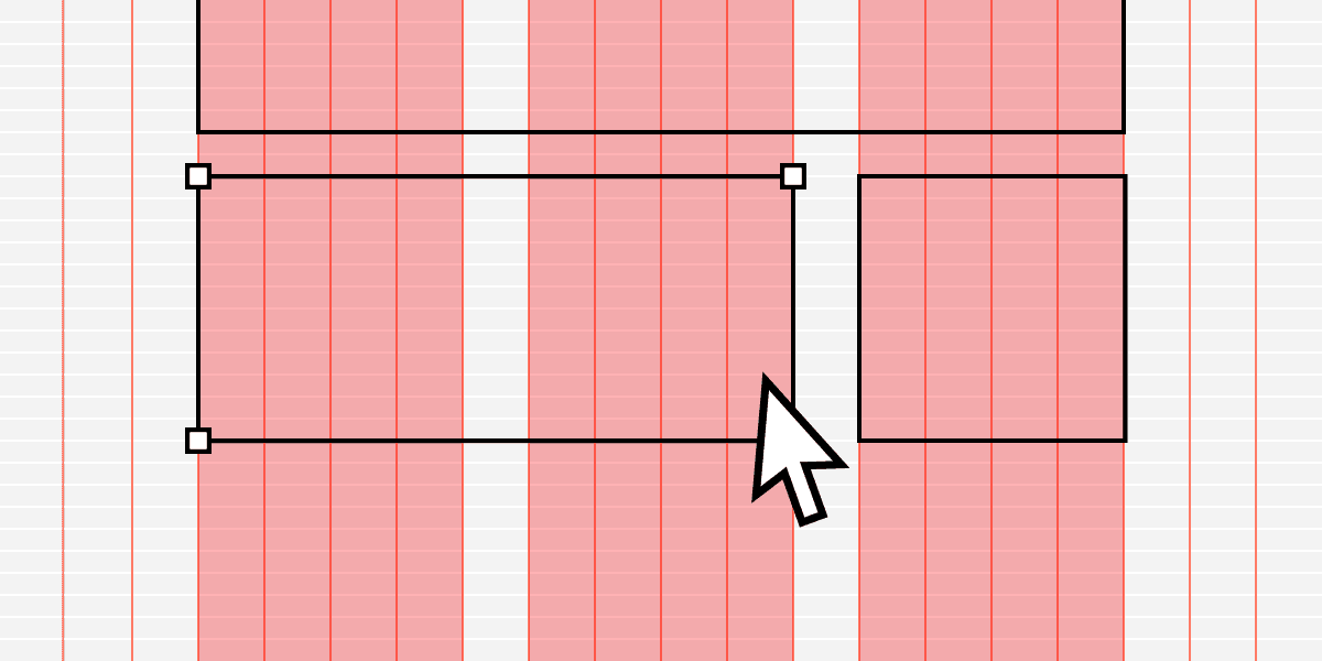
Think of a modular grid as spreadsheet cells for your UI. It extends a column grid with horizontal rows, creating a matrix of modules. It's ideal for repeating items like product cards or dashboard widgets.

Why it exists

Simple column grids are great for vertical alignment but offer no rules for horizontal alignment. When a layout features many repeating elements that need to align both down and across, like a gallery of product cards, a system is needed to control both axes. A modular grid provides this two-dimensional control, creating a more organized and harmonious layout.

The mental model

Think of a modular grid as graph paper for your interface. A standard column grid gives you vertical lines to follow, but a modular grid adds horizontal lines, creating a complete matrix of cells. Each element on the page—a card, an image, a data widget—snaps into one or more of these cells. This turns layout design from a freehand exercise into a structured, block-placing activity, ensuring perfect alignment in both directions.

How it works

A modular grid builds upon a column grid. It starts with vertical columns and gutters (e.g., a 12-column system) and adds a series of horizontal rows. These rows create rectangular units called modules. An element can occupy a single module or span across multiple modules, for instance, taking up 2 columns and 1 row. This system ensures that all elements share a common spatial relationship, making the entire layout feel cohesive.

When to use it

Use a modular grid when your layout consists of many repeating, similarly-sized items. It is the ideal choice for e-commerce product listings, image galleries, and dashboards filled with data widgets or charts. Any time you need to enforce a strict, repeating rhythm across both the X and Y axes, a modular grid provides the necessary structure and predictability.

When not to use it

Avoid a modular grid for layouts with a strong narrative flow or a clear visual hierarchy of dissimilar elements. A blog post (better for a manuscript grid) or a marketing page with a large hero image and varied sections (better for a hierarchical grid) would feel constrained. The grid's uniformity works against you when content size and importance vary wildly.

One canonical example

An e-commerce website's product listing page is a classic modular grid. Each product is presented in a "card" of identical dimensions. The grid might be four columns wide on a desktop screen. As you scroll down, the rows of cards maintain perfect horizontal and vertical alignment, creating a clean, scannable, and organized shopping experience.

Interview question

What is the primary benefit of a modular grid compared to a simple column grid?

  • a.It allows for greater variation in the size and placement of individual elements.
  • b.It simplifies the layout process by restricting all content to a single, fluid column.
  • c.It provides a structured system for aligning elements consistently across both rows and columns.Correct
  • d.It prioritizes a strong visual hierarchy by emphasizing a few dominant content areas.
Why?

The card explains that a modular grid extends a column grid with horizontal rows, creating a matrix of cells that provides "two-dimensional control" for "perfect alignment in both directions" for repeating elements. Option C accurately describes this core advantage. Options A and D describe scenarios where a modular grid is explicitly stated as not suitable, making them plausible but incorrect distractors.

Just read this? Test yourself on what you have been reading.

Read the original → uxpin.com

You just looked this up. Could you explain it out loud?

That is the part interviews actually test. Tezvyn takes questions like this one and gives you what the interviewer is really checking, the answer that lands, and the mistake that ends the conversation, in the four minutes before your next meeting.

The iPhone app is on the way

We are building it. Until it lands, nothing here is held back from you: every interview card, your saved cards, streaks and the job board all work in Safari, plus hundreds of free practice quizzes of thirty questions each. Sign in and it all carries over to the app the day it arrives.

Want it as an icon? Tap Share at the bottom of Safari, then Add to Home Screen. It opens full screen and the cards you have read stay available offline.

Get it on Google PlayiPhone app coming soon

We are hiring for this. Open roles that interview on ui design — each one lists the topics its interview covers.

See open roles