Progressive Disclosure: Show, Don't Overwhelm
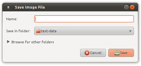
Progressive disclosure is a guided tour for your UI, revealing information only as needed. It simplifies complex forms and setup wizards by deferring advanced options, making apps easier to learn.
WHY IT EXISTS Interfaces with too many options, fields, and bits of information presented at once can overwhelm a user, leading to decision paralysis or errors. Progressive disclosure was created to manage this complexity, making applications feel simpler and easier to learn by presenting only what's necessary for the current task.
THE MENTAL MODEL Think of it as a guided tour. Instead of handing a user a massive, unfolded map of the entire city (your full UI), you give them turn-by-turn directions. You reveal the next step only when they reach the current landmark. This keeps them focused on the immediate task and prevents them from getting lost in details that aren't yet relevant.
HOW IT WORKS Progressive disclosure works by creating a clear information hierarchy. The most common or essential information and actions are visible by default. Less common, advanced, or context-specific options are hidden behind a user-initiated trigger, such as an "Advanced Settings" link, a "Show More" button, or an accordion panel. When the user interacts with the trigger, the secondary information is revealed. This allows the interface to adapt to the user's needs, revealing complexity only when requested.
WHEN TO USE IT Use this pattern for complex configuration screens, multi-step wizards, or long forms. It's ideal for separating primary tasks from advanced or rarely-used features. For example, in a user profile, basic information is visible, while options like "Deactivate Account" might be placed in an "Advanced" section.
WHEN NOT TO USE IT Avoid progressive disclosure for core, high-frequency tasks. Hiding a button that 90% of users click every session just adds friction. The biggest footgun is hiding information that is critical for making a decision on the visible part of the UI. For instance, hiding shipping costs or key terms of service behind an extra click can mislead users and destroy trust.
ONE CANONICAL EXAMPLE A classic example is the Wi-Fi connection dialog on a computer or phone. The primary interface shows a list of networks and asks for a password—the essentials. A link or button labeled "Advanced Options" or "Details" reveals a secondary screen with settings for IP configuration (DHCP vs. Static), DNS servers, and proxy settings. Most users never need these, so hiding them keeps the main task clean and simple.
Read the original → en.wikipedia.org
Get five bites like this every day.
Tezvyn delivers a daily feed of 60-second tech bites with quizzes to lock in what you learn.