Skip to content
tezvyn:

The Golden Ratio in UI Design
Source: nngroup.comHardHow cards are made

The Golden Ratio in UI Design

The Golden Ratio (1.618) is a proportion from art and nature used to create visually harmonious UI. Apply it to set layout dimensions or create a typographic scale (e.g., a 26px header for 16px body text).

Why it exists

Designers need systematic ways to create visually balanced and aesthetically pleasing compositions. The Golden Ratio provides a framework rooted in mathematics, art, and nature, which is thought to be innately pleasing to the human eye. It offers a rational basis for proportions in a design.

The mental model

Think of the Golden Ratio (φ ≈ 1.618) as a recipe for visual harmony, not a rigid blueprint. It's a proportional system where the ratio of two quantities is the same as the ratio of their sum to the larger of the two quantities. This relationship appears in the Mona Lisa and nautilus shells, and in UI, it's a guide for making elements “feel right” together.

How it works

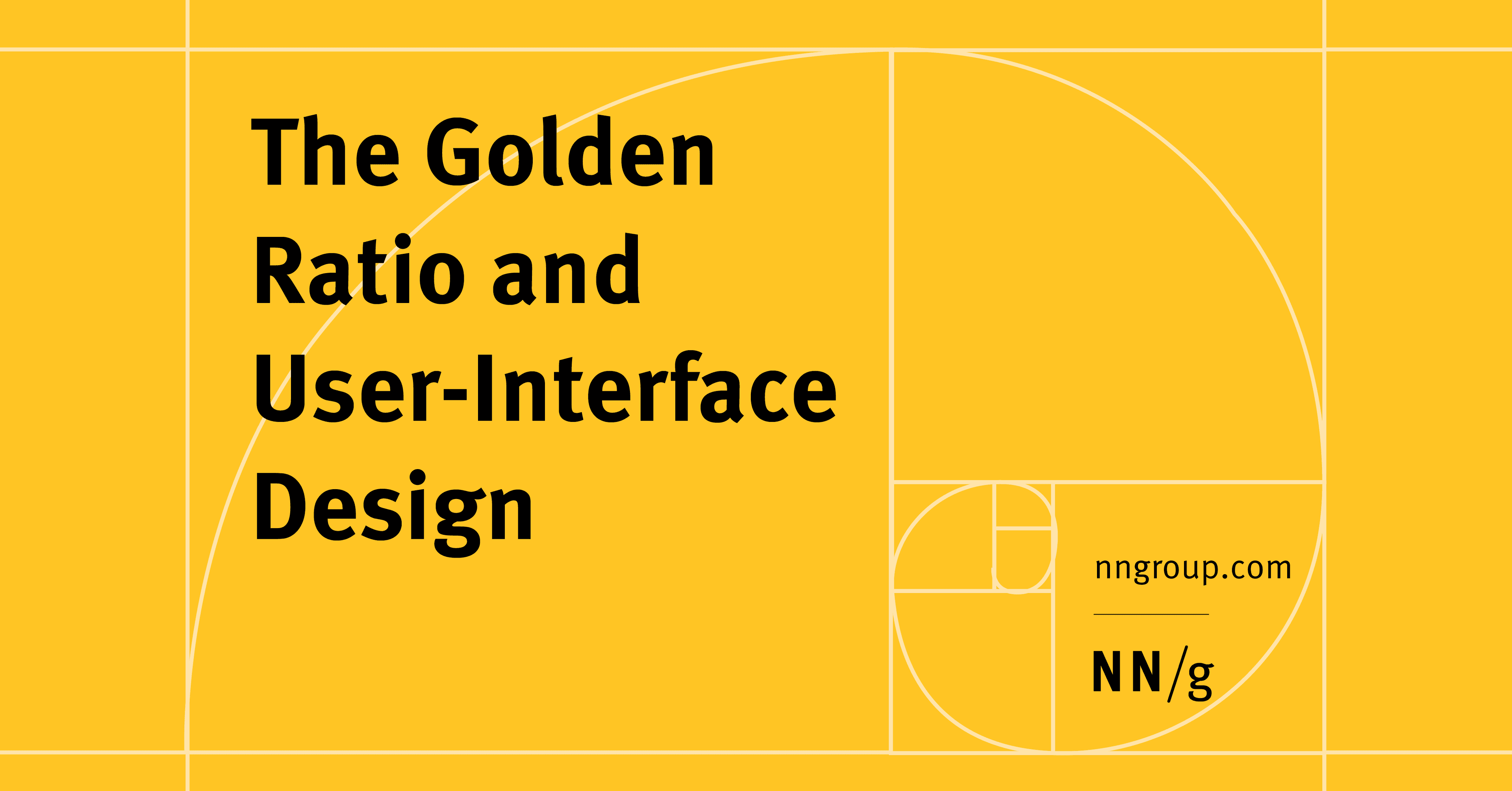
A rectangle whose sides are in the Golden Ratio is a "Golden Rectangle." If you cut a perfect square from it, the remaining smaller rectangle is also a Golden Rectangle. Repeating this process creates a spiral that can guide a user's eye. In practice, designers use it in two main ways: first, for layout, by setting the dimensions of containers like a main content column and a sidebar; second, for typography, by creating a scale where font sizes are multiples of 1.618 (e.g., a 16px body font with a 26px header).

When to use it

Use the Golden Ratio when you need a system to establish visual hierarchy and harmony, especially in early design stages. It's effective for defining the macro-layout of a page (content vs. sidebar widths) or for creating a consistent and aesthetically pleasing typographic scale. It provides a mathematical justification for choices that might otherwise feel purely subjective.

When not to use it

Do not use it as an unbreakable rule that overrides usability or content requirements. If your content or user needs demand a different layout, prioritize them. Forcing elements into these proportions can harm the user experience if it makes the interface cluttered, unbalanced, or difficult to navigate. It is a guideline, not a substitute for user testing.

One canonical example

A common application is a two-column web layout. For a total page width of 960px, you can divide it by the Golden Ratio to determine column widths. The main content area would be 960px / 1.618 ≈ 593px, and the sidebar would occupy the remaining 367px. This creates a classic, visually balanced page structure without guesswork.

Interview question

What is the primary, appropriate application of the Golden Ratio in UI design, according to the card?

  • a.To strictly dictate every aspect of visual balance, overriding content or usability requirements.
  • b.To establish a systematic, visually harmonious proportional framework for macro-layouts and typographic scales.Correct
  • c.To replace the need for user testing by guaranteeing an innately pleasing and intuitive user experience.
  • d.To precisely determine the pixel dimensions for all interactive elements and micro-components.
Why?

The card states the Golden Ratio is used for 'layout dimensions' and 'typographic scale' to create 'visually harmonious' compositions, acting as a 'guideline' or 'framework'. It explicitly warns against using it as an 'unbreakable rule that overrides usability or content requirements' or as a 'substitute for user testing'.

Just read this? Test yourself on what you have been reading.

Read the original → nngroup.com

You just looked this up. Could you explain it out loud?

That is the part interviews actually test. Tezvyn takes questions like this one and gives you what the interviewer is really checking, the answer that lands, and the mistake that ends the conversation, in the four minutes before your next meeting.

The iPhone app is on the way

We are building it. Until it lands, nothing here is held back from you: every interview card, your saved cards, streaks and the job board all work in Safari, plus hundreds of free practice quizzes of thirty questions each. Sign in and it all carries over to the app the day it arrives.

Want it as an icon? Tap Share at the bottom of Safari, then Add to Home Screen. It opens full screen and the cards you have read stay available offline.

Get it on Google PlayiPhone app coming soon

We are hiring for this. Open roles that interview on ui design — each one lists the topics its interview covers.

See open roles