Which plot visualizes a continuous versus categorical variable and why?
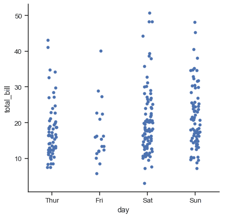
This tests categorical plot selection for continuous vs categorical relationships. A strong answer names boxplots or violinplots for distribution shape and outliers, or swarmplots for density, and cites median spread, skew, and anomalies.
What's really being asked
This question checks whether you know the three seaborn categorical plot families and can select the right level of granularity for a continuous-versus-categorical comparison. Interviewers want to see that you think about the analytical goal before picking a chart type, rather than defaulting to a generic plot.
The full answer
First, name the appropriate plot types from the distribution or scatter families. For most exploratory work, boxplots or violinplots are ideal because they reveal median, quartiles, and outliers per category. If the dataset is small, a swarmplot can show every observation without overlap. Second, explain the specific insights you would hunt for: differences in central tendency between neighborhoods, variance or skew in house prices, the presence of outliers or bimodal distributions within a single category, and whether price ranges overlap or are cleanly separated. Third, mention ordering strategy, such as sorting neighborhoods by median price to make patterns immediately visible.
The mistakes people make
A major red flag is suggesting a bar plot or line chart. Bar plots collapse the continuous distribution into a single estimate like the mean, hiding variance, multimodality, and extreme values. Another red flag is recommending a simple scatterplot without jitter or a beeswarm algorithm, which causes overplotting because all points in one category share the same x-axis position. Saying you would use a histogram alone also misses the categorical comparison aspect.
What usually comes next
The interviewer might ask how you would handle fifty neighborhoods instead of five, which could motivate switching to a boxenplot or faceted violinplots to avoid overcrowding. They might ask how you would overlay a hue dimension such as property type, which changes color grouping within each categorical bin. Another follow-up is how you would communicate the plot to a non-technical stakeholder, which tests whether you can trade statistical precision for interpretability.
A concrete example
Imagine you plot neighborhood on the x-axis and house_price on the y-axis using a violinplot. You notice that Neighborhood A has a tight distribution around three hundred thousand dollars, while Neighborhood B shows a bimodal shape with clusters at four hundred thousand and eight hundred thousand dollars. This immediately tells you that Neighborhood B contains two distinct housing submarkets, an insight that a simple mean bar would have completely obscured.
Interview question
Why is a violinplot generally preferred over a bar plot when exploring house prices across neighborhoods?
- a.It preserves the full distribution, revealing features like bimodality and outliers that a bar plot's single statistic would obscure.Correct
- b.It is the default choice for non-technical audiences because it requires no explanation of medians or quartiles.
- c.It avoids overplotting by displaying every individual data point in a beeswarm arrangement.
- d.It summarizes each neighborhood with a single estimate and confidence interval for faster interpretation.
Why? this is the answer
The card states that bar plots collapse a continuous distribution into a single estimate like the mean, hiding variance, multimodality, and extreme values, whereas violinplots reveal the full distribution shape. Option D actually describes the key limitation of a bar plot, not an advantage of a violinplot.
Just read this? Test yourself on what you have been reading.
Read the original → seaborn.pydata.org
- #data visualization
- #seaborn
- #categorical plots
- #exploratory data analysis
- #interview prep
You just looked this up. Could you explain it out loud?
That is the part interviews actually test. Tezvyn takes questions like this one and gives you what the interviewer is really checking, the answer that lands, and the mistake that ends the conversation, in the four minutes before your next meeting.
The iPhone app is on the way
We are building it. Until it lands, nothing here is held back from you: every interview card, your saved cards, streaks and the job board all work in Safari, plus hundreds of free practice quizzes of thirty questions each. Sign in and it all carries over to the app the day it arrives.
Want it as an icon? Tap Share at the bottom of Safari, then Add to Home Screen. It opens full screen and the cards you have read stay available offline.
We are hiring for this. Open roles that interview on data visualization — each one lists the topics its interview covers.
See open roles