Easy everything in Design & UX, page 9

prefers-color-scheme: Respect User Theme Preferences
The prefers-color-scheme media query lets your CSS automatically adapt to a user's system-wide light or dark mode. It's used to create themes that respect user preferences.
CSS Custom Properties: Variables for Your Stylesheet
CSS custom properties are variables for your design system. Define a value like --primary-color once on :root and reuse it everywhere. This is ideal for theming, like switching between light and dark modes.
Theme Provider Pattern: Centralized UI Styling
A Theme Provider acts like a global style guide, injecting design tokens like colors and fonts into all child components. It's used in frameworks like React to ensure a consistent look and feel. The footgun: components outside the provider won't get the theme.
Semantic Versioning: The MAJOR.MINOR.PATCH Contract
Semantic Versioning (MAJOR.MINOR.PATCH) is a contract that tells users if an update will break their code. It's used by package managers to safely resolve dependencies.
System Usability Scale (SUS): A Quick Usability Score
The System Usability Scale (SUS) is a 10-question survey that gives a single 0-100 score for a system's perceived usability. It's a quick, industry-standard way to benchmark usability. The biggest footgun: the score is not a percentage; 68 is average.
Design System Feedback: Start with User Needs
A design system's success depends on feedback from the end-users of the products it builds, not just its internal consumers. Prioritize features and validate designs by continuously testing with real people to ensure the system solves actual user problems.
Driving Design System Adoption
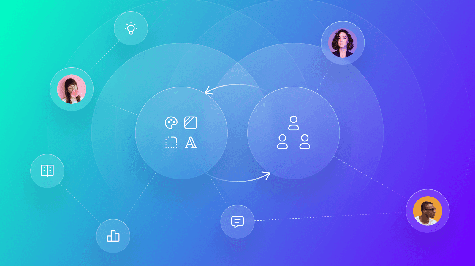
A design system's value isn't in its components, but in its use. Drive adoption by creating collaborative feedback loops with users through interactive workshops and dedicated office hours.
Design System Triage: Treating Your DS Like a Product
Treat your design system like a product, not a static library. It requires a triage process to handle bugs and feature requests from its users—your designers and developers. This applies when a component breaks or needs a new feature.

Image Alt Text: What Screen Readers Say About Pictures
Alt text tells screen readers what to say when an image can't be seen. For a photo, describe the scene. For a button, describe its action ("Submit form"). For pure decoration, use an empty alt="" to tell screen readers to skip it.
Keyboard Focus Order: Navigating by Tab
Keyboard focus order is the path a user takes through your UI using only the Tab key. It must follow a logical sequence that preserves meaning, especially in forms and modals. The footgun is when CSS creates a visual layout that diverges from the HTML.
WCAG Conformance Levels: A, AA, and AAA
WCAG levels are a tiered rating for web accessibility. Level A is the minimum, AA is the widely accepted standard, and AAA is the highest. This helps teams set clear, testable goals. The footgun: don't require AAA for an entire site, as it's often impossible.

Package Publishing: Sharing Your Code with the World
Publishing a package is like adding a book to a public library, making your code reusable with one command. It's essential for sharing design system components or utilities. The footgun: accidentally publishing secrets or making a private package public.

Storybook: A Workshop for Isolated UI Components
Storybook is a workshop for building UI components in isolation, separate from your app's business logic. It's ideal for developing edge cases and documenting a design system.
Figma Team Libraries: A Single Source of Truth
Think of a Figma Library as a shared box of official LEGOs for your team. It ensures everyone uses the same approved components, styles, and variables, keeping designs consistent. The biggest footgun is forgetting to publish changes to the main components.
Design System Onboarding: The Welcome Mat
Design system onboarding is a welcome mat, not a full manual. It orients new users by explaining the system's purpose and scope, then routes designers to interactive guides and engineers to implementation docs. The footgun is information overload.
Modal Dialogs: The Focus Trap Pattern
A modal dialog is a "focus trap" that overlays the UI, forcing a user to complete a task. It's used for critical confirmations or focused inputs, like a date picker. The main footgun is failing to trap keyboard focus, letting users tab into the inert.
Footer Layout Patterns
A footer is a safety net for users who reach the bottom of a page without finding what they need. Use a "Big" footer for complex sites, "Medium" for standard ones, and "Slim" for simple pages.
Component Composition: Treat a Group Like an Individual
Component composition treats a group of objects the same as a single one. This allows building complex UIs by nesting simple components, like putting a Button inside a Form. The footgun is creating monolithic components instead of small, reusable ones.
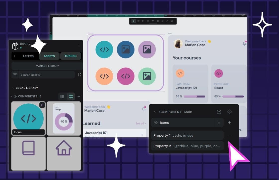
Component Variants: One Component, Many Forms
Component variants are like Lego bricks for your UI: one block can build many things. Instead of creating a unique component for every button state or size, you define properties to manage its variations.
Spacing Scales: Using Multiples for Consistent UI
A spacing scale builds consistent UI layouts from a limited set of values, usually multiples of a base unit like 8px. It's used for everything from button padding to page gaps. The footgun is using arbitrary pixel values, which breaks the system's rhythm.
We are hiring for this. Every open role lists the topics its interview covers, so you can prepare for the real thing rather than guessing.
See open roles