Intermediate everything in Design & UX, page 17
Boolean Component Properties in Figma
Boolean properties in Figma are light switches for layers inside a component. They let you toggle an icon or badge on and off without spawning extra variants. The catch is that hiding a layer can break auto-layout if that layer was anchoring spacing.
Text Resizing in Figma Auto Layout
Text in Auto Layout does not wrap by default. A label set to Auto Width grows forever, while a parent set to Hug follows it. The footgun is leaving text on Auto Width inside a responsive card and expecting it to behave like a paragraph.
Component Properties: Levers Without Variants
Component properties are levers that let you swap text, toggle layers, or change icons without detaching. They shine in buttons with optional icons. The footgun is adding so many toggles that the panel becomes harder to use than a tidy variant grid.
Masking: Hide Pixels Without Deleting Them
A mask is a stencil that hides everything outside its shape without destroying the original image. Use it for circular avatars and rounded photo crops. The hidden portion still exists, so exporting without flattening may bloat the file with invisible pixels.
Components: One Master, Many Instances
A component is a master spawning linked copies; edit it and all copies update instantly. Use them for buttons and cards that repeat so one edit flows everywhere. Detach instances or override everything and you kill reusability, forcing manual fixes.
Alignment: Invisible Lines That Structure Interfaces
Alignment is invisible scaffolding: eyes travel along shared edges instead of hunting anchors. In Figma, left-aligning labels and inputs turns chaos into readable flow. Center-aligning long text is the footgun; ragged invisible edges increase reading friction.
Font Pairing Is Casting, Not Matchmaking
Font pairing is casting: one lead voice, one supporting role that contrasts without competing. A display headline face plus a neutral body sans guides the eye through a dashboard. Using two fonts with similar weights or x-heights creates noise, not hierarchy.
Figma Permissions Cascade Downward
Figma permissions flow downward: team access opens every project and file inside it. Use share links for quick reviews, but direct invites gate specific files. Inviting someone to a team exposes every project, while a file invite keeps the rest hidden.
Mathematical Expressions in Figma Prototypes
Use variable modes as contexts for math in Figma prototypes. Instead of creating one variable per item, a single number variable with multiple modes lets expressions calculate independent counts, like separate produce counters in a shopping cart.
Rhythm and Repetition in UI Layouts
Rhythm turns random elements into scannable patterns by repeating spatial intervals, not just shapes. Use it in lists, dashboards, and card grids where users hunt for information.
What WAI-ARIA attributes and keyboard interactions make Tabs accessible?
This tests mastery of the W3C Tabs pattern. A strong answer covers role tablist tab tabpanel, aria-selected, aria-controls, and arrow-key roving focus with optional auto-activation. A red flag is treating tabs as buttons and relying only on the Tab key.

How would you structure a flexible Card component API?
Tests composition-over-configuration thinking in design systems. A strong answer uses compound components or slots so consumers reorder or omit title, image, and body freely without prop drilling. Red flag: rigid boolean props that freeze layout order.
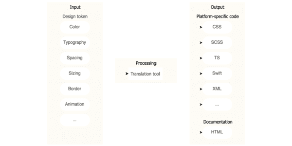
Design token pipeline serving Web, iOS, and Android
This tests cross-platform design system architecture and governance. A strong answer uses W3C JSON tokens in option, decision, component layers, with Style Dictionary generating Web, iOS, and Android outputs. Red flag: using Figma or CSS as source of truth.

What metrics measure design system success and adoption?
Tests if you connect design system health to delivery speed and consistency. Strong answers hit adoption rate, component usage, design-to-code parity, and accessibility compliance tied to team behavior.
What are design tokens and why standardize them?
Tests whether you treat tokens as API contracts between design and engineering. Strong answers define platform-agnostic decisions, cite W3C DTCG spec for cross-platform codegen, and note aliasing prevents drift.

How would you build a design system business case for leadership?
Audit inefficiencies with metrics, map the pitch to stakeholder priorities like ROI and velocity, and contrast build cost with projected savings.
Map Components to Native Platform Equivalents
Map design system components to native OS equivalents instead of forcing identical custom widgets everywhere. Use this when cross-platform apps must respect platform conventions.
Material Design: Android's Paper Metaphor
Material Design models Android UI as stacked paper with light and elevation. It ships pre-built components like cards and FABs so your app feels native immediately.
Structural vs. Thematic Tokens: Job vs. Value
Structural tokens describe the role, like text-primary; thematic tokens describe the value, like blue-500. Split them so retheming does not require hunting hexes. The footgun is using only thematic tokens, which hardcodes intent and breaks dark mode.
Scoped Theming: Local Overrides Without Global Leaks
Scoped theming is sunglasses for a UI subtree: it swaps tokens for one section without touching the global page. Use it for a dark-mode dashboard or white-label widget inside a light app, but avoid deep nesting or you will fight invisible inheritance chains.
We are hiring for this. Every open role lists the topics its interview covers, so you can prepare for the real thing rather than guessing.
See open roles