Intermediate everything in Frontend Dev, page 26
Emotion: Component-Scoped Styles in JavaScript
Emotion lets you write CSS directly in your JavaScript, keeping styles and logic colocated. It's ideal for dynamic, component-scoped styles in React that avoid global conflicts.
Integrating Sass/SCSS in Next.js
Next.js has built-in Sass support, letting you use variables, mixins, and nesting. Import .scss files for component-scoped styles or global stylesheets. The main footgun: you must install the sass package yourself; it's not included by default.
next/dynamic: Defer Loading Heavy Components
next/dynamic splits a component into its own file, loading it only when needed to shrink your initial bundle. Use it for heavy components below the fold or browser-only libraries. The footgun: forgetting a loading state causes layout shifts.
Next.js Layouts: Shared UI That Survives Navigation
Think of a Next.js Layout as a picture frame that stays put while you swap the pictures (Pages) inside. It defines shared UI like headers that persist across routes, preserving state.
Compound Components: Build Flexible APIs via Shared State
Think of HTML's <select> and <option>. The Compound Component pattern lets a parent manage state while children act as declarative configuration. It's used for flexible UI like tabs or accordions.

useMemo: Cache Expensive Calculations in React
The useMemo hook caches a function's return value, preventing slow calculations from running on every render. Use it to skip heavy data filtering unless its inputs change. The main footgun is a missing dependency, which leads to stale, cached data.
React's useCallback: Cache Functions, Not Just Values
useCallback gives you the same function instance across re-renders, as long as its dependencies are stable. This is key for optimizing child components with React.memo or preventing useEffect from re-running.
The useReducer Hook: Predictable State Updates
useReducer is a state machine for your components, managing complex state changes predictably. Use it when state logic is complex or the next state depends on the previous one, like in a shopping cart.

Custom Hooks: Package Component Logic for Reuse
A custom hook packages stateful logic (like useState and useEffect) into a reusable function. Use one when multiple components need the same logic, like tracking online status for a status bar and a save button. Footgun: Names must start with use.
Thinking in React: Decomposing UIs into Components
Think of UIs not as one big page, but as a tree of reusable components. Start by breaking a design mockup into a hierarchy of pieces. The footgun is creating 'god components' that do too much; each component should have a single responsibility.
useEffect: Syncing React with the Outside World
useEffect synchronizes your component with systems outside React's control, acting as a bridge to the browser or network. It's for data fetching or subscriptions.
Conditional Rendering: Show UI Based on State
React uses plain JavaScript to decide what UI to show, which is essential for displaying loading states, errors, or user-specific content. The footgun: count && <Component /> will render a "0" if count is 0, not nothing.
React Events: Pass, Don't Call
React handles user actions with event handler functions passed as props, like onClick={handleClick}. This is how you make buttons or forms interactive. The key mistake is calling the function (onClick={doIt()}), which runs on render, not on click.
useState: Giving Components Memory
useState gives a component its own memory, letting it track information that changes over time. It's used for everything from handling form input to toggling UI. The biggest footgun: state updates are asynchronous and only apply on the next render.
Component Usage Guidelines: The Manual for Your Design System
Usage guidelines are the instruction manual for your design system, ensuring consistency. They prevent developers from guessing button states and designers from stretching logos.

Bundle Size: When Runtime Dependencies Defeat Tree Shaking
Tree Shaking is static, but your app is dynamic. It can fail when a component imports a large dependency for an optional, runtime-configured feature. A UI library's provider might pull in an entire form library, even if you don't use it.

Atomic CSS: Styling with Single-Purpose Utilities
Atomic CSS builds interfaces with tiny, single-purpose classes directly in your HTML, like using LEGO bricks for styling. It's the core of frameworks like Tailwind CSS, letting you build UIs without writing custom CSS. The footgun is creating unreadable HTML.
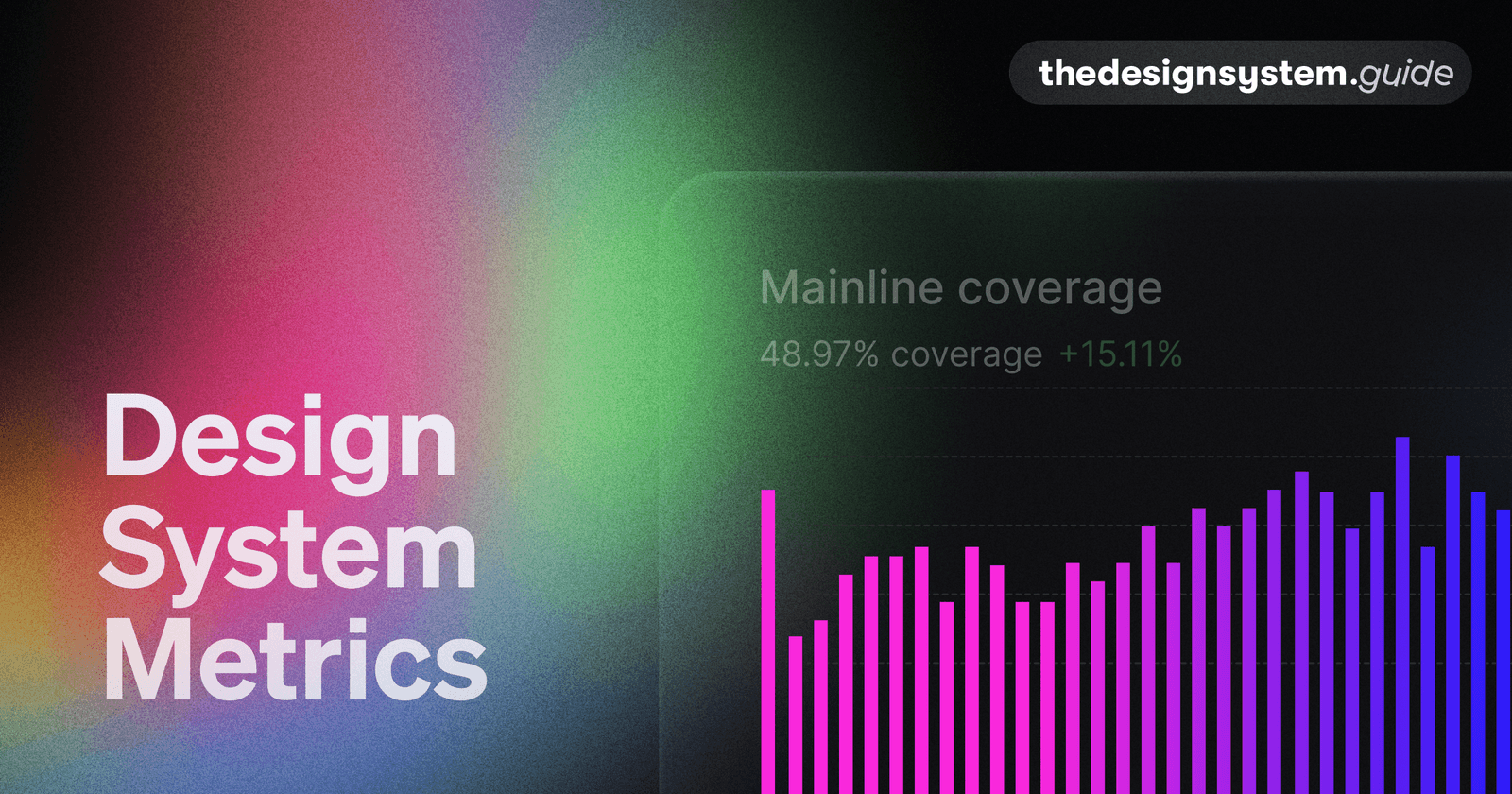
Design System Metrics: Proving Its Worth
Prove your design system's value with data, showing it's a force multiplier, not just a library. Track metrics like component adoption and faster time-to-market to justify budget and guide your roadmap. The footgun: avoid vanity metrics like component count.
Architectural Decision Records (ADRs): Documenting 'Why'
An ADR is a short text file capturing the 'why' behind a key engineering choice. Use it for big decisions like choosing a library or defining a core pattern.
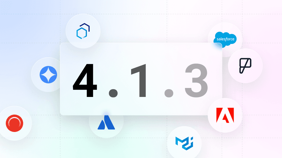
Versioning Design Systems: Holistic vs. Incremental
Versioning a design system is about communicating change. Use Semantic Versioning (MAJOR.MINOR.PATCH) to signal update impact. This prevents teams from using outdated components, ensuring consistency.
We are hiring for this. Every open role lists the topics its interview covers, so you can prepare for the real thing rather than guessing.
See open roles