All bites
The whole library, newest first. Filter by what you are here for, or pick a topic if you already know.
8664 bites
Page 58

Rule of Thirds: Guide the Eye, Don't Just Center
Don't center your subject; place key elements along the lines or intersections of a 3x3 grid. This creates a more dynamic, visually interesting composition in photos and UI layouts. The footgun is treating it as a rigid law; sometimes centering is better.
How do you build a responsive Figma component across breakpoints?
Tests Figma auto layout and constraint logic for responsive components. Strong answers mention nested frames, hug/fill modes, breakpoint variants or variables, and resizing previews. Red flag: copying static frames instead of using constraints.
Color Schemes: The Logic of Color Harmony
A color scheme is a logical combination of colors to achieve a goal, not just a random palette. It's used in UI design for brand consistency, in data viz to encode information, and in safety systems for high visibility.
How do you enforce proximity with Figma Auto Layout and spacing variables?
Tests translating Gestalt proximity into systematic spacing. Strong answers map t-shirt scales to Auto Layout gap and padding, then bind them to Figma spacing variables. Red flag: confusing proximity with alignment or manual nudging.
WCAG Color Contrast: A Readability Score, Not an Opinion
WCAG color contrast is a mathematical ratio ensuring text is readable for people with vision impairments. Use it for all text and UI elements. The footgun is only testing on a good monitor or forgetting that large text has a lower 3:1 requirement.
How do you apply systematic rules to asymmetrical layouts predictably?
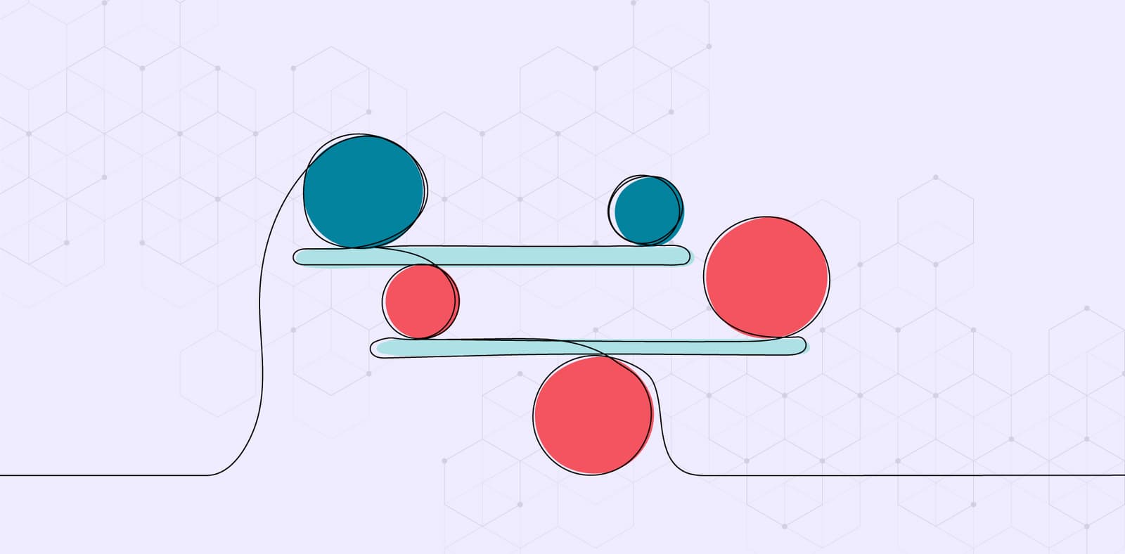
Grid and spacing tokens as guardrails; deliberate ratios create asymmetry, not random offsets; engineers get rules, not pixels.

SVG: Code-Based, Infinitely Scalable Graphics
Think of SVG as HTML for graphics. It's an XML file with drawing instructions, not pixels, so images scale perfectly. It's ideal for logos and icons on responsive sites. The footgun: SVGs can contain JavaScript, posing a security risk (XSS) if not sanitized.
How do you optimize nested Auto Layout for performance?
Tests architectural restraint and layer complexity in Figma. Strong answers use Grid and Wrap to avoid deep nesting, remove redundant groups, and favor component instances. Red flag: proposing invisible spacers or manual positioning hacks.
.png&w=1600&q=75)
Icon System Design: Build Once, Use Everywhere
Treat icons as reusable building blocks, not one-off graphics. A systematic setup in Figma ensures consistency and speeds up your entire design process. The footgun is skipping standardization, which creates tedious overrides and visual debt later on.
When would you wrap layers in a Frame versus a Group?
Use a Frame when you need Clip content, scroll overflow, or constraints on children.

Kerning, Tracking, and Leading: Spacing in Typography
Kerning adjusts space between two letters, tracking adjusts space across a whole word, and leading controls vertical line spacing. These are used in UI and branding to improve readability. The footgun is confusing kerning (pairs) with tracking (groups).
How would you inspect a Figma text element for CSS properties?
Your Figma-to-CSS typography workflow. A good answer selects the layer, opens the Properties tab or Dev Mode, reads font family, weight, size, line height, and letter spacing, and uses Copy as code.
Semantic Naming for Design Tokens
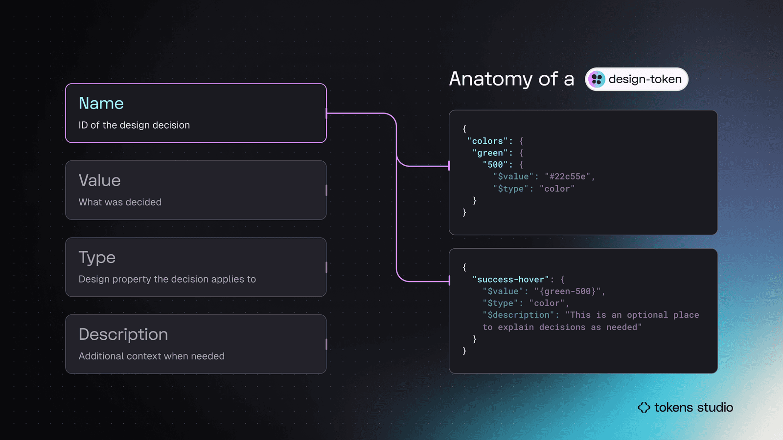
Don't name a token by its value (blue-500); name it by its job (color.action.primary). This decouples design intent from implementation, making systems scalable. It's key for theming and avoiding "lie" variables when designs change.
How do you build a responsive card with Auto Layout?
Tests nested Auto Layout and resizing logic. Answer: vertical hug frame, nested vertical text stack with hug height, image set to fill width, plus padding. Red flag: fixed-height text or absolute positioning breaks responsiveness.
White Space: Designing with Nothing
White space isn't just empty background; it's an active tool for grouping related elements and separating unrelated ones. Use it to improve readability and create focus. The footgun is seeing it as leftover space to be filled, which creates visual clutter.
How do you pin a Close icon to a modal's top-right corner?
This tests Figma constraint knowledge for responsive resizing. A strong answer sets horizontal to Right and vertical to Top so the icon pins to the corner as the modal resizes.
Figma's Auto Layout Grid
Figma's Auto Layout Grid arranges items in a true 2D grid of rows and columns. Use it for complex, responsive layouts like dashboards or bento boxes. The footgun is expecting items to auto-wrap; it's a structured grid, not a flowing container.
How would you structure Figma colors for light and dark themes?
Fluency with token layers and Figma's mode-aware raw values. Use aliased color variables for semantics, switch themes via variable modes, and apply variables to styles not relying on styles for modes. Suggesting styles handle theming instead of variables.

Focal Point: You Can't Emphasize Everything
A focal point guides the user's eye by making one element dominant. To make something stand out, other elements must fade into the background. Use it to draw attention to a call-to-action or headline. The footgun is trying to emphasize everything at once.
How would you use Auto Layout for a button with optional icon?
This tests Figma Auto Layout for responsive components. Answer: apply horizontal auto layout, set fixed padding and spacing, set text to hug contents, and set the frame to hug so it resizes when text changes. Red flag: using fixed widths or manual resizing.