Component Naming: A Shared Language for UI
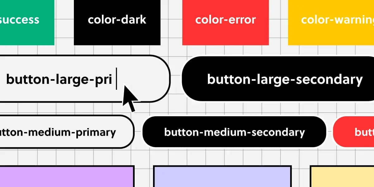
Think of naming conventions as a shared dictionary for your team. A name like ButtonPrimary should mean the same thing in Figma and in code, ensuring consistency.
Why it exists
To solve the chaos that happens when designers and developers use different names for the same UI element. Without rules, a 'main call to action' in a design file might become cta-button, submitBtn, or PrimaryAction in code, leading to confusion, duplication, and maintenance nightmares.
The mental model
Treat your naming convention as a formal API for your user interface. Just as a good API has clear, predictable function names, a good UI naming system has clear, predictable names for every component, token, and state. The goal is for anyone on the team to look at a name like CardWithImage--Featured and know exactly what it is and how it relates to other components.
How it works
A good system names elements based on their function, not their appearance. It uses a consistent structure, often following a pattern like Block-Element--Modifier. For example: Block is the component (Button), Element is a part of it (Icon), and Modifier is a variation or state (--Disabled). This structure applies to everything: components (ButtonPrimary), design tokens (color-background-brand), states (--hover), and sizes (--large). The key is consistency.
When to use it
Use a naming convention from day one of any project involving a design system or a reusable component library. It is essential for collaboration between design and engineering, ensuring that the component in Figma has the exact same name and conceptual model as the component in the React or CSS codebase. This prevents drift and miscommunication as the system scales.
When not to use it
For a small, one-off project with a single developer and no plans for reuse, a strict naming convention might be overkill. If you're rapidly prototyping and the UI is in constant flux with no shared library, enforcing a rigid system can slow you down. The value comes from scale and collaboration, not from rigid adherence on a throwaway project.
One canonical example
Consider a button component. Instead of naming it BigBlueButton.css, a functional approach would be Button--Primary-Large.css. Let's break it down: Button is the base component. --Primary is a modifier indicating its role as the main call-to-action. -Large is another modifier for its size. The color 'blue' is an implementation detail tied to the Primary token, which can be changed later without renaming the component itself. This decouples the component's identity from its current styling.
Interview question
What is the primary advantage of naming a component "Button--Primary-Large" over "BigBlueButton" in a design system?
- a.It ensures that the component will always maintain a consistent size across all screen resolutions.
- b.It allows the component's visual styling to change (e.g., color) without requiring a name update.Correct
- c.It enforces a stricter visual appearance, preventing designers from making unauthorized changes.
- d.It simplifies the process of searching for components within a large codebase.
Why? this is the answer
The card explains that naming based on function (like Primary) rather than appearance (like Blue) "decouples the component's identity from its current styling," meaning the color can change without renaming. Option C is incorrect because the goal is flexibility, not strict enforcement of a single style.
Just read this? Test yourself on what you have been reading.
Read the original → uxpin.com
- #design systems
- #frontend
- #ui
- #naming conventions
You just looked this up. Could you explain it out loud?
That is the part interviews actually test. Tezvyn takes questions like this one and gives you what the interviewer is really checking, the answer that lands, and the mistake that ends the conversation, in the four minutes before your next meeting.
The iPhone app is on the way
We are building it. Until it lands, nothing here is held back from you: every interview card, your saved cards, streaks and the job board all work in Safari, plus hundreds of free practice quizzes of thirty questions each. Sign in and it all carries over to the app the day it arrives.
Want it as an icon? Tap Share at the bottom of Safari, then Add to Home Screen. It opens full screen and the cards you have read stay available offline.
We are hiring for this. Open roles that interview on design systems — each one lists the topics its interview covers.
See open roles