Design System: The Whole vs. Its Parts
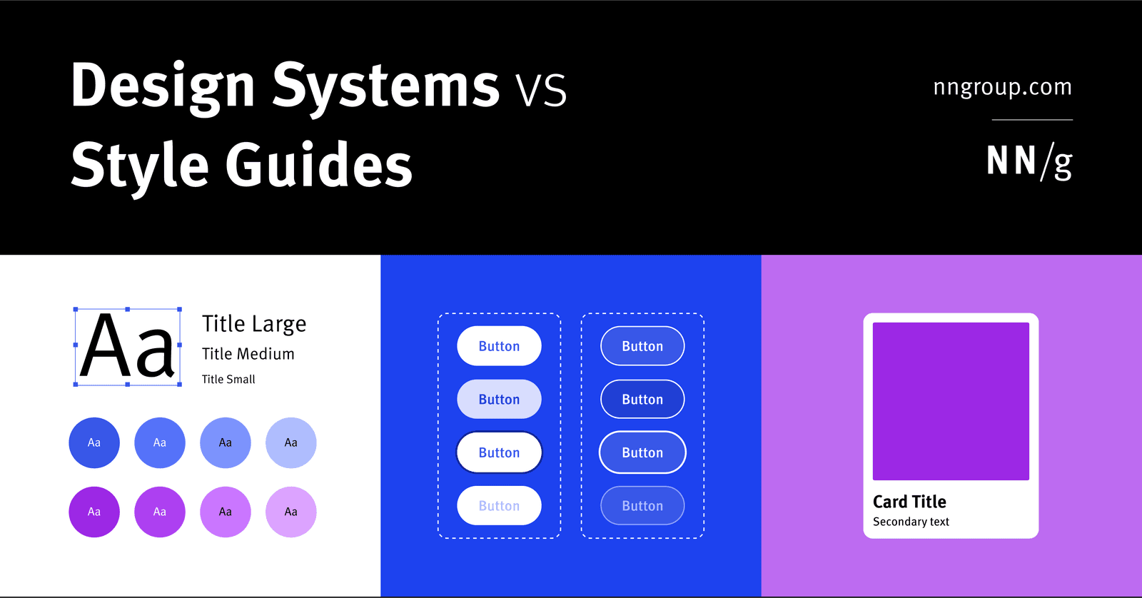
A design system is the parent; style guides and component libraries are its children. It's the full toolkit for building consistent products at scale, containing rules, patterns, and ready-to-use code.
Why it exists
In large organizations, multiple teams often design and code multiple versions of the same UI element, like a button. This leads to internal inconsistency, wasted time, and messy, duplicated code. A design system was created to solve this problem of managing design at scale.
The mental model
Think of a design system as the parent, and its children are smaller, focused pieces like style guides and component libraries. The design system is the entire Lego set—the bricks, the instructions, and the color guide—while a style guide is just the color guide and a component library is just the box of individual bricks. It is a living system, not a static document.
How it works
A design system is housed in a central repository, usually a website. It contains three main parts. First, one or more Style Guides, which are documents defining rules for specific areas like visual design (colors, fonts) or content (tone of voice). Second, a Component Library, which contains reusable individual UI elements like buttons or form fields. For each element, it provides design specs, different states (hover, disabled), and the clean code for developers to copy and paste. Third, a Pattern Library, which specifies how to combine individual components into larger, reusable groups, like a page header.
When to use it
A design system is essential for maintaining consistency when multiple teams are building a single product. It creates a shared language between designers and developers, allowing them to work faster by using pre-approved, ready-made elements. This reduces redundant work and ensures a cohesive user experience.
When not to use it
A full design system can be overkill for a small team working on a simple project. If consistency is easy to manage, the overhead of creating and maintaining a complete system may not be justified. In these cases, a simple style guide might be enough.
One canonical example
Google's Material Design is a comprehensive design system, not just a style guide. It's a repository providing principles, visual guidelines, and a library of coded components for Android, iOS, and the web. Teams can use it to build applications that look and feel like a native Google product, leveraging pre-built, tested components to ensure consistency.
Interview question
According to the card, what is the main problem a design system aims to solve in large organizations?
- a.The difficulty in rapidly deploying new product features without full redesigns.
- b.Inconsistent user interface elements and redundant work across various product teams.Correct
- c.The absence of a single, static document for all brand guidelines.
- d.The challenge of recruiting and retaining sufficient design and development talent.
Why? this is the answer
The card explicitly states that a design system was created to solve the problem of "multiple teams often design and code multiple versions of the same UI element," leading to "internal inconsistency, wasted time, and messy, duplicated code." Option B accurately summarizes this. Option A describes a benefit of a design system, not the primary problem it was created to address.
Just read this? Test yourself on what you have been reading.
Read the original → nngroup.com
You just looked this up. Could you explain it out loud?
That is the part interviews actually test. Tezvyn takes questions like this one and gives you what the interviewer is really checking, the answer that lands, and the mistake that ends the conversation, in the four minutes before your next meeting.
The iPhone app is on the way
We are building it. Until it lands, nothing here is held back from you: every interview card, your saved cards, streaks and the job board all work in Safari, plus hundreds of free practice quizzes of thirty questions each. Sign in and it all carries over to the app the day it arrives.
Want it as an icon? Tap Share at the bottom of Safari, then Add to Home Screen. It opens full screen and the cards you have read stay available offline.
We are hiring for this. Open roles that interview on design systems — each one lists the topics its interview covers.
See open roles