Five-Second Test: Capture a User's Gut Reaction
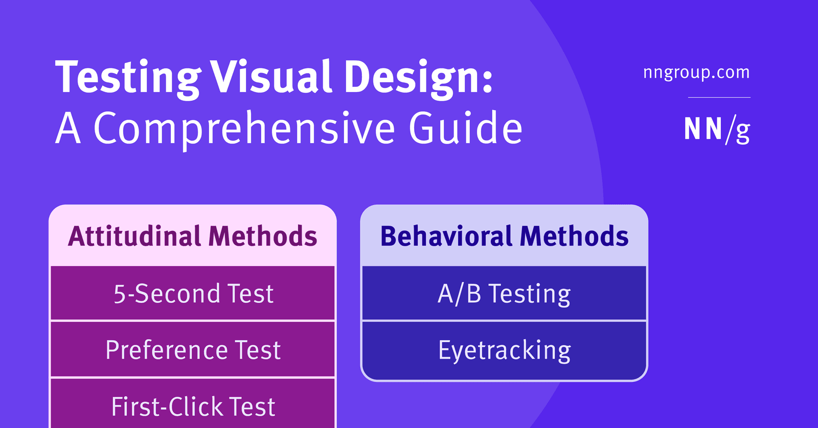
A five-second test captures a user's gut reaction by showing them a design for just five seconds. It's used to see if the visual style communicates the right brand identity before users have time to read. The footgun: don't warn users about the time limit.
Why it exists
A user's first impression of a digital product is formed almost instantly, based on visual design. Teams need a way to know if that initial "gut reaction" aligns with their brand goals, before the user gets distracted by reading copy or interacting with features. The five-second test was designed to isolate and measure this critical first impression.
The mental model
Think of it as a "glance test." You show someone a design for just long enough to form an impression, but not long enough to consciously analyze it. It measures the immediate, subconscious message your visuals send—the feeling, the purpose, the brand—separate from the explicit content or functionality.
How it works
A participant is shown a static image of a design for exactly five seconds. The image is then hidden, and the researcher immediately asks follow-up questions like, "What do you remember?" or "What was the purpose of this page?" or "Describe the design in three words." The five-second duration is the key: it's enough time to perceive the overall aesthetic but too short to read copy or notice fine details, forcing a reliance on pure visual impression.
When to use it
Use this method early in the design process to validate a visual direction. It's an attitudinal test, perfect for assessing brand perception (e.g., "Does this feel trustworthy?"), checking if the page's core purpose is clear at a glance, and gauging the overall emotional response to a design before investing in development.
When not to use it
Do not use a five-second test to evaluate usability, task completion, or navigation. Because it uses a static, non-interactive image, it cannot tell you if a user can find a button or complete a workflow. For measuring user behavior and interaction, use methods like first-click testing or full usability studies.
One canonical example
A fintech startup wants its new homepage to convey "secure" and "simple." They run a five-second test. Afterwards, most users describe the page as looking like a "bank" or being "professional," but nobody mentions simplicity. This feedback tells the team their design successfully communicates security but fails on the simplicity goal, giving them a clear, actionable insight for the next design iteration. Crucially, they don't warn participants about the time limit beforehand to capture a more authentic reaction.
Interview question
What is the main type of insight a five-second test is designed to provide?
- a.How well the visual design conveys the intended brand perception and overall message.Correct
- b.Which textual content users recall most accurately after a brief exposure.
- c.The user's ability to locate and interact with key functional elements.
- d.The ease with which users can complete a specific task on a page.
Why? this is the answer
The five-second test is designed to capture a user's immediate 'gut reaction' to a design's visual style, assessing if it communicates the right brand identity and purpose. It is explicitly stated not to be used for evaluating usability, task completion, or detailed content recall.
Just read this? Test yourself on what you have been reading.
Read the original → nngroup.com
- #ux research
- #visual design
- #user feedback
- #usability testing
You just looked this up. Could you explain it out loud?
That is the part interviews actually test. Tezvyn takes questions like this one and gives you what the interviewer is really checking, the answer that lands, and the mistake that ends the conversation, in the four minutes before your next meeting.
The iPhone app is on the way
We are building it. Until it lands, nothing here is held back from you: every interview card, your saved cards, streaks and the job board all work in Safari, plus hundreds of free practice quizzes of thirty questions each. Sign in and it all carries over to the app the day it arrives.
Want it as an icon? Tap Share at the bottom of Safari, then Add to Home Screen. It opens full screen and the cards you have read stay available offline.
We are hiring for this. Open roles that interview on ux research — each one lists the topics its interview covers.
See open roles