Heatmaps: Visualizing User Attention
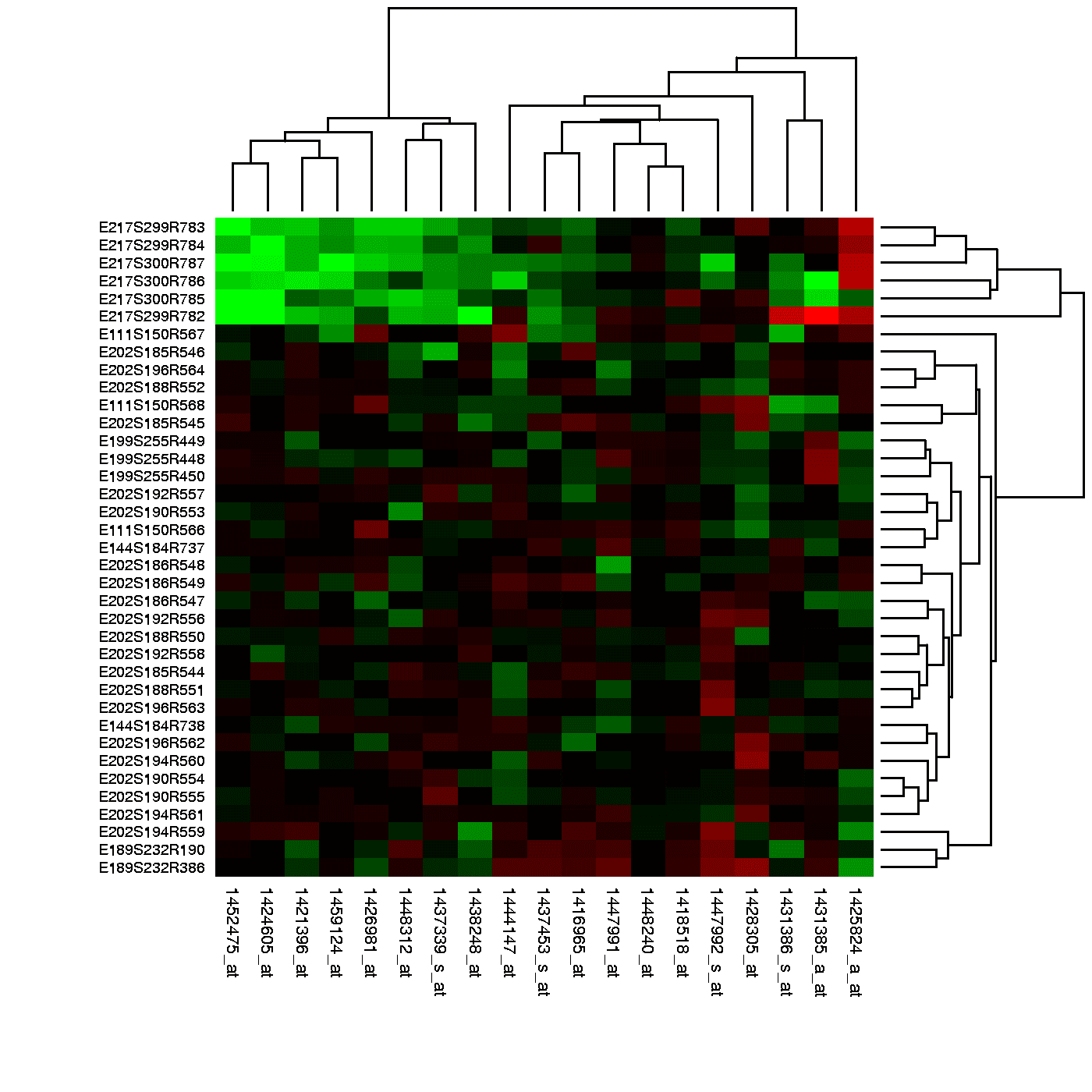
Think of a heatmap as a weather map for your app, showing 'hot' spots of user clicks and 'cold' spots they ignore. It reveals if users are clicking key buttons or getting distracted. The footgun: a hot spot can mean rage-clicks, not just engagement.
Why it exists
Raw analytics data, like a table of click counts, tells you what happened but not where or in what context. It's hard to see behavioral patterns in a spreadsheet. Heatmaps were created to translate abstract interaction data into an intuitive, visual format overlaid directly on the UI, making it easy to spot trends and problems at a glance.
The mental model
Think of a heatmap like a thermal camera pointed at your user interface. Instead of heat, it detects user attention—clicks, mouse movements, and scroll depth. Areas with high activity glow red and yellow ('hot'), while areas users ignore remain blue or transparent ('cold'). This gives you an instant, visual answer to the question: 'Where are my users actually looking and interacting?'
How it works
Heatmap tools record user interactions on a webpage or app screen. For a click map, the tool logs the X/Y coordinates of every click. For a scroll map, it tracks how far down the page each user scrolls. The tool then aggregates this data from many user sessions and overlays a color-coded layer on a screenshot of your page. The color intensity at any point corresponds to the number of interactions recorded there.
When to use it
Use heatmaps to answer specific questions about user behavior. First, for design validation: are users clicking the primary call-to-action button? Second, for content discovery: are users scrolling far enough to see important information below the fold? Third, for identifying friction: are users clicking on elements that look like buttons but aren't actually clickable?
When not to use it
Heatmaps show the 'what' and 'where,' but not the 'why.' A hot spot on a form field doesn't tell you if the user found it easy to fill out or if they struggled and had to re-click it multiple times. Always complement heatmap data with other research methods like user interviews or session recordings to understand the context behind the clicks.
One canonical example
An e-commerce site has a low conversion rate. A heatmap reveals the 'Add to Cart' button is 'cold' (few clicks), but a non-clickable promotional image is bright red. This shows users are distracted by the image and missing the main call-to-action. The team can now form a hypothesis: making the banner clickable and increasing the button's prominence will improve conversion.
Interview question
What crucial insight about user behavior can a heatmap NOT directly provide, even for a 'hot spot'?
- a.The specific elements users are interacting with.
- b.The total number of clicks on a particular area.
- c.The underlying motivation or frustration driving the user's actions.Correct
- d.Whether users are scrolling far enough to see key content.
Why? this is the answer
The card explicitly states that heatmaps show the 'what' and 'where,' but not the 'why.' A hot spot indicates high activity but doesn't differentiate between positive engagement and frustration (e.g., rage-clicks). Options A, B, and D are all types of information that heatmaps are designed to visualize.
Just read this? Test yourself on what you have been reading.
Read the original → en.wikipedia.org
Put your scrolling time to good use
Learn one idea, try a quiz and save useful cards for revision. Tezvyn makes it easy to learn and stay current in your tech field, a few minutes at a time.
The iPhone app is on the way
We are building it. Until it lands, nothing here is held back from you: every interview card, your saved cards, streaks and the job board all work in Safari, plus hundreds of free practice quizzes of thirty questions each. Sign in and it all carries over to the app the day it arrives.
Want it as an icon? Tap Share at the bottom of Safari, then Add to Home Screen. It opens full screen and the cards you have read stay available offline.
We are hiring for this. Open roles that interview on ux — each one lists the topics its interview covers.
See open roles