Measuring Documentation Effectiveness
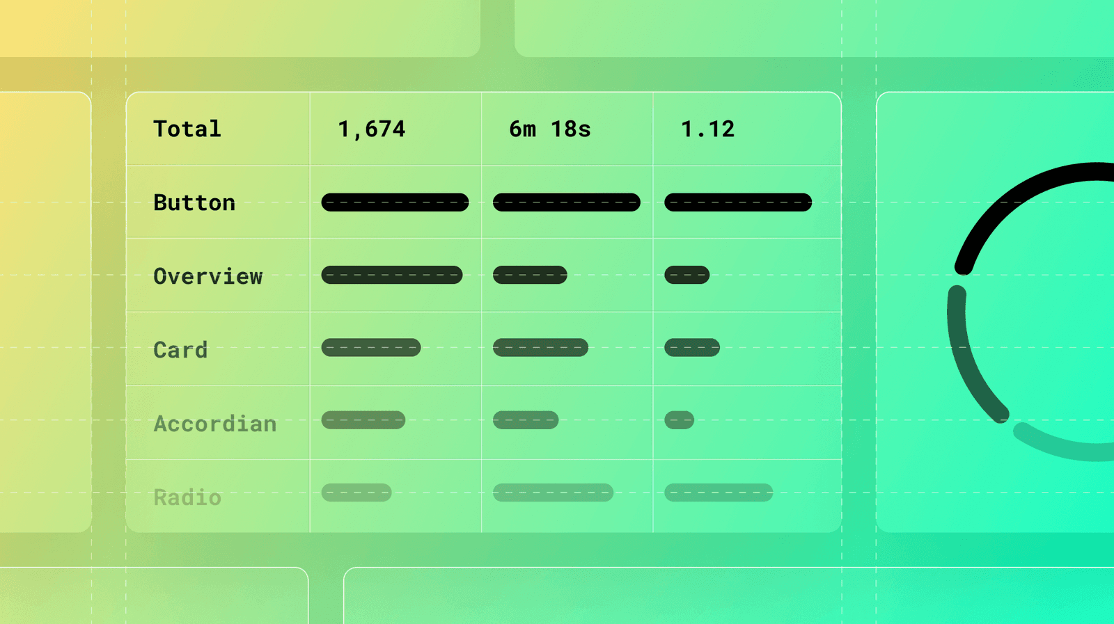
Treat your design system docs like a product, not a library. Use analytics on page views, search queries, and user feedback to find confusing components and content gaps. The footgun: high traffic can signal a confusing page, not just a popular one.
Why it exists
Design system teams have limited resources. They need a data-driven way to decide where to focus their efforts—fixing a confusing component guide, documenting a new one, or improving search—to maximize adoption and impact, rather than relying on guesswork.
The mental model
Treat your documentation as the primary interface to your design system. Like any software product, you can use analytics to understand user behavior, identify pain points, and prioritize improvements based on real data, not just assumptions about what users need.
How it works
You collect data from three main sources. First, usage metrics like page views, time on page, and navigation paths show what's popular and where users spend time. Second, search analytics, including common terms and failed searches, reveal user intent and highlight content gaps. Third, qualitative feedback from user ratings and office hours provides context for the numbers. The real power comes from connecting these metrics, for instance by correlating high documentation views with actual component adoption in production code.
When to use it
Use documentation analytics continuously to guide your roadmap. It's especially valuable when prioritizing work. For example, if many users search for "data table filtering" and find no results, that's a clear signal to create that content. If a critical component's doc page has a high exit rate, it's a sign the guide needs immediate clarification to unblock users.
When not to use it
Don't rely on analytics alone without qualitative context. A high "time on page" could mean users are deeply engaged, or it could mean they are completely lost and struggling to understand the content. Always pair quantitative data with direct user feedback from surveys, interviews, or office hours to understand the "why" behind the numbers.
One canonical example
A design system team sees that their "Button" component page has the highest page views, but support requests about button variants are also high. Digging into analytics, they see users frequently jump between the "Button" page and the "Design Tokens" page. They realize the connection isn't clear. They update the "Button" page with an interactive example showing how tokens change a button's appearance. After the update, support requests drop by 50% and the average time on page decreases, indicating users now find their answers faster.
Interview question
When interpreting documentation analytics, what critical insight does the card provide regarding a page with consistently high traffic?
- a.It suggests the content is likely confusing or incomplete, causing users to spend excessive time or repeatedly visit.
- b.It primarily indicates the associated component is widely adopted and should be prioritized for new feature development.
- c.While it can indicate popularity, it could also mean users are struggling to understand the content or find specific information.Correct
- d.High traffic always signifies that the documentation is clear, comprehensive, and highly effective.
Why? this is the answer
The card explicitly warns that high traffic is a 'footgun' because it 'can signal a confusing page, not just a popular one.' Therefore, option C correctly captures this dual possibility. Option A is a tempting distractor because confusion is one possible reason, but it misses the nuance that popularity is also a possibility, which the card highlights.
Just read this? Test yourself on what you have been reading.
Read the original → supernova.io
You just looked this up. Could you explain it out loud?
That is the part interviews actually test. Tezvyn takes questions like this one and gives you what the interviewer is really checking, the answer that lands, and the mistake that ends the conversation, in the four minutes before your next meeting.
The iPhone app is on the way
We are building it. Until it lands, nothing here is held back from you: every interview card, your saved cards, streaks and the job board all work in Safari, plus hundreds of free practice quizzes of thirty questions each. Sign in and it all carries over to the app the day it arrives.
Want it as an icon? Tap Share at the bottom of Safari, then Add to Home Screen. It opens full screen and the cards you have read stay available offline.
We are hiring for this. Open roles that interview on design systems — each one lists the topics its interview covers.
See open roles