The Slot Pattern: Making UI Components Composable
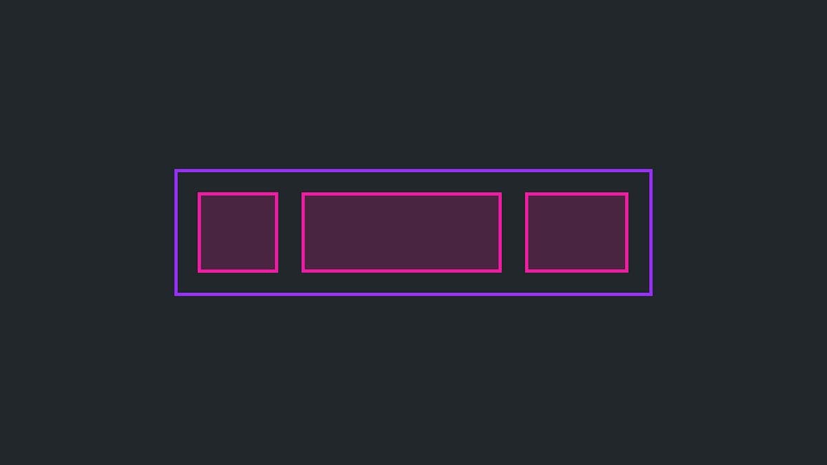
The Slot Pattern makes components flexible by defining areas for custom content, like a picture frame for your UI. It's used in Cards or Modals to allow varied content in a consistent frame. The footgun is that too much flexibility can break consistency.
Why it exists
A design system cannot predict every single UI need. Overly rigid components become frustrating and are often bypassed by developers, defeating the system's purpose. The slot pattern was created to balance a component's fixed, consistent structure with the need for flexible, custom content composition inside it.
The mental model
Think of a component with slots as a pre-built shelf with designated empty spaces. The shelf itself—the component's frame, padding, and background—is fixed and consistent. But you can place any object you want—your custom content, like text, images, or other components—into the empty spaces, which are the slots. This allows for customization without having to rebuild the entire shelf each time.
How it works
In design tools like Figma, a slot is often a special layer where you can place custom content inside a component instance. In code, this pattern is implemented in several ways. The most common is the children prop in React, where any content placed between a component's opening and closing tags, like in <Card>...here...</Card>, is rendered in a default slot. For more complex components, you can have "named slots," which are passed as specific props, like <PageLayout header={<MyHeader />} footer={<MyFooter />} />.
When to use it
Use slots when a component's "chrome" (its wrapper, layout, and styling) should be consistent, but its content is variable. This is ideal for container-like components. Three key places are: first, general content areas like the body of a Modal or Card; second, components that accept a list of repeating items, like a TabGroup accepting multiple Tab items; and third, complex layouts with multiple distinct areas, like a page shell with slots for a header, sidebar, and main content.
When not to use it
Avoid slots for simple, atomic components like a basic Button or an Icon. These components are meant to be fully encapsulated and configured only through props. Introducing slots here adds unnecessary complexity and defeats their purpose as predictable, self-contained units. If you find yourself wanting to slot content inside a button, you likely need a different, more complex component. The key footgun is that slots blur component boundaries; overuse can lead to a loss of control and consistency.
One canonical example
A Card component is the classic example. A basic Card might have a default slot for its main body content. A more advanced Card could have named slots for a header, media (for an image or video), body (the default), and footer (for actions). This allows a developer to construct many different card variations from a single, consistent Card component, ensuring padding, borders, and shadows are always correct while the content inside is completely custom.
Interview question
When would applying the Slot Pattern generally be considered an anti-pattern or lead to unnecessary complexity?
- a.When a component's visual wrapper and layout must remain consistent across all instances.
- b.To enable developers to completely customize the styling and behavior of a component's core structure.
- c.For container components that need to display a wide variety of internal content types.
- d.For atomic UI elements like a basic button or icon that are meant to be fully encapsulated.Correct
Why? this is the answer
The card explicitly states to avoid slots for simple, atomic components like buttons or icons, as they are meant to be fully encapsulated and adding slots introduces unnecessary complexity. The Slot Pattern aims to provide content flexibility within a consistent structure, not to allow complete customization of the component's core structure itself.
Just read this? Test yourself on what you have been reading.
Read the original → nathanacurtis.substack.com
- #design systems
- #composability
- #frontend
- #react
- #ui
You just looked this up. Could you explain it out loud?
That is the part interviews actually test. Tezvyn takes questions like this one and gives you what the interviewer is really checking, the answer that lands, and the mistake that ends the conversation, in the four minutes before your next meeting.
The iPhone app is on the way
We are building it. Until it lands, nothing here is held back from you: every interview card, your saved cards, streaks and the job board all work in Safari, plus hundreds of free practice quizzes of thirty questions each. Sign in and it all carries over to the app the day it arrives.
Want it as an icon? Tap Share at the bottom of Safari, then Add to Home Screen. It opens full screen and the cards you have read stay available offline.
We are hiring for this. Open roles that interview on design systems — each one lists the topics its interview covers.
See open roles