More in Analytics & Metrics — page 25
Outlier Detection: Finding Data That Doesn't Belong
Outlier detection finds data points that don't fit the pattern, signaling an error, fraud, or a new event. It's used to spot faulty sensor readings or fraudulent transactions.
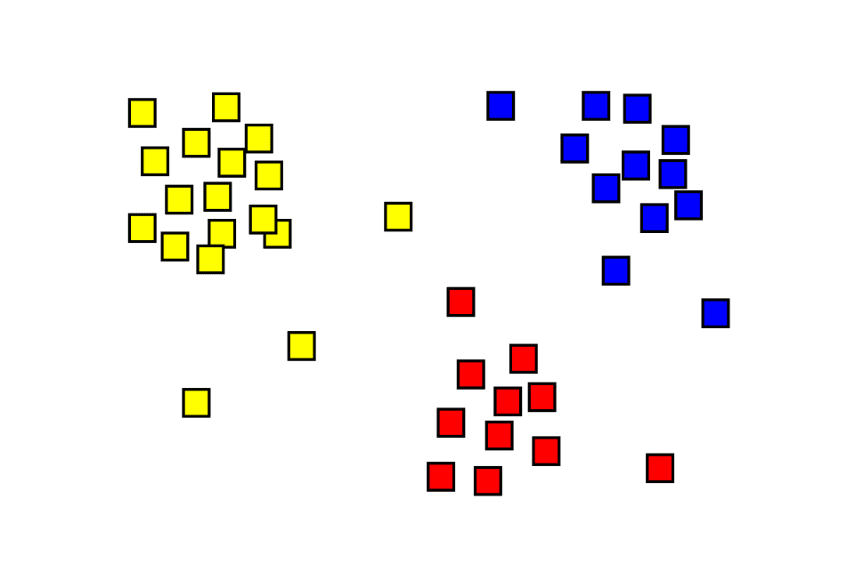
Cluster Analysis: Finding Hidden Groups in Your Data
Cluster analysis automatically finds natural groupings in unlabeled data, like sorting a mixed bag of Legos without a manual. It's used for customer segmentation or anomaly detection.
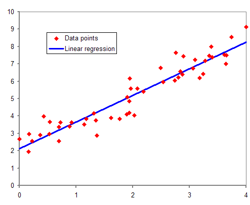
Regression Analysis: Finding the Line of Best Fit
Regression analysis draws a line through data to model relationships between variables. Use it to predict a house price from its square footage or forecast sales from ad spend. The footgun: a strong correlation doesn't prove one variable causes the other.

Confidence Interval: Quantifying Uncertainty in Your Estimates
A confidence interval puts error bars around a measurement, showing the plausible range for a true value. It's used in A/B tests to report not just a winner, but the range of its likely impact.
P-value: Probability of Your Data, Not Your Hypothesis
A p-value measures how surprising your data is, assuming your null hypothesis (e.g., "no change") is true. It's used in A/B tests to decide if an effect is real. The footgun: a low p-value doesn't prove your theory, it just casts doubt on the null.
Statistical Significance: Is Your Result Real or Just Random?
Statistical significance checks if a result is a real effect or just random chance. It answers: 'How surprising is this data if my change had no effect?' It's used in A/B tests to validate new features. The footgun: a significant result isn't always important.
Root Cause Analysis: Stop Fixing Symptoms, Find the Source
Root Cause Analysis digs past surface-level symptoms to find the true origin of a problem. It’s used to analyze IT outages, manufacturing defects, and even medical misdiagnoses.
Correlation Is Not Causation
Just because two metrics move together doesn't mean one causes the other. This is vital when analyzing user data, as a feature launch might correlate with higher signups when the real cause was a marketing campaign.
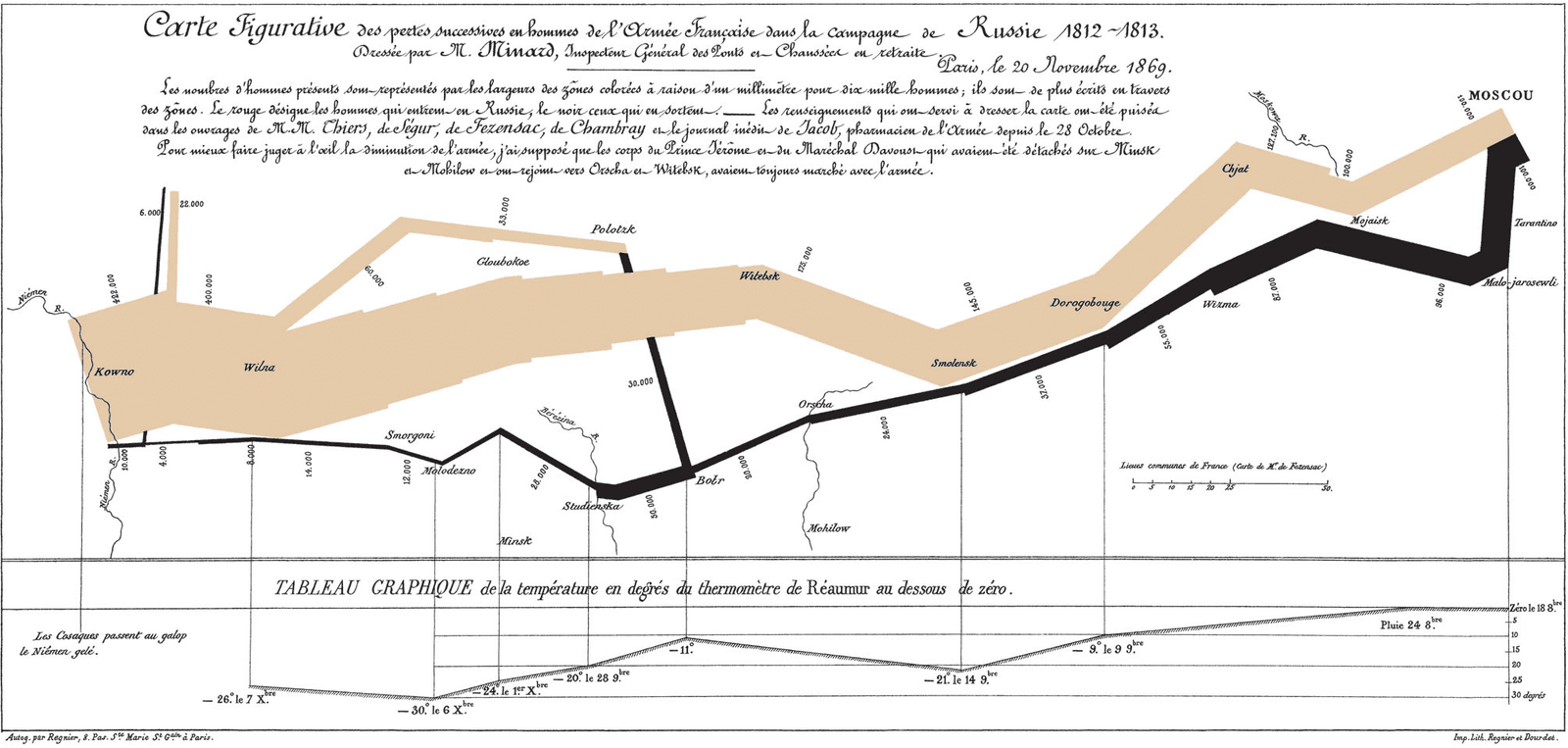
Exploratory Data Analysis (EDA): Look Before You Leap
Exploratory Data Analysis (EDA) is like being a detective with your data: you look for clues, patterns, and outliers before forming a theory. It's the first step in any data project, from building a model to creating a dashboard.

Lie Factor: Quantifying Visual Distortion in Graphs
The Lie Factor measures how much a graph's visuals distort the data's story. It's used to critique charts that exaggerate changes, like with a truncated y-axis.

Choropleth Maps: Coloring Data by Region
A choropleth map colors geographic areas to represent a metric, like shading states red or blue on an election map. It's used to show regional data like population density or sales per territory.
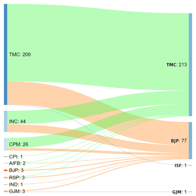
Sankey Diagram: Visualizing Proportional Flow
A Sankey diagram visualizes flow, where the width of each path is proportional to the quantity moving through it. Use it to trace user journeys or track budget allocation.

The Narrative Arc for Data Storytelling
A narrative arc gives data a story by building tension toward a key insight. It guides stakeholders from a problem (plot) to a turning point (climax) and a resolution. The footgun is oversimplifying; compelling stories have multiple smaller tension peaks.
Small Multiples: Comparing Data with a Grid of Charts
Small multiples are a comic strip for data, showing different dataset slices in a grid of charts with identical axes. They're used to compare trends across categories, like sales per region. The footgun is using inconsistent scales, which breaks comparison.

Data-Ink Ratio: Maximize Signal, Minimize Noise
The Data-Ink Ratio states that a good chart maximizes the ink showing data and minimizes everything else. It's a call to erase 'chart junk'—heavy gridlines or 3D effects—that doesn't convey information.
Gestalt Principles: How Brains Group Visuals
Gestalt principles explain why we see organized patterns, not random dots. Use them in data visualization to group related metrics with proximity or color, guiding users to see the intended story. Ignoring them creates confusing charts that obscure insights.

Chart Selection: Match Purpose, Not Looks
Start with the purpose, not the chart. The question you're asking—'how do these compare?' or 'what's the trend?'—determines the best visualization. A line chart shows trends; a bar chart compares categories.

Anscombe's Quartet: When Numbers Lie
Anscombe's Quartet shows how four datasets can share identical summary stats (mean, variance) but look completely different when plotted. It's a classic reminder to always visualize your data before trusting numerical summaries.
The Semantic Layer: A Business Map for Company Data
A semantic layer is a translation dictionary for data, mapping cryptic database columns to plain business terms like "Revenue." It lets non-technical teams build reports without writing SQL.
Exception Reporting: Focus on Signals, Not Noise
Exception reporting filters out the noise, showing only data that breaks predefined rules. It's used in financial reconciliation to flag mismatched transactions or to alert on system performance dips.