Intermediate concepts in CSS & Design Systems, page 4
PostCSS Preset Env: Write Future CSS Today
postcss-preset-env is like Babel for CSS, transpiling modern syntax into code older browsers understand. Use it to write features like nesting or color-mix() today. The footgun: it only polyfills Stage 2+ features by default; you must opt-in for more.

Source Maps: Debug Your Compiled CSS
Source maps are a decoder ring for your browser's dev tools, translating minified CSS back to the original SCSS or LESS files you wrote. This lets you debug styles in your source code, not the unreadable compressed output.
Sass Control Directives: Logic in Your Stylesheets
Sass control directives bring programming logic—if/else, loops—into your CSS preprocessor. Use them to generate component variations or utility classes without repetitive code.

Atomic Design: Building UIs from the Smallest Parts
Atomic Design treats UIs as thoughtful hierarchies, building interfaces from the smallest parts up. This methodology helps create robust design systems for rolling out consistent UIs faster across countless devices. The footgun is seeing it as a rigid process.

Design System Governance: Preventing UI Chaos
A design system governance model defines the rules for evolving your UI library, preventing a free-for-all of conflicting changes. It dictates how new components are proposed and approved.
Versioning Design Systems: Holistic vs. Incremental
Versioning a design system is about communicating change. Use Semantic Versioning (MAJOR.MINOR.PATCH) to signal update impact. This prevents teams from using outdated components, ensuring consistency.
Architectural Decision Records (ADRs): Documenting 'Why'
An ADR is a short text file capturing the 'why' behind a key engineering choice. Use it for big decisions like choosing a library or defining a core pattern.
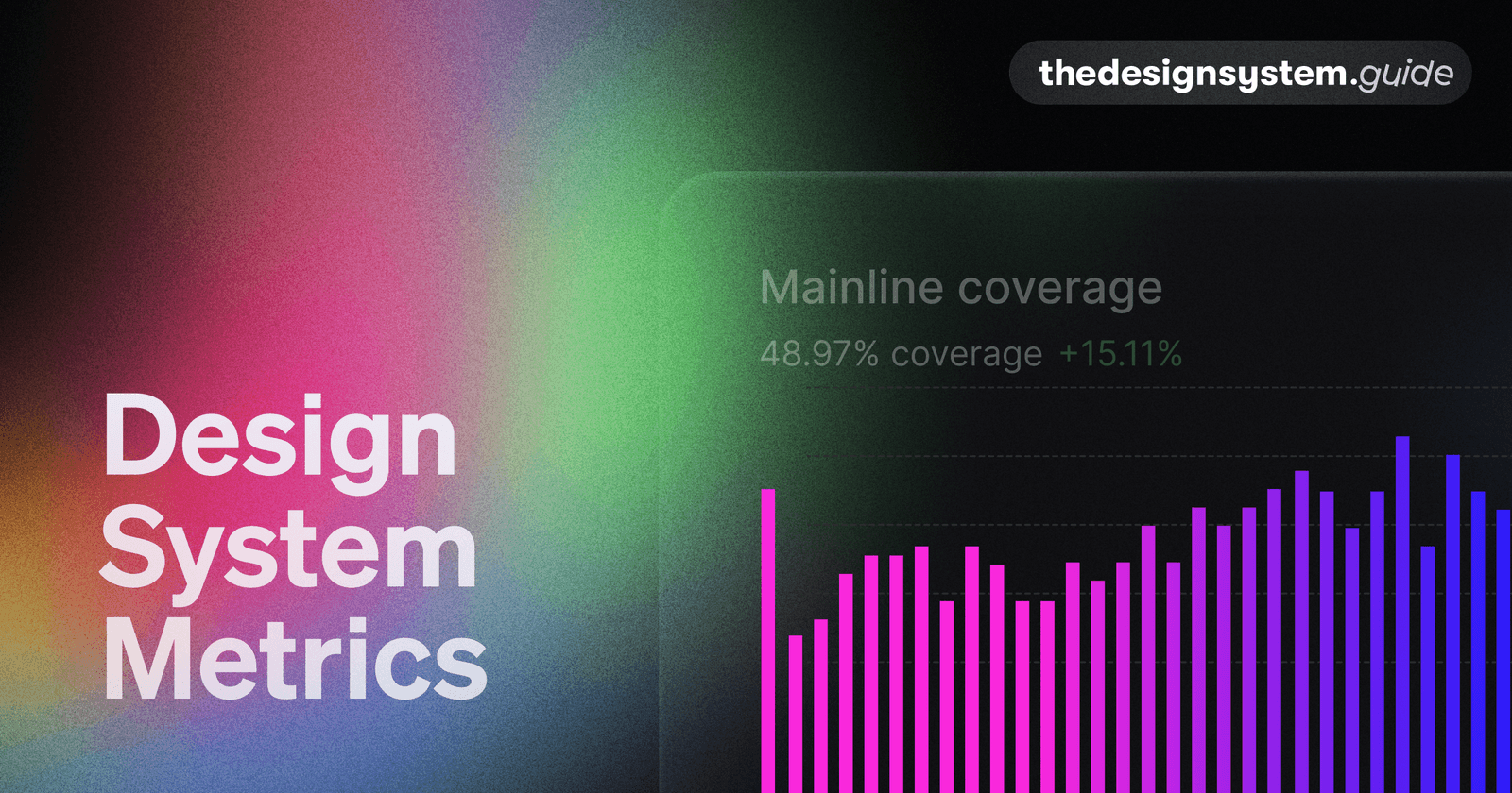
Design System Metrics: Proving Its Worth
Prove your design system's value with data, showing it's a force multiplier, not just a library. Track metrics like component adoption and faster time-to-market to justify budget and guide your roadmap. The footgun: avoid vanity metrics like component count.

Atomic CSS: Styling with Single-Purpose Utilities
Atomic CSS builds interfaces with tiny, single-purpose classes directly in your HTML, like using LEGO bricks for styling. It's the core of frameworks like Tailwind CSS, letting you build UIs without writing custom CSS. The footgun is creating unreadable HTML.

Bundle Size: When Runtime Dependencies Defeat Tree Shaking
Tree Shaking is static, but your app is dynamic. It can fail when a component imports a large dependency for an optional, runtime-configured feature. A UI library's provider might pull in an entire form library, even if you don't use it.
Component Usage Guidelines: The Manual for Your Design System
Usage guidelines are the instruction manual for your design system, ensuring consistency. They prevent developers from guessing button states and designers from stretching logos.
BEM: Scoped CSS Naming by Convention
BEM is a naming convention that scopes CSS classes like postal addresses, preventing specificity wars in component systems. It shines in large codebases with many developers. The footgun is deep element nesting, which bloats markup into unreadable strings.
Voice and Tone in Design Systems
Voice is personality; tone is the mood for the moment. Lock both in your design system so UI text feels like one product. The footgun is documenting voice while letting teams pick their own tone, breaking consistency when users are stressed.
Semantic vs. Primitive Design Tokens
Semantic tokens give meaning to raw values so components bind to intent, not hex codes. They let you rebrand or theme by changing aliases, not component code.
Design Token Naming Conventions
Design token names encode meaning through a consistent, layered structure so values stay portable across themes and platforms. A clear convention like category-type-item-state turns scattered constants into a self-documenting, predictable system that…
Categories of Design Tokens
Design tokens fall into tiers: primitive tokens hold raw values, semantic tokens assign meaning by aliasing primitives, and component tokens scope decisions to specific UI parts.
Tiered Token Architecture in CSS
Tiered tokens layer CSS variables as raw values, semantic aliases, and component bindings. Use them when one rebrand must update hundreds of elements. The footgun is skipping aliases and binding hex codes directly to components, locking you into manual…
Auto-Generated Changelogs for Design Systems
Automated changelog generation turns structured commits into release notes without hand editing. It rescues teams when design systems ship frequent token or component updates. The footgun is that sloppy commits produce useless logs so discipline beats tooling.
Cross-Browser Testing Automation
Rendering engines disagree, so your CSS may break in Safari while Chrome looks fine. Automation runs your UI across real browsers in CI to catch visual drift early. The footgun is testing every pixel, which breeds brittle suites that teams eventually ignore.
Private NPM Registry for Internal Packages
A private registry hosts packages so teams npm install internal design systems like public dependencies. It matters when you split a monolith into shared libraries. The footgun is skipping scoped names and auth, which risks leaking code to the public registry.
We are hiring for this. Every open role lists the topics its interview covers, so you can prepare for the real thing rather than guessing.
See open roles