Concepts in CSS & Design Systems
CSS Cascade: How Browsers Resolve Style Conflicts
The CSS Cascade is a tie-breaking algorithm that decides which style rule applies when multiple rules target the same element. It resolves conflicts between browser defaults, user styles, and your CSS.

CSS Specificity: The Browser's Tie-Breaking Rule
CSS Specificity is the browser's tie-breaking system for conflicting styles. Think of it as a score: an ID is worth more than any number of classes, and a class is worth more than any number of elements. The footgun: using !important to win.
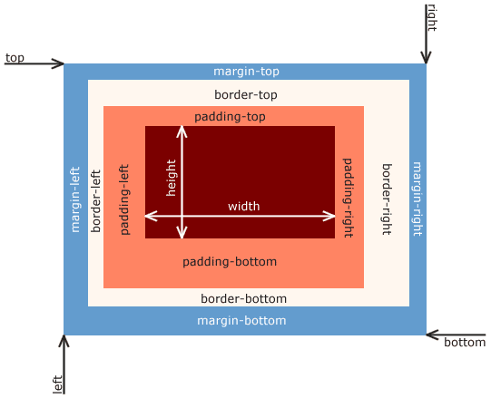
CSS Box Model: Every Element is a Box
Every HTML element is a box with layers: content, padding, border, and margin. This model dictates how elements take up space and align, forming the basis of all CSS layout. The footgun is the default sizing, which adds padding *outside* the set width.
CSS Inheritance: Styles Flow Downhill
CSS inheritance is like genetics for web elements: children inherit styles like color and font-family from their parents. This is why setting a font on <body> styles a whole page.
CSS Selectors: How to Target HTML for Styling
CSS selectors are like addresses for your HTML, telling the browser which elements to style. They're used to apply everything from colors to layouts. The main footgun is specificity: an overly specific selector can be difficult to override later.
CSS 'display': How Elements Occupy Space
The CSS display property defines an element's layout role: does it demand its own line (block) or share space (inline)? It's essential for everything from text flow to complex layouts with flex and grid.
CSS box-sizing: Predictable Element Sizing
The box-sizing property controls if padding and borders are added outside an element's width or carved out from inside. Using border-box makes layouts predictable, ensuring a width: 100px box is exactly 100px wide.
CSS Pseudo-classes: Style Elements Based on State
CSS pseudo-classes style elements based on their state, not just their HTML structure. Use them for interactive states like :hover, form validation like :invalid, or structural position like :first-child.
CSS Positioning: Taking Elements Out of Normal Flow
CSS position lets you override the default document flow. Think of it as telling an element to ignore its neighbors and listen to top/left coordinates instead. Use it for overlays, modals, and sticky headers.
CSS Margin Collapsing: The Largest Margin Wins
Instead of adding up, vertical margins on adjacent block elements 'collapse' into one, taking the size of the largest margin. This explains why two paragraphs with margin: 1rem don't have 2rem of space between them. The footgun is assuming it's a bug.
CSS Pseudo-elements: Styling Parts of an Element
Pseudo-elements style parts of an element not in the DOM, like a paragraph's first line or selected text. Use ::before/::after for decorative content or ::selection to style user highlights.
CSS Stacking Contexts: The Z-Axis Explained
A CSS stacking context is like a self-contained group of layers. Elements inside only compete for z-index with siblings in that same group. They're created by properties like position with z-index, opacity, or transform.
Block Formatting Context: Taming Floats and Margins
A Block Formatting Context (BFC) is a mini-layout sandbox on your page, isolating its contents. Use it to contain child floats that would otherwise overflow their parent, or to stop adjacent elements from collapsing their margins.
CSS Containing Block: The Box That Defines Your Box
An element's size and position are calculated relative to its containing block, not always its direct parent. This determines how percentage widths are resolved and provides the reference for position: absolute.
CSS Color Values: From Keywords to Functions
CSS offers multiple ways to define colors, from simple names like red to functions like rgb(). Use keywords for mockups, hex for design handoffs, and HSL for intuitive manipulation. The main footgun: colors can look different across uncalibrated devices.
CSS `font`: The All-in-One Typography Shorthand
The font property is a single CSS declaration for setting multiple type styles at once, like size, weight, and family. Use it to define base typography for your site or components.
CSS `background`: The All-in-One Shorthand
The CSS background property is a shortcut for styling an element's backdrop, combining color, image, and position in one line. Use it for most background tasks, from simple colors to complex layered images.
border-radius: More Than Just Rounded Corners
The border-radius property rounds an element's corners, used for everything from buttons to circular avatars. The footgun is its shorthand syntax: one value is simple, but two, three, or four values follow specific clockwise rules that are easy to mix up.

@font-face: Ship Custom Fonts with Your CSS
@font-face lets you use fonts not installed on a user's machine by telling the browser where to download them. It's how you get custom brand fonts on a website, but be wary of the performance hit from downloading large font files.
CSS Gradients: Dynamic Images from Code
Think of CSS gradients as dynamic images generated by the browser, creating color transitions without a separate file. Use them for backgrounds and buttons. The default direction is top-to-bottom, but a 0deg angle is counterintuitively bottom-to-top.
We are hiring for this. Every open role lists the topics its interview covers, so you can prepare for the real thing rather than guessing.
See open roles