Intermediate interview questions in CSS & Design Systems

Describe the full CSS cascade precedence order
This tests deep cascade knowledge beyond specificity. A strong answer lists the six origins in order, notes !important reverses them, then layers, specificity, and source order.
What is margin collapsing? Give a sibling scenario and prevention.
This tests understanding of vertical margin combination in normal flow. A strong answer defines collapsing, gives a sibling paragraph example where the larger margin wins, and names a block formatting context or padding as prevention.
Pseudo-class versus pseudo-element in CSS
Pseudo-classes target an element in a state, pseudo-elements style a generated or sub-part using double colons, and ::before injects decorative content.
How is CSS specificity calculated for a complex selector?
This tests ID-CLASS-TYPE algorithm fluency. A strong answer gives the three-column tally, counts IDs, classes or attributes, and types in order, and notes combinators add zero. A red flag is counting combinators or mixing inline styles into selector scores.
Which CSS background properties make a hero image cover its container?
Tests background-size keywords and aspect-ratio behavior. Lead with cover, note it fills the container by cropping while preserving ratio, unlike contain. Red flag: recommending 100% 100% or explicit lengths, which stretch and distort the image.
Create a vertical black gradient overlay on a background image
Use linear-gradient with rgba black stops, layer it over the image via stacked backgrounds or a pseudo-element.
What is font-display and how do swap and block differ?
This tests knowledge of the font display timeline. Swap shows fallback immediately then swaps in custom font, while block hides text for a short block period before fallback. A red flag is claiming swap prevents layout shift or that block is superior.
How do CSS Custom Properties manage a design system color palette?
Define --color-primary on :root, use var() for buttons and headings, mention fallbacks.
Explain flex-grow, flex-shrink, flex-basis and their interaction
Tests deep understanding of flexbox sizing beyond keywords. A strong answer defines grow and shrink as ratios for distributing leftover or overflow space, basis as the starting size, and explains the two-step calculation.
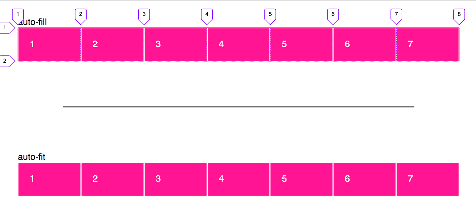
Create a responsive card grid without media queries
This tests CSS Grid intrinsic sizing. Answer: grid-template-columns with repeat(auto-fit, minmax(min, 1fr)), leveraging repeat, minmax, and auto-fit for fluid wrapping. Red flag: defaulting to Flexbox or media queries instead of intrinsic grid behavior.
Explicit vs implicit grid: how do you control implicit tracks?
Explicit tracks use grid-template; implicit tracks appear on overflow. Control via grid-auto-rows/columns and grid-auto-flow.
Implement a fixed-width sidebar with Flexbox and CSS Grid
This tests Flexbox as one-dimensional versus Grid as 2-dimensional. A strong answer covers Flexbox with flex: 1 on main and flex: none on sidebar, and Grid with grid-template-columns: 250px 1fr. Red flag: claiming Grid is always superior or ignoring overflow.
Key differences between responsive and adaptive design, and when to choose adaptive
It tests layout strategy trade-offs beyond media queries. A strong answer contrasts responsive fluid grids with adaptive device-specific layouts. Red flag: claiming they are identical or that adaptive means more breakpoints.
Build a responsive 3-column layout with Flexbox and Grid
Tests whether you pick right tool for responsive layouts. Good answers use flex-wrap and flex-basis for Flexbox, repeat() or grid-template-areas for Grid, in min-width 768px query. Red flag: desktop-first max-width queries or claiming Grid replaces Flexbox.
How would you use srcset and sizes for responsive image performance?
This tests responsive image selection in the browser. A strong answer covers srcset with w or x descriptors, sizes for layout width hints, and the browser picking before CSS loads. Red flag: suggesting JS detection or CSS backgrounds instead.
Explain advantages of rem and em over px in responsive design
This tests cascading font scaling and accessibility. Strong answers mention user zoom, root-level rem control, component em scaling, and avoiding px fragmentation. Red flag: claiming px handles all user preferences automatically.
Why is animating transform preferred over top or margin-left?
Grasp of the rendering pipeline and frame rate. A strong answer says transform skips layout and runs on the compositor, while top and margin-left force layout and drop frames.
Create a staggered list fade-in using only CSS
Tests CSS animation orchestration via keyframes and delay strategies. Great answers use :nth-child or --index variables for scalable staggering, set fill-mode forwards, and honor prefers-reduced-motion.
CSS will-change: purpose, appropriate use, and overuse consequences
Tests whether you know will-change is a last-resort hint, not a default. Strong answers: hint imminent changes, toggle via script, and warn that overuse wastes memory. Red flag: leaving it in CSS permanently or applying it preemptively to many elements.
How custom properties enable dynamic theming
Custom properties cascade and resolve live, so redefining them on a scope or data attribute reskins everything via var().
We are hiring for this. Every open role lists the topics its interview covers, so you can prepare for the real thing rather than guessing.
See open roles