Intermediate everything in CSS & Design Systems, page 4

Implement a fixed-width sidebar with Flexbox and CSS Grid
This tests Flexbox as one-dimensional versus Grid as 2-dimensional. A strong answer covers Flexbox with flex: 1 on main and flex: none on sidebar, and Grid with grid-template-columns: 250px 1fr. Red flag: claiming Grid is always superior or ignoring overflow.
Explicit vs implicit grid: how do you control implicit tracks?
Explicit tracks use grid-template; implicit tracks appear on overflow. Control via grid-auto-rows/columns and grid-auto-flow.
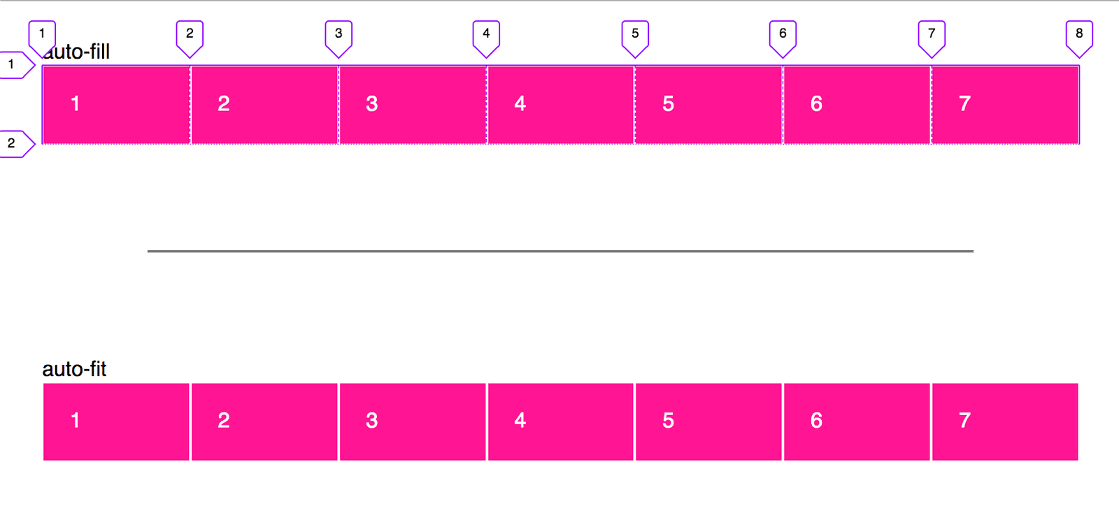
Create a responsive card grid without media queries
This tests CSS Grid intrinsic sizing. Answer: grid-template-columns with repeat(auto-fit, minmax(min, 1fr)), leveraging repeat, minmax, and auto-fit for fluid wrapping. Red flag: defaulting to Flexbox or media queries instead of intrinsic grid behavior.
Explain flex-grow, flex-shrink, flex-basis and their interaction
Tests deep understanding of flexbox sizing beyond keywords. A strong answer defines grow and shrink as ratios for distributing leftover or overflow space, basis as the starting size, and explains the two-step calculation.
How do CSS Custom Properties manage a design system color palette?
Define --color-primary on :root, use var() for buttons and headings, mention fallbacks.
What is font-display and how do swap and block differ?
This tests knowledge of the font display timeline. Swap shows fallback immediately then swaps in custom font, while block hides text for a short block period before fallback. A red flag is claiming swap prevents layout shift or that block is superior.
Create a vertical black gradient overlay on a background image
Use linear-gradient with rgba black stops, layer it over the image via stacked backgrounds or a pseudo-element.
Which CSS background properties make a hero image cover its container?
Tests background-size keywords and aspect-ratio behavior. Lead with cover, note it fills the container by cropping while preserving ratio, unlike contain. Red flag: recommending 100% 100% or explicit lengths, which stretch and distort the image.
How is CSS specificity calculated for a complex selector?
This tests ID-CLASS-TYPE algorithm fluency. A strong answer gives the three-column tally, counts IDs, classes or attributes, and types in order, and notes combinators add zero. A red flag is counting combinators or mixing inline styles into selector scores.
What is margin collapsing? Give a sibling scenario and prevention.
This tests understanding of vertical margin combination in normal flow. A strong answer defines collapsing, gives a sibling paragraph example where the larger margin wins, and names a block formatting context or padding as prevention.
Describe the full CSS cascade precedence order
This tests deep cascade knowledge beyond specificity. A strong answer lists the six origins in order, notes !important reverses them, then layers, specificity, and source order.
Design System Roadmap: Sequence Adoption Over Completeness
A design system roadmap sequences components by business impact, not visual completeness, to stop teams rebuilding the same UI. Use it when multiple squads duplicate buttons and forms. The footgun is a perfect Figma library engineers never adopt.
Design System Guild: Cross-Team Governance
A design system guild lets squads co-own the system, not a central team alone. It scales when one team cannot cover every surface. The footgun is voluntary membership without decision rights; it devolves into a committee that ships nothing.
Private NPM Registry for Internal Packages
A private registry hosts packages so teams npm install internal design systems like public dependencies. It matters when you split a monolith into shared libraries. The footgun is skipping scoped names and auth, which risks leaking code to the public registry.
Cross-Browser Testing Automation
Rendering engines disagree, so your CSS may break in Safari while Chrome looks fine. Automation runs your UI across real browsers in CI to catch visual drift early. The footgun is testing every pixel, which breeds brittle suites that teams eventually ignore.
Auto-Generated Changelogs for Design Systems
Automated changelog generation turns structured commits into release notes without hand editing. It rescues teams when design systems ship frequent token or component updates. The footgun is that sloppy commits produce useless logs so discipline beats tooling.
Tiered Token Architecture in CSS
Tiered tokens layer CSS variables as raw values, semantic aliases, and component bindings. Use them when one rebrand must update hundreds of elements. The footgun is skipping aliases and binding hex codes directly to components, locking you into manual…
Semantic vs. Primitive Design Tokens
Semantic tokens give meaning to raw values so components bind to intent, not hex codes. They let you rebrand or theme by changing aliases, not component code.
Voice and Tone in Design Systems
Voice is personality; tone is the mood for the moment. Lock both in your design system so UI text feels like one product. The footgun is documenting voice while letting teams pick their own tone, breaking consistency when users are stressed.
BEM: Scoped CSS Naming by Convention
BEM is a naming convention that scopes CSS classes like postal addresses, preventing specificity wars in component systems. It shines in large codebases with many developers. The footgun is deep element nesting, which bloats markup into unreadable strings.
We are hiring for this. Every open role lists the topics its interview covers, so you can prepare for the real thing rather than guessing.
See open roles