Intermediate everything in Design Systems, page 4
Measuring design system adoption and health
Component coverage and version spread from code scans, usage analytics, issue and satisfaction signals.
Technical and comms plan for a Button break
Additive-first then deprecate, major semver, codemod and guide, multi-channel early comms with adoption tracking.
Critical a11y fix requiring a breaking API change
Ship a safe interim fix, plan the breaking API as a major with deprecation and codemod, communicate urgency.
Design systems across micro-frontends
Shared singletons and version alignment, token-based theming, distribution via shared scopes, stronger governance.
Governance for accessibility regressions
Detection via audits and monitoring, triage with severity and ownership, remediation SLAs, prevention feedback.
Automated a11y testing in CI and its limits
Axe-core in unit and story tests, fail the build on violations, plus manual screen-reader and keyboard testing.
Architecting a federated documentation site
Docs-as-code with a manifest, CI publishing artifacts, a build that pulls and merges, unified deploy.
Documenting accessibility per component
Per-component a11y sections, keyboard tables, ARIA roles and states, live examples.
Composite components versus layout primitives
Primitives give flexibility and composition, composites enforce consistency, choose by reuse and variation.
Rolling out a breaking change to a shared Button
Major semver bump, deprecation period, codemod and migration guide, staged comms.
Versioning and shipping design tokens via NPM
Semver, deprecate-before-delete with aliases, codemods and migration guides.
What WAI-ARIA attributes and keyboard interactions make Tabs accessible?
This tests mastery of the W3C Tabs pattern. A strong answer covers role tablist tab tabpanel, aria-selected, aria-controls, and arrow-key roving focus with optional auto-activation. A red flag is treating tabs as buttons and relying only on the Tab key.

How would you structure a flexible Card component API?
Tests composition-over-configuration thinking in design systems. A strong answer uses compound components or slots so consumers reorder or omit title, image, and body freely without prop drilling. Red flag: rigid boolean props that freeze layout order.
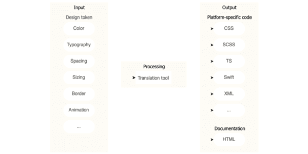
Design token pipeline serving Web, iOS, and Android
This tests cross-platform design system architecture and governance. A strong answer uses W3C JSON tokens in option, decision, component layers, with Style Dictionary generating Web, iOS, and Android outputs. Red flag: using Figma or CSS as source of truth.

What metrics measure design system success and adoption?
Tests if you connect design system health to delivery speed and consistency. Strong answers hit adoption rate, component usage, design-to-code parity, and accessibility compliance tied to team behavior.
What are design tokens and why standardize them?
Tests whether you treat tokens as API contracts between design and engineering. Strong answers define platform-agnostic decisions, cite W3C DTCG spec for cross-platform codegen, and note aliasing prevents drift.

How would you build a design system business case for leadership?
Audit inefficiencies with metrics, map the pitch to stakeholder priorities like ROI and velocity, and contrast build cost with projected savings.
Map Components to Native Platform Equivalents
Map design system components to native OS equivalents instead of forcing identical custom widgets everywhere. Use this when cross-platform apps must respect platform conventions.
Material Design: Android's Paper Metaphor
Material Design models Android UI as stacked paper with light and elevation. It ships pre-built components like cards and FABs so your app feels native immediately.
Structural vs. Thematic Tokens: Job vs. Value
Structural tokens describe the role, like text-primary; thematic tokens describe the value, like blue-500. Split them so retheming does not require hunting hexes. The footgun is using only thematic tokens, which hardcodes intent and breaks dark mode.
We are hiring for this. Every open role lists the topics its interview covers, so you can prepare for the real thing rather than guessing.
See open roles