Intermediate everything in Design & UX, page 29
Unit Testing UI Components: Beyond the DOM Mock
Unit tests for UI components verify individual pieces in a mocked browser environment (jsdom). This is standard for checking component logic with Jest or Vitest, but it can't test visual rendering, element sizes, or layout, creating critical blind spots.

Monorepos: A Design System's Single Source of Truth
A monorepo places your design system and its consuming apps in one repo. This enables atomic changes: update a component and all its consumers in a single commit. It's ideal for keeping UI consistent, but requires strict tooling to avoid becoming a monolith.
Figma Variables: The Single Source of Truth for Tokens
Figma variables are the central vault for your design tokens, letting you reference a name like color-background instead of a hardcoded value. Use them to build scalable themes and update spacing across an entire app.
Writing Accessibility Docs for Your Components
Accessibility docs are the user manual for your component's a11y features. They guide consumers on correct usage, like required ARIA attributes or keyboard behavior.

Design System Changelogs: For Humans, Not Machines
A design system changelog translates code changes into human-readable impact. It's a curated notice for consumers—not a raw git log. It's essential for communicating new components, token updates, and breaking changes so teams can adopt updates safely.

Wizard/Stepper Pattern: Guide Users Through Complex Tasks
A wizard or stepper pattern is like a recipe for a complex task, breaking a long process into numbered, manageable steps. It's ideal for multi-stage forms like onboarding or checkout flows.
Skeleton Screens: Faster by Faking It
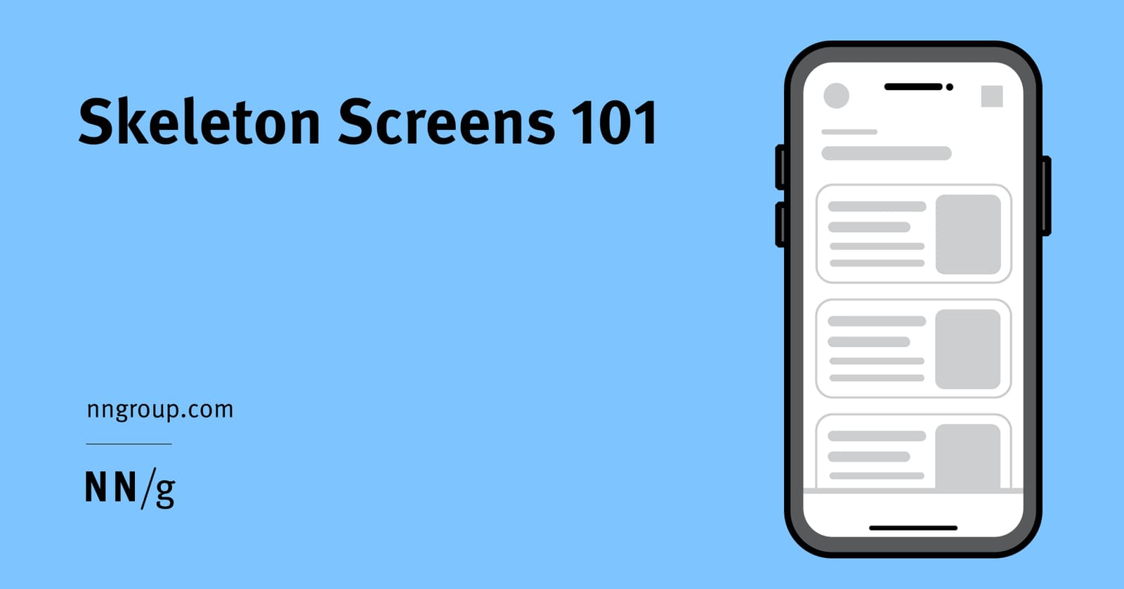
Skeleton screens create the illusion of speed by showing a wireframe-like preview of a page while content loads. They're used for full-page loads to set expectations about the layout. The footgun is showing just the app frame, which gives no structure.
Master-Detail: Show a List, Focus on One
The master-detail pattern splits your UI into a list of items (master) and a view for the selected one (detail). It's used in email clients and file explorers to manage information density. The footgun is a master list so sparse it forces users to click.
Header Components: An Exception to Reusability
Treat your site header as a unique beast, not a reusable component. Its complexity—managing branding, responsive navigation, and sticky positioning—makes abstraction brittle. The footgun is reusing the entire header instead of just its internal components.
Semantic Versioning: A Contract for Your Code's Evolution
Semantic Versioning is a contract for your code. The MAJOR.MINOR.PATCH format signals if an update is a breaking change, a new feature, or a bug fix. It's vital for managing dependencies safely. The footgun: SemVer is meaningless without a defined public API.

Style Encapsulation with Shadow DOM
Shadow DOM creates a private DOM tree for a component, acting like a one-way mirror for CSS. This prevents style collisions in complex UIs, ensuring a button's CSS doesn't break a header.

Component-Driven Development: Build UIs Bottom-Up
Component-Driven Development (CDD) builds UIs bottom-up, like assembling a car from its engine and wheels. It's used to manage complex UIs by creating small, independent components first. The footgun is building components too coupled to app-specific logic.

Controlled vs. Uncontrolled Components
A controlled component is a puppet; its parent pulls the strings via props. An uncontrolled one manages its own state. This pattern is key for coordinating siblings, like ensuring only one panel in an accordion is open.
CSS clamp(): Fluid Sizing Without Media Queries
CSS clamp() sets guardrails for a value, letting it scale fluidly but never going outside a min/max bound. It's ideal for responsive typography, allowing font-size to grow with the viewport. The footgun: the preferred value is ignored at extreme screen sizes.

Vertical Rhythm: A Formula for Consistent Spacing
Vertical rhythm is a system for consistent spacing derived from your body text's line height. Use this calculated unit between all elements—paragraphs, lists, and after headings—to create harmony.
WCAG Color Contrast: The 4.5:1 Rule for Readability
WCAG contrast ratios ensure text is readable for people with low vision by measuring relative luminance, not just color. Standard text needs a 4.5:1 ratio against its background.

Theming: One Design System, Many Visual Styles
Theming lets one component library wear many visual styles, like skins on a character. You can support multiple brands or dark/light modes by swapping design tokens instead of rebuilding components.
Design Systems: Your UI's Single Source of Truth
A design system is the single source of truth for UI, giving designers and developers a shared toolkit of reusable components and standards. It ensures consistency and efficiency across projects.

Design Systems: From UI Kits to Business Infrastructure
A design system is business infrastructure, not just a UI kit. It translates brand consistency into measurable ROI by reducing costs and accelerating delivery.

Atomic Design: Building UIs Like Chemistry
Atomic Design is like chemistry for UIs: you build complex screens from simple, indivisible 'atoms' like buttons and inputs. It's used to create consistent design systems. The footgun is treating it as a rigid, linear process instead of a mental model.
We are hiring for this. Every open role lists the topics its interview covers, so you can prepare for the real thing rather than guessing.
See open roles